Nij ClinicsBringing life to light.
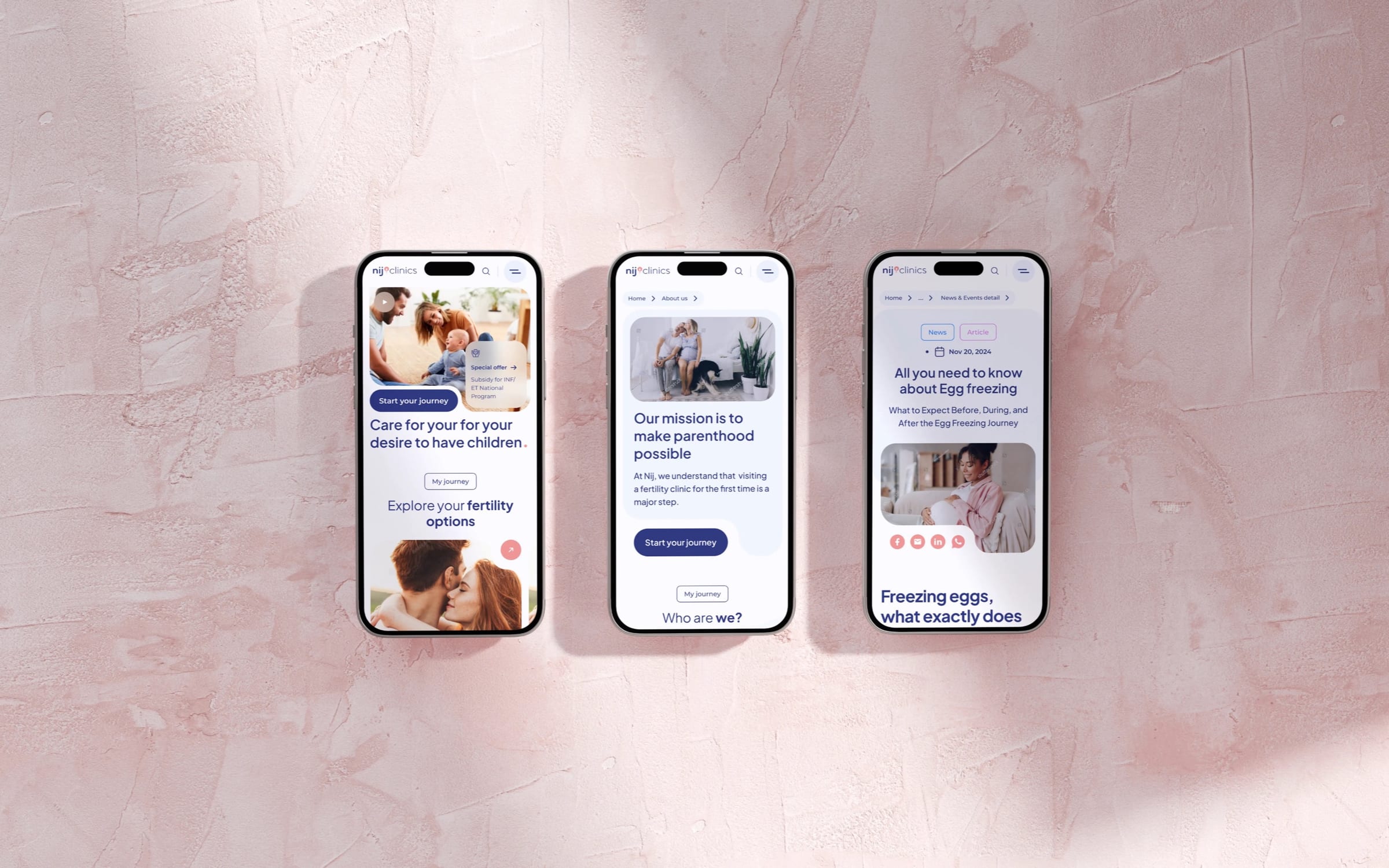
At a glance
- Design thinking
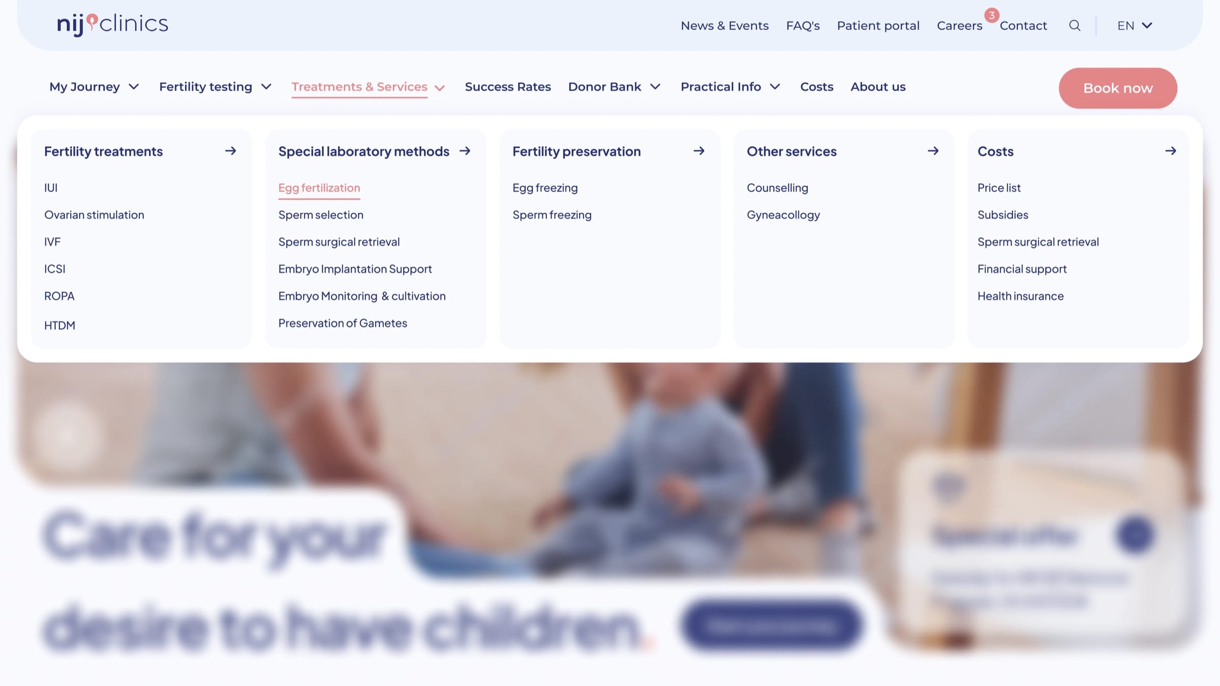
- Nobody in a tender moment should have to dig for a price, so costs sit in the main menu.
- Problem
- Visitors to a fertility clinic often arrive anxious, and the site had to give them a plain answer quickly.
- Approach
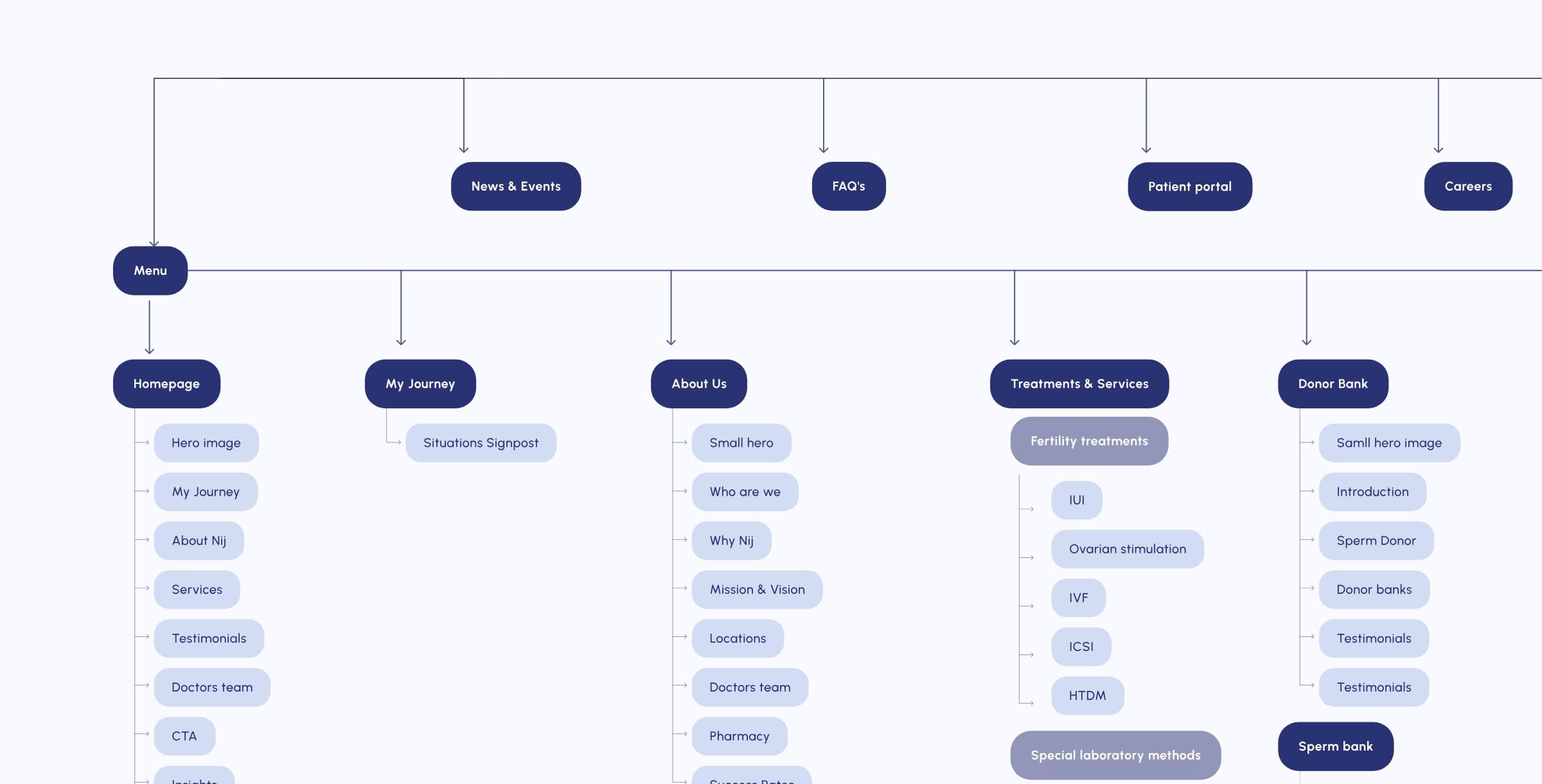
- We started from the sitemap, with two ways in, by personal situation or by treatment, and a short main menu.
- Outcome
- The redesigned website is live, built on components the clinic can keep adding to.
- Role
- Lucie as design and project lead, working with Petra Roubíková, Marketing Project Manager at FutureLife, and the internal team.
- What we designed
- UX/UI design
- Visual identity
- Design system
- Website design
- Platforms
- Clinic website
- Mobile web
- Component library
Treatments and costs, right in the main menu.
The decision
Two ways in, because not everyone knows what to ask for.
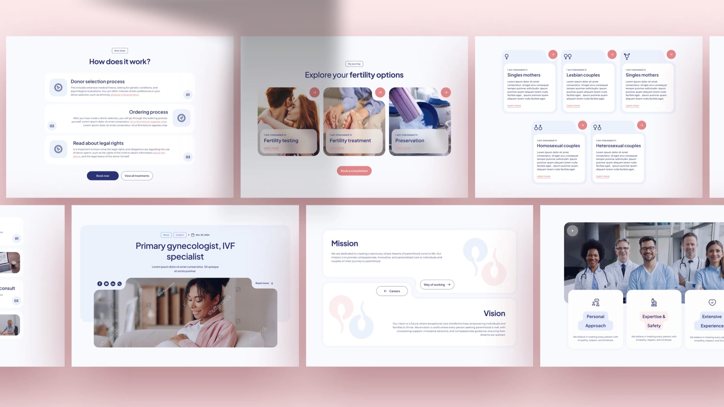
“My Journey” opens with a list of personal situations, and the homepage cards start from “I am interested in”.
The treatments menu stays complete and direct for anyone who already knows the name of what they need.
A simple menu, backed by a detailed sitemap.
The patient portal and FAQs sit in a smaller secondary menu, which keeps the main menu short. Every page below is planned as a sequence of sections, from the hero down.
Flexible components the clinic can keep building on.
Situation cards, specialist profiles and whatever the clinic adds next are built from the same set of components, so a new page arrives already on brand.
Gradients appear only where one section hands over to the next.
Blush and evening blue carry the warmth and the hope.
- Evening Nest#293273
- Powder Kiss#EFD6D7
- First Blush#E58D8F
- Milk Veil#F9FAFF
- Baby Sky#ECF1FB
The homepage starts with the visitor’s question.
“Explore your fertility options” follows straight after the hero, with booking a consultation one step away. Services and treatments come further down.
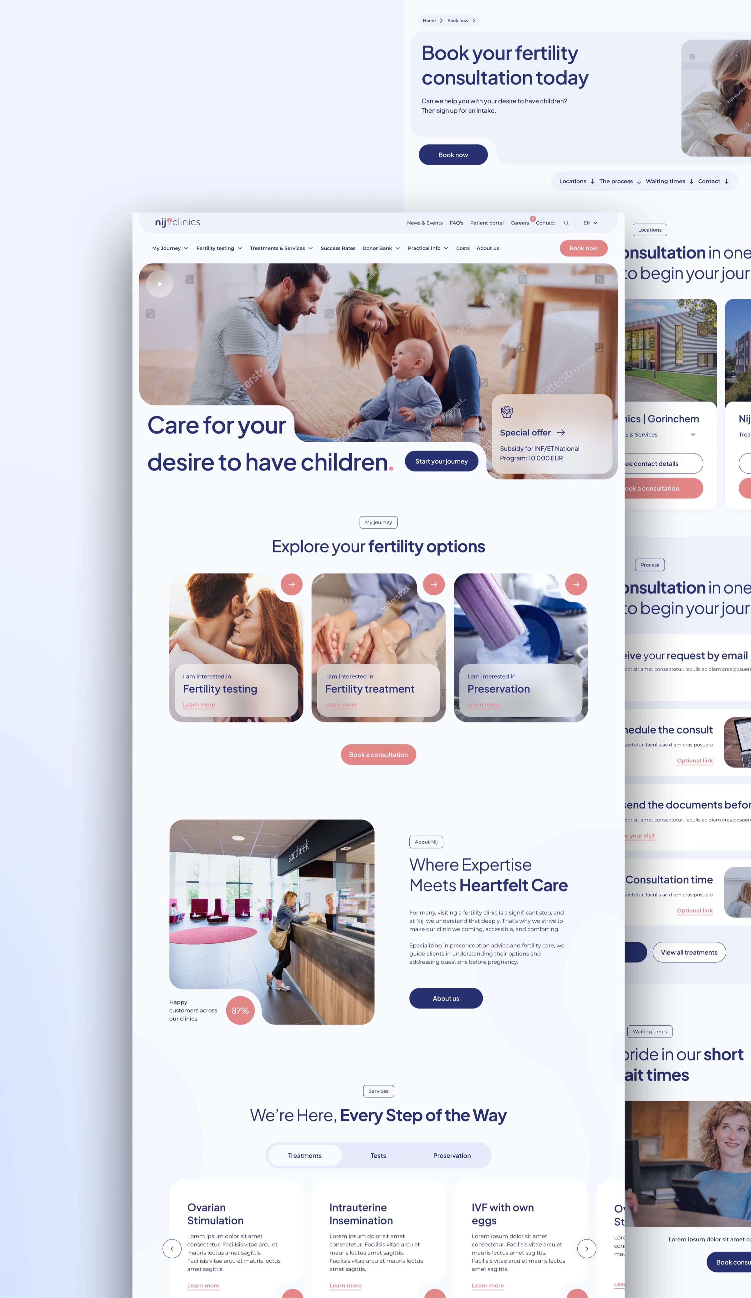
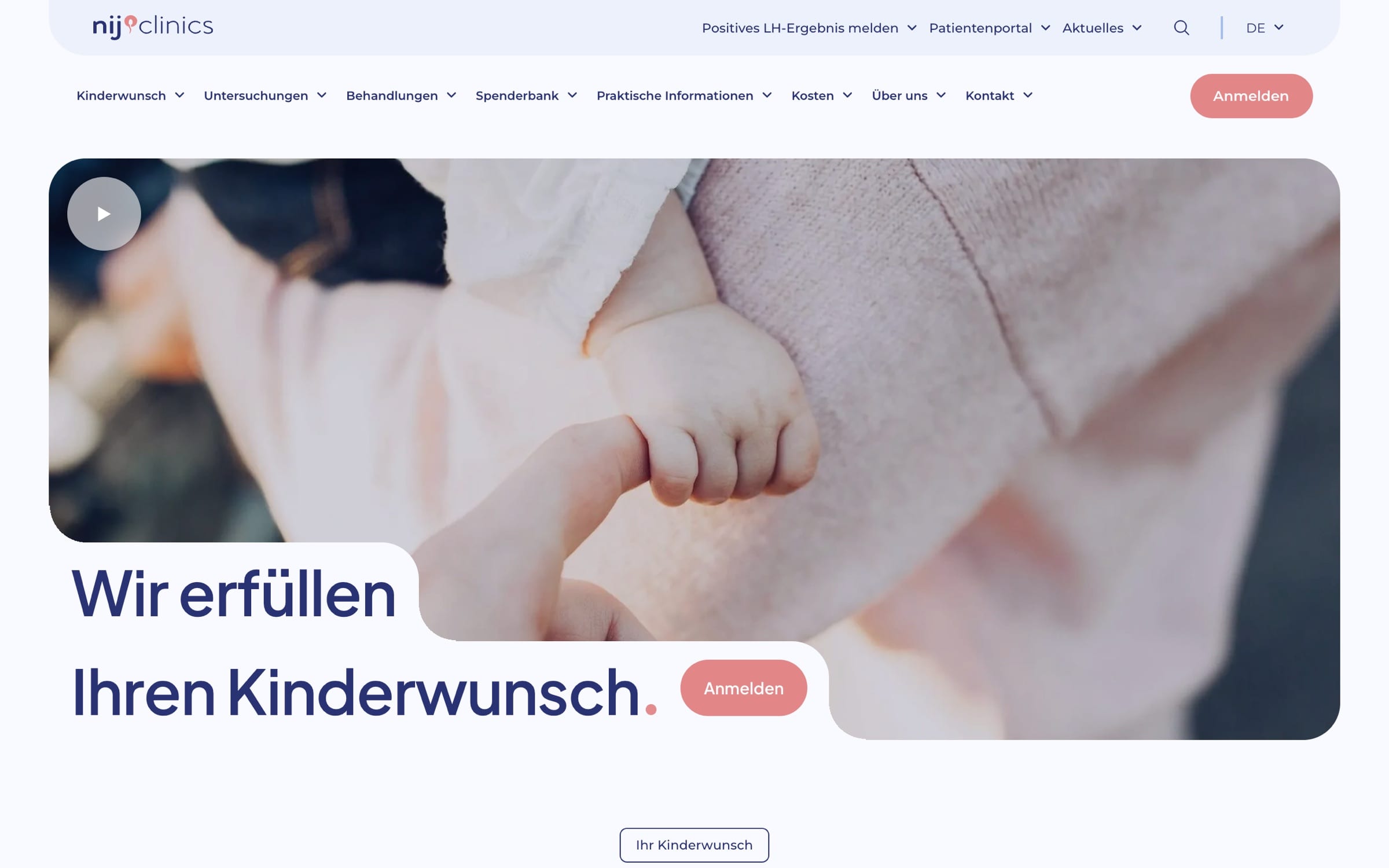
She took time to understand the clinic’s positioning in the Dutch healthcare market and delivered a website that is visually compelling and aligns with local user expectations.
More work
All projects →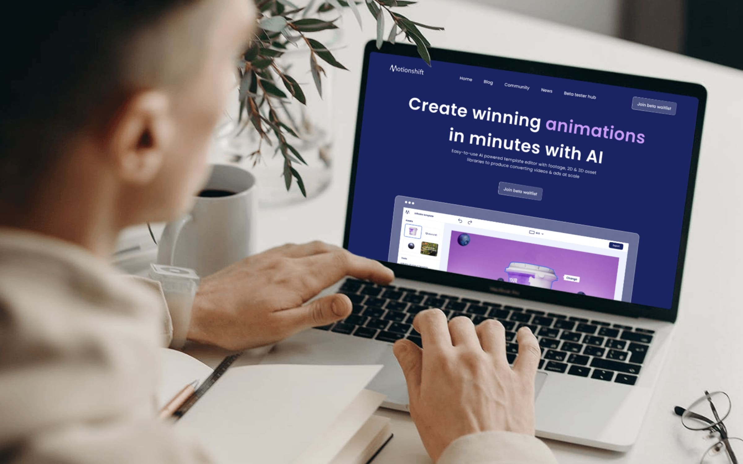 AI
AIMotionshift
An AI video tool shaped by what its first users actually needed.
 AI
AIAmass
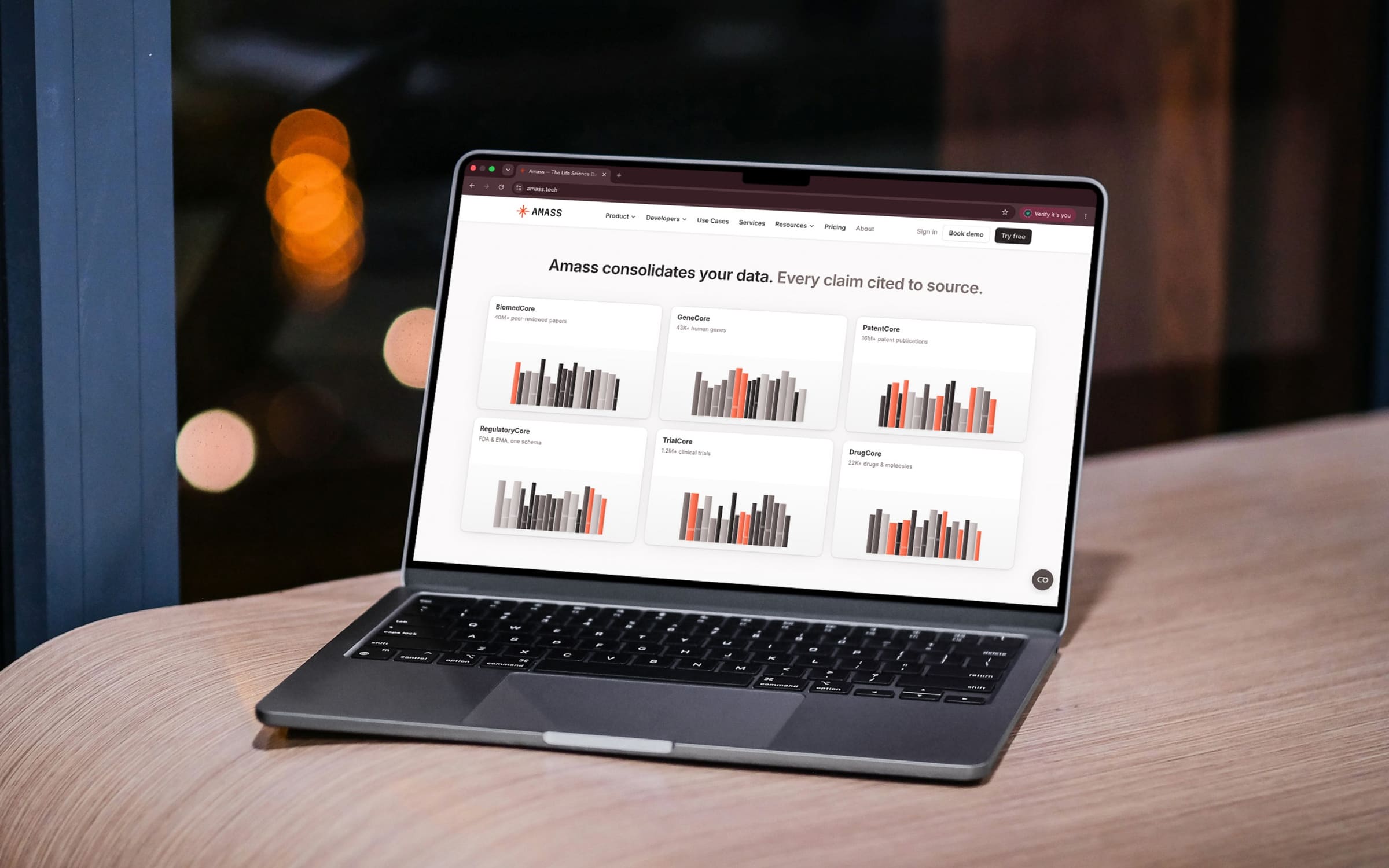
Life-science data in one place, with every claim cited to its source.
 Health
Movido
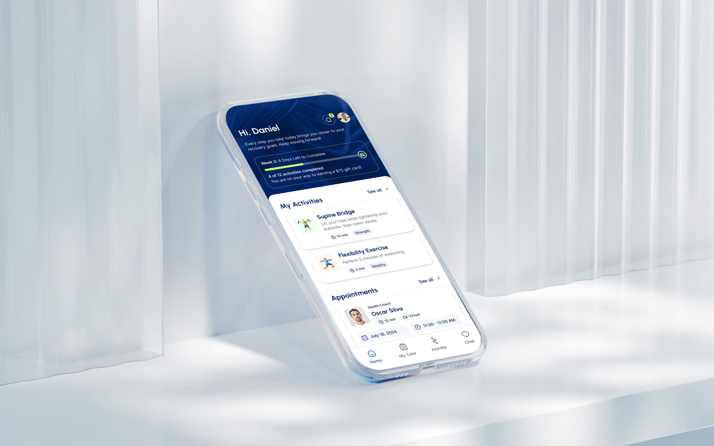
A recovery app that starts by asking what you want to get back to.
 AI
AITalentiqa
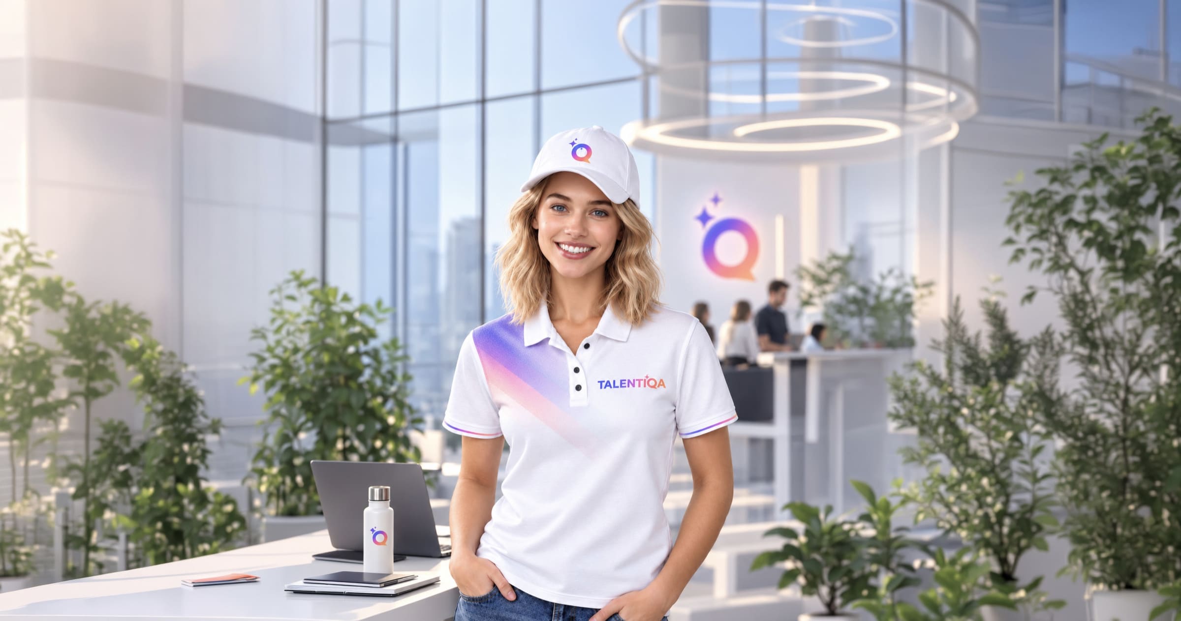
An AI hiring assistant that had a name, and nothing else.
 Automotive
AutoOpat
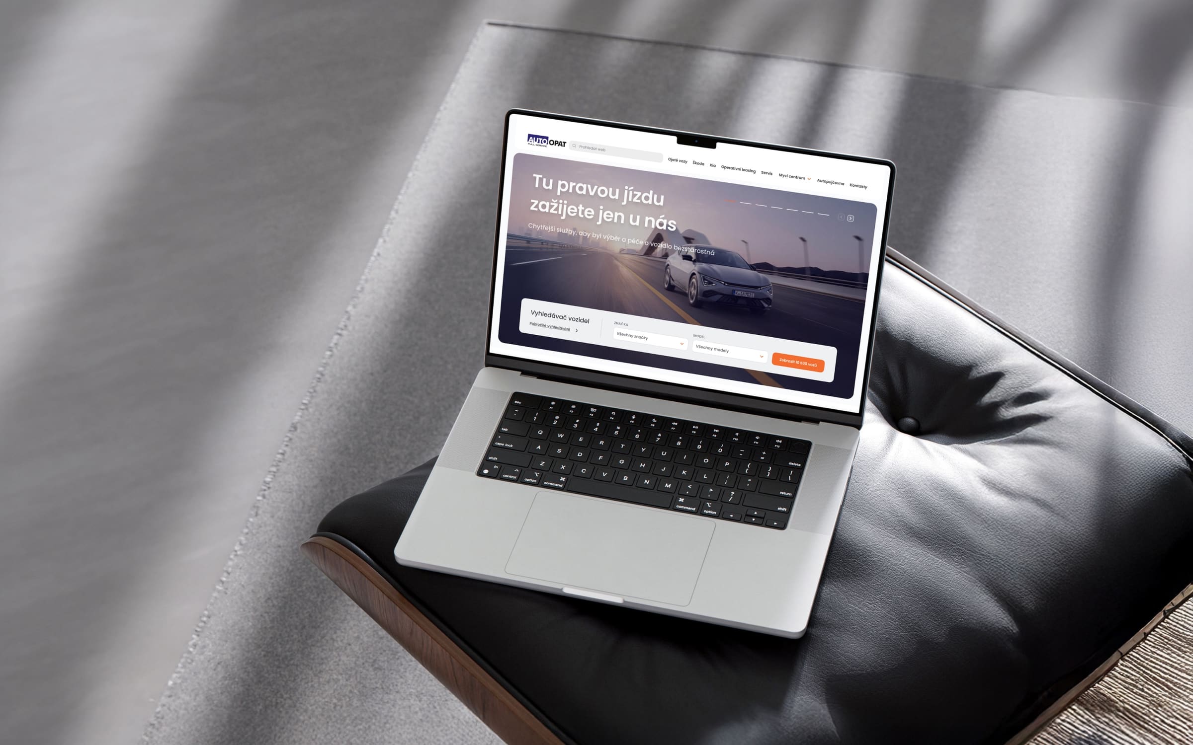
A simple car search for one of the country’s largest used-car dealers.
 Consumer
LEGO
An event app for LEGO, mapped before anyone drew a screen.