MovidoA physio programme for the days between appointments.
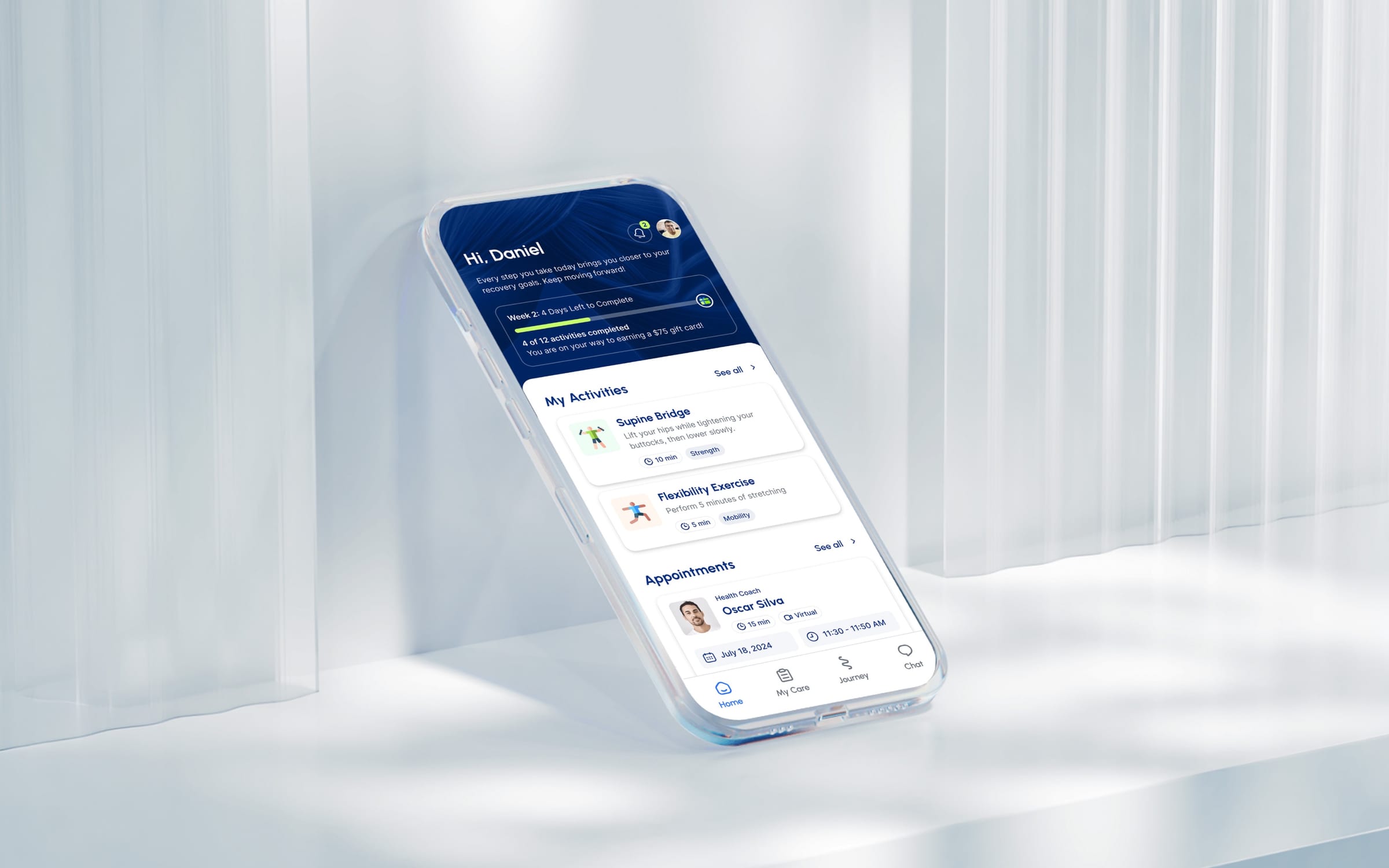
At a glance
- Design thinking
- Design for the bad days. A patient in pain can postpone an exercise and say why, and the plan stays intact.
- Problem
- Patients recover alone, often in pain. The app had to gather clinical detail and give a plan without feeling like paperwork.
- Approach
- Round by round with the product manager, we turned a questionnaire into one conversation that screens, checks and books.
- Outcome
- An interactive prototype of the full patient journey, refined round by round with the product manager.
- Role
- Lucie on a long-term retainer, designing alongside Sergey Senčik, with Movido’s product manager.
- What we designed
- Product strategy
- UX/UI design
- Prototyping
- Duration
- Long-term retainer
- Platforms
- Patient mobile app
- Interactive prototype
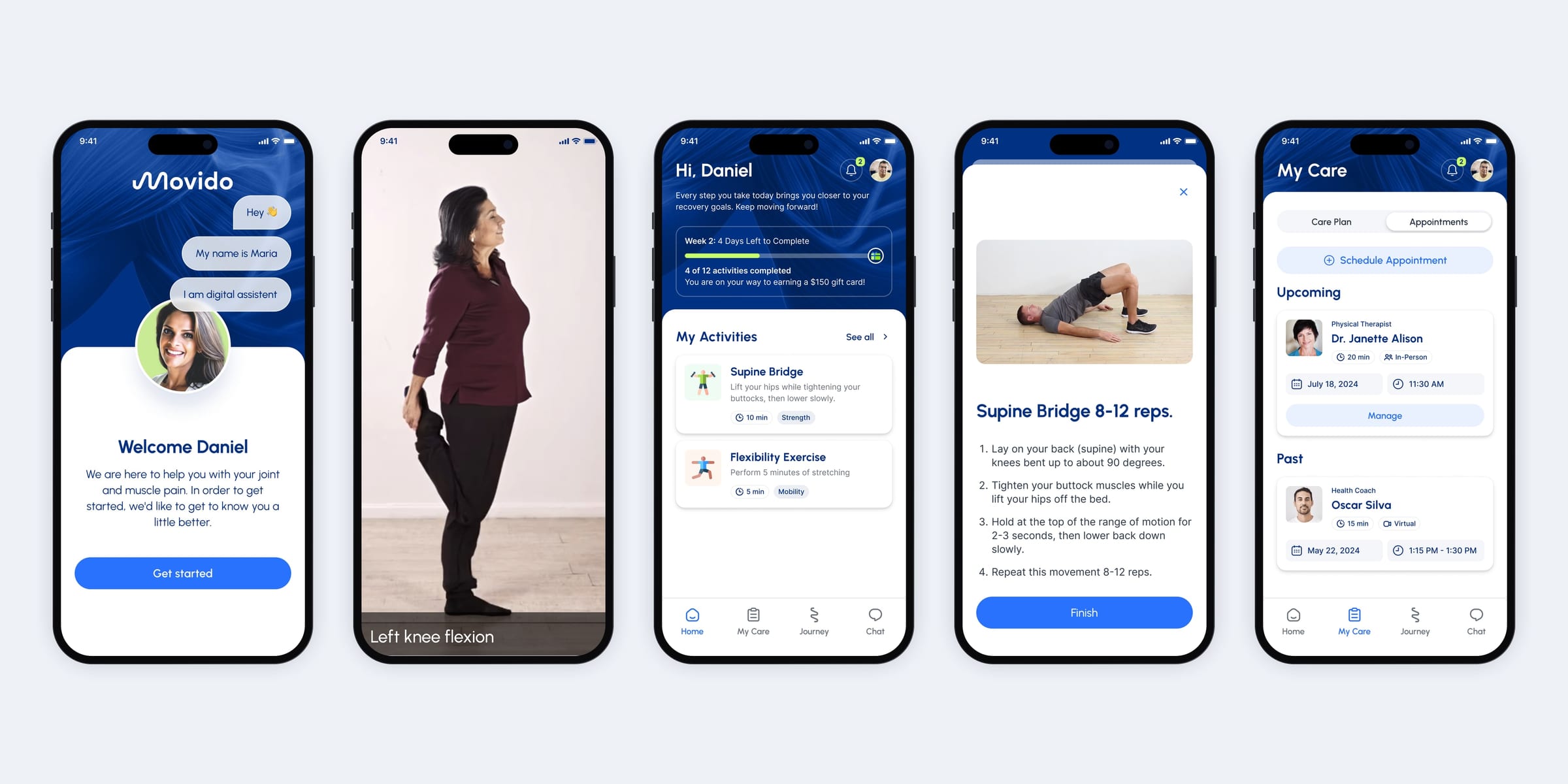
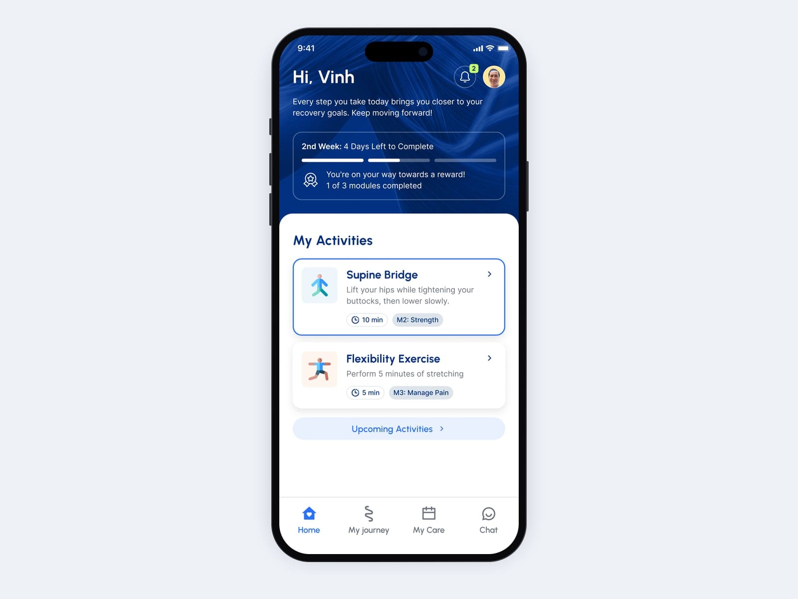
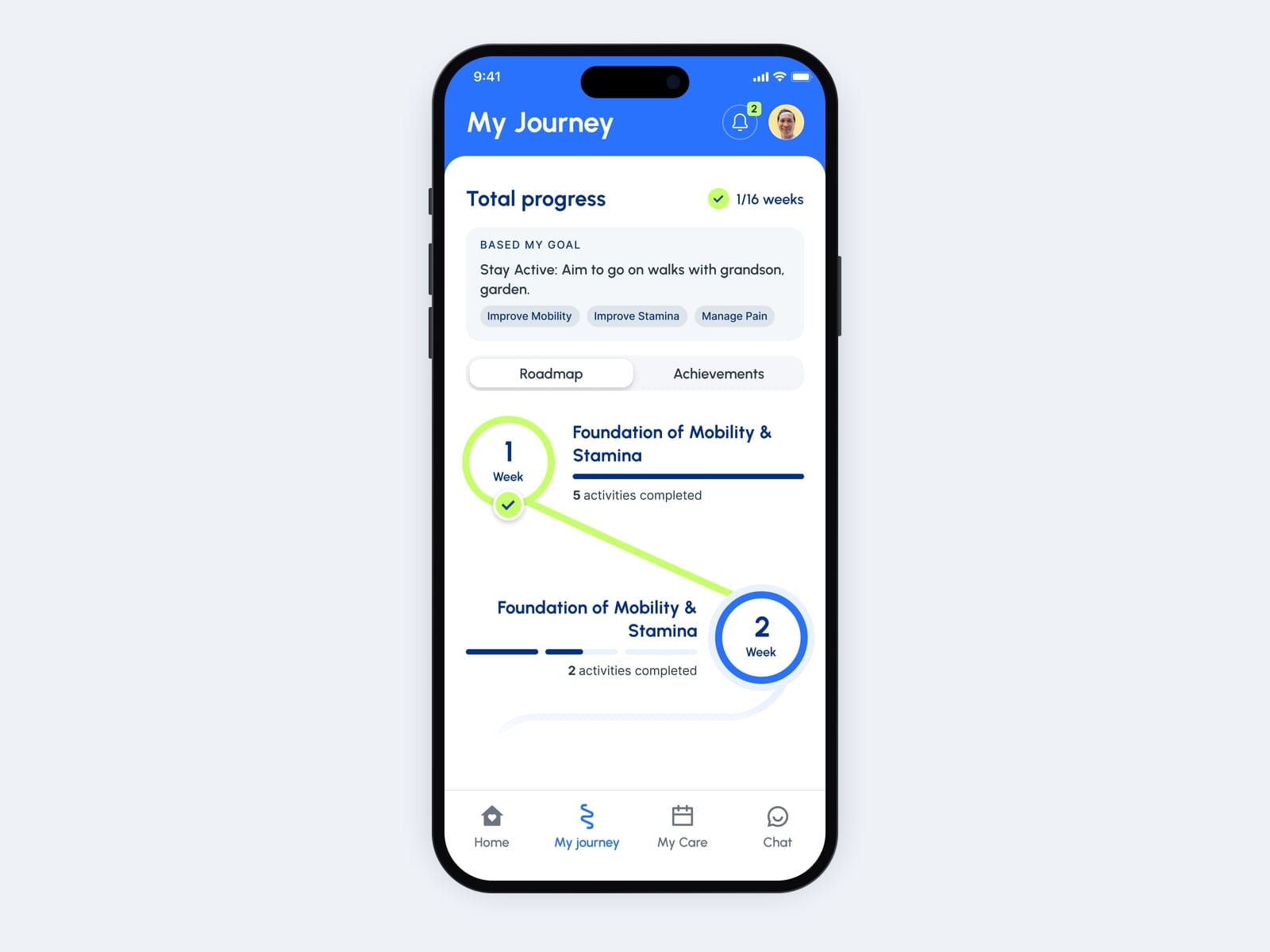
Early versions had the right screens, but Home and the Journey path didn’t link to each other.
One journey from sign-up to the next session, built around the patient’s own goal.
- 01ProductMeet the assistantConsent first, and a clear promise of about three minutes of questions.
- 02PersonSay what mattersSymptoms and body region with a tap; goals in the patient’s own words.
- 03ProductScreen and check movementScreening questions, then a guided camera check of one movement.
- 04PersonBook the first sessionDate, time and reminder, inside the same conversation.
- 05PersonAct on todayHome holds the week’s progress, today’s activities and the next appointment.
- 06PersonExercise, or postpone with a reasonInstructions, a countdown, the movement, then one question about difficulty.
- 07TeamFollow the planThe weeks ahead, the care team and the milestones on the way.
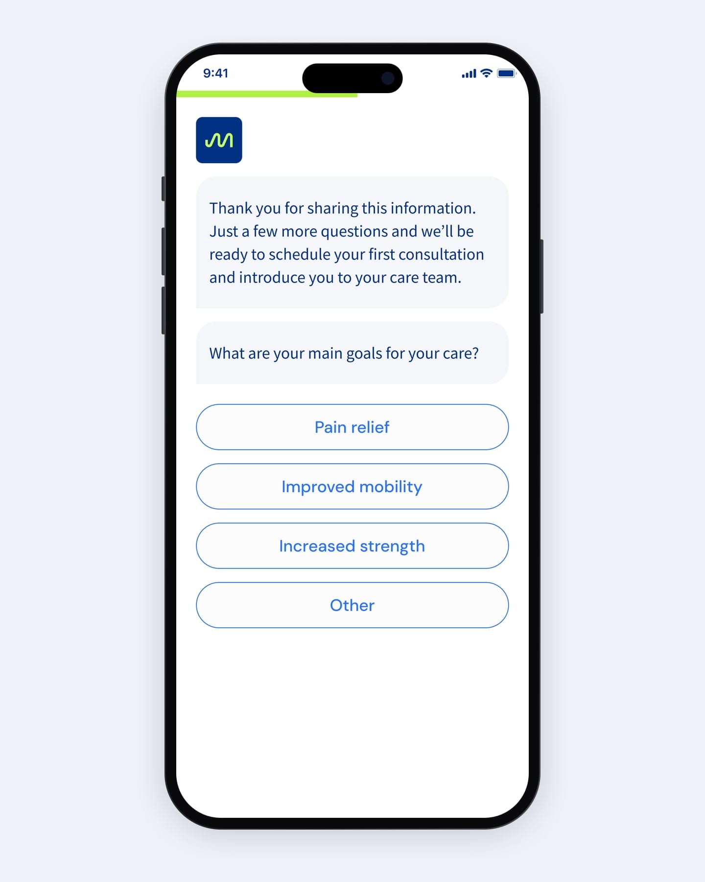
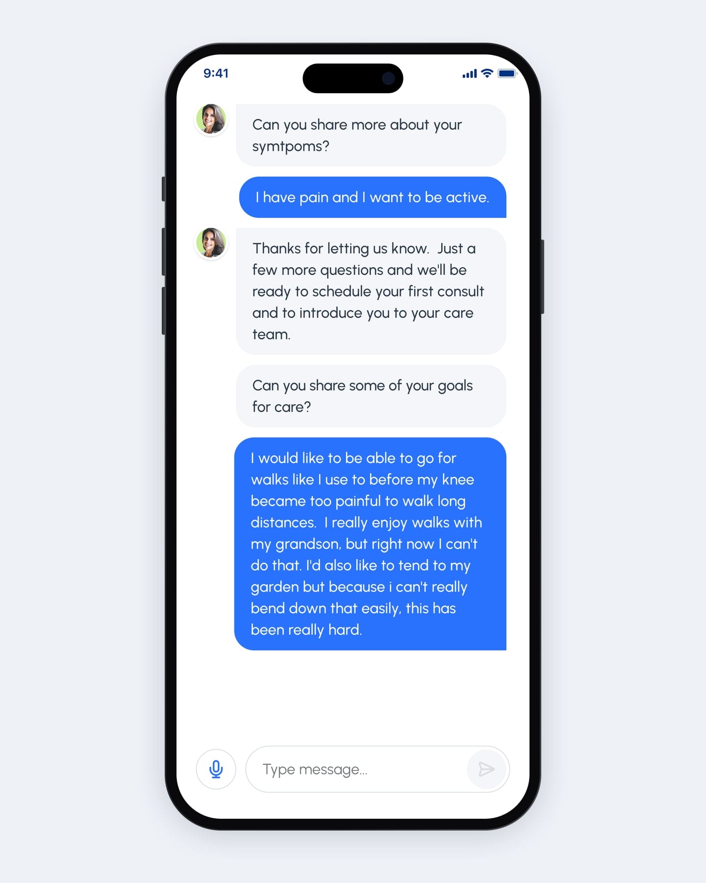
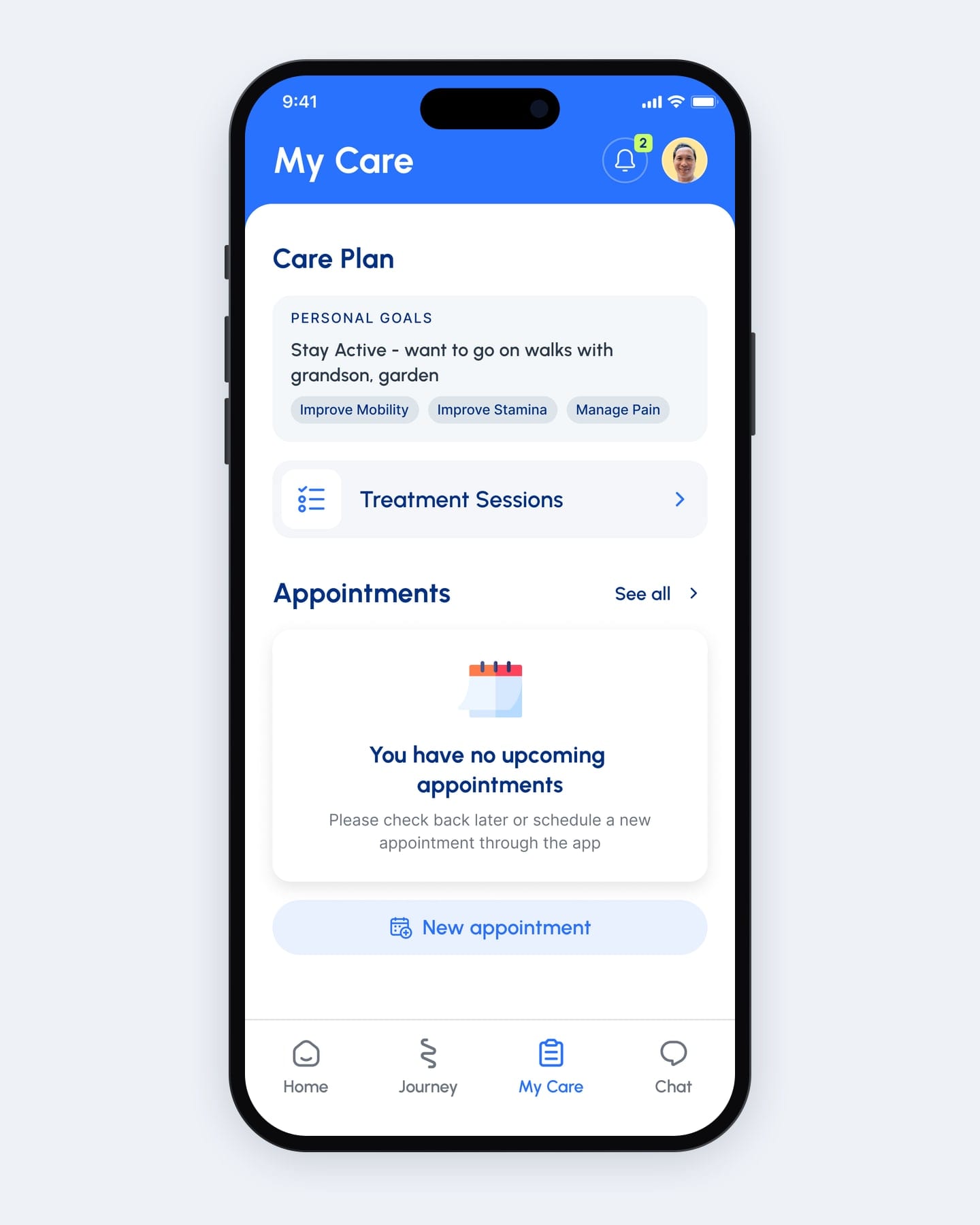
The care plan opens with the patient’s own words.
The first draft asked patients to pick from four preset goals, such as pain relief. The final version asks an open question, typed or spoken, and puts the answer at the top of My Care.
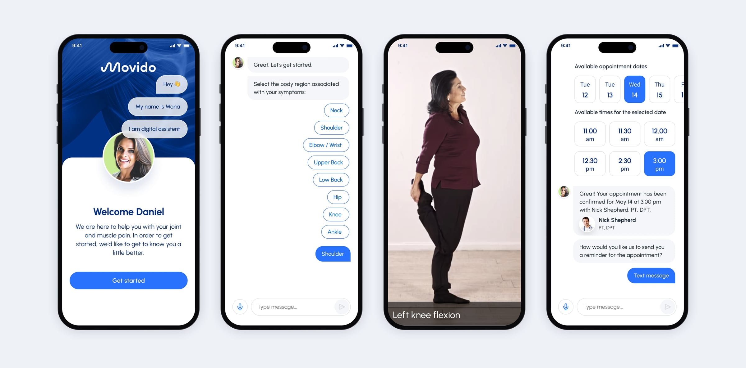
One conversation replaces the intake form, from screening to the first booking.
This was the first big change to the journey. The assistant screens the patient, checks one movement on camera and books the first session, so the patient never meets a form.
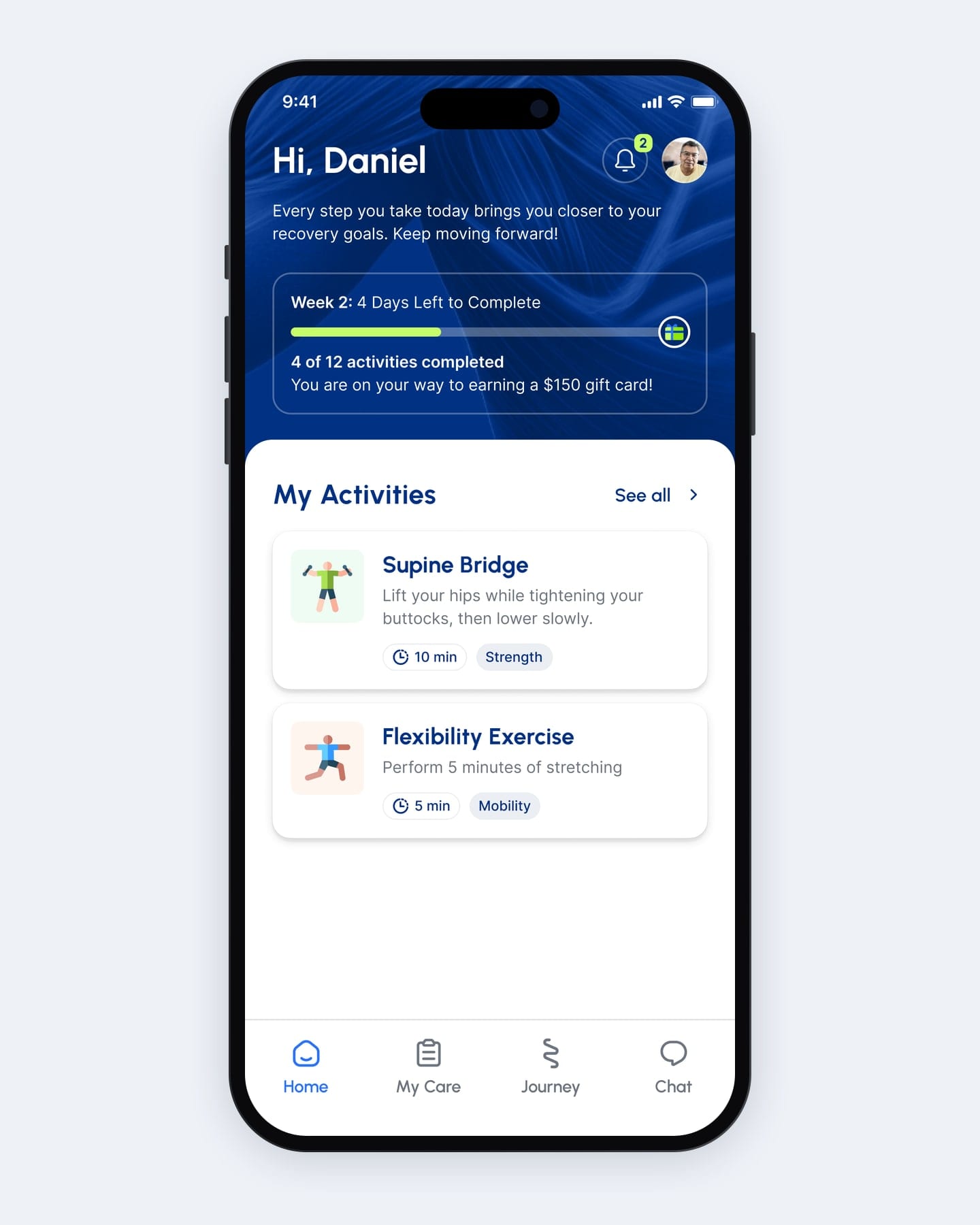
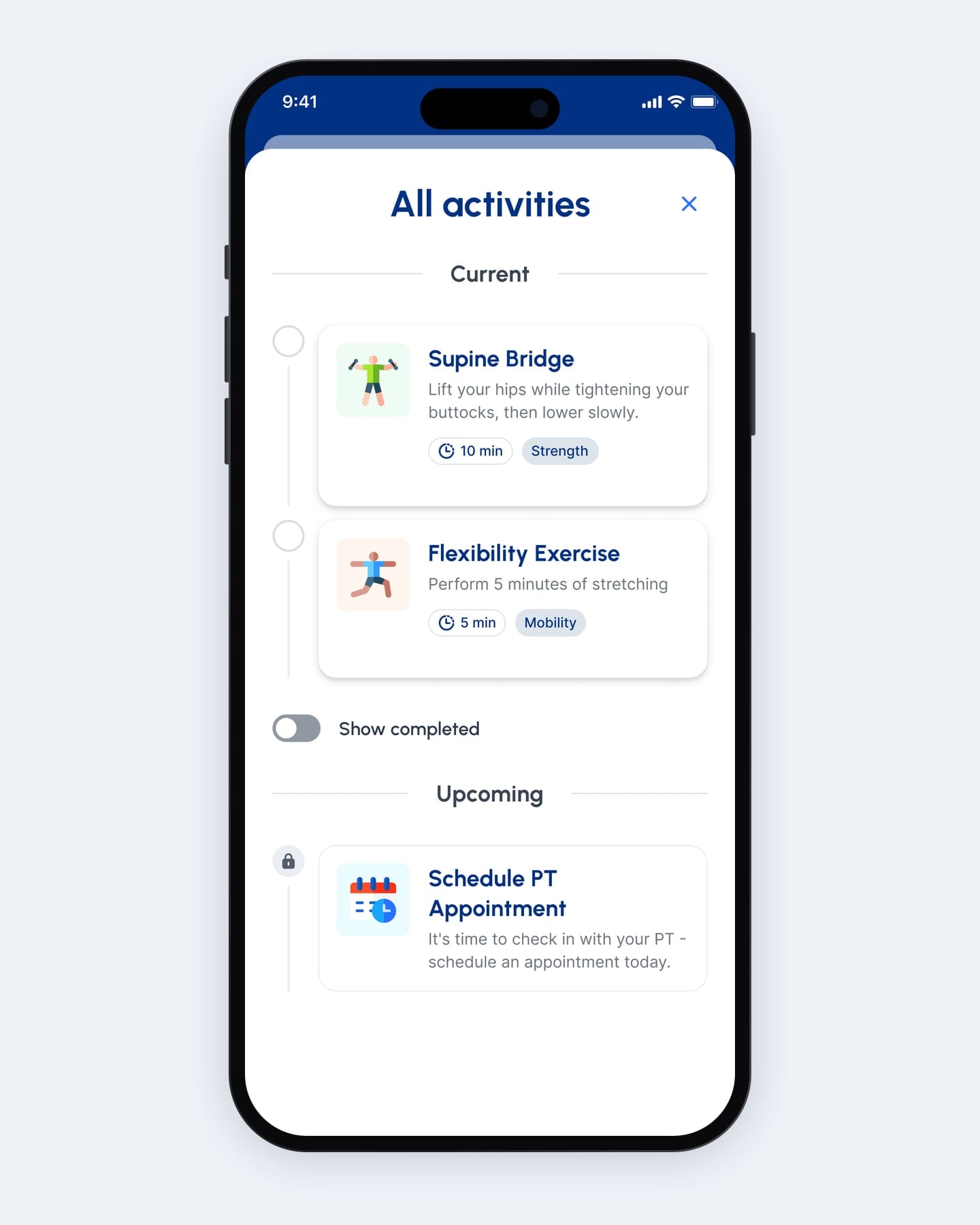
Today’s plan in one place, instead of split across two tabs.
For many rounds, progress, activities and the next appointment were split between Journey and My Care. Now Home gathers them on one screen, with the full activity list one tap away.
Bad days
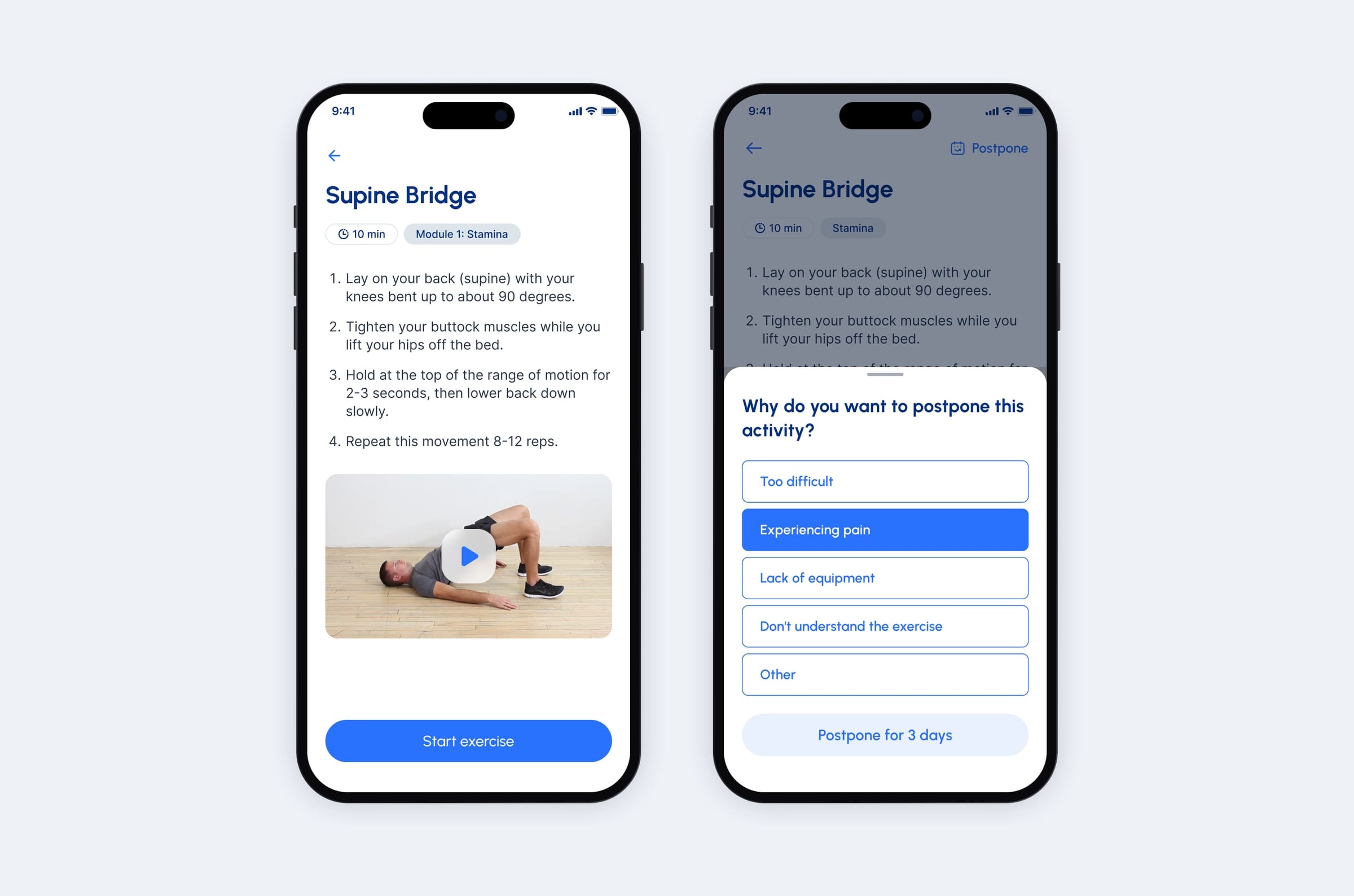
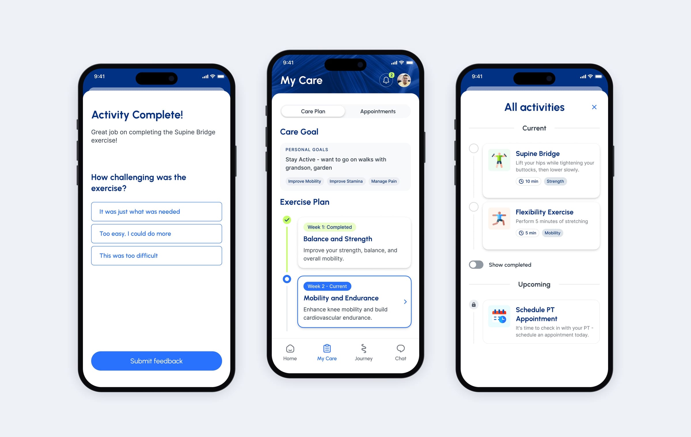
Postpone with a reason, so a bad day doesn’t break the plan.
At first the only option was Start exercise, so a patient in pain could push through or quietly skip. We explored swapping and postponing, dropped swap, and let patients postpone by three days and say why, for example pain.
The plan stays intact, and a missed day becomes a stated reason.
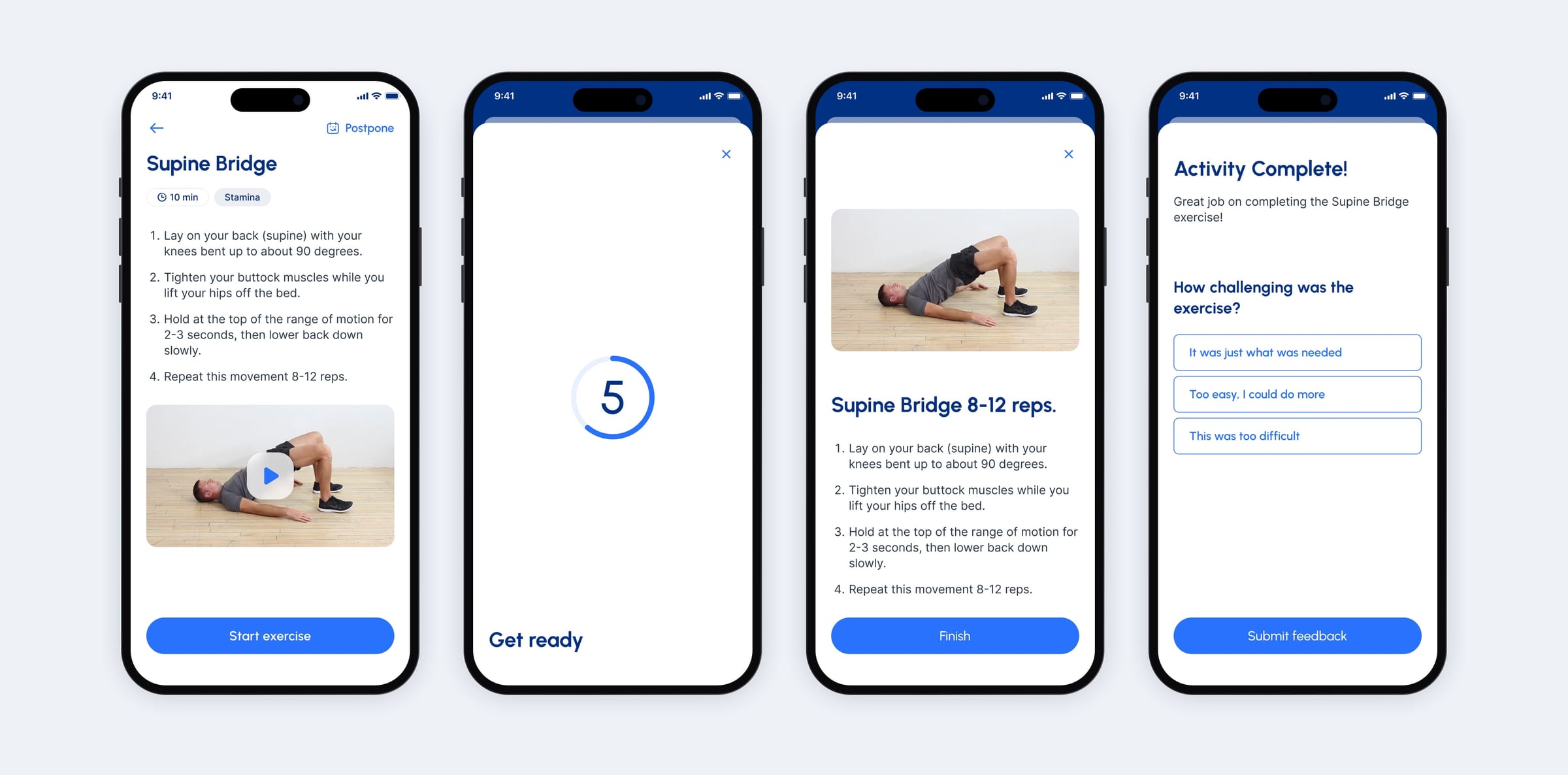
A fixed four-step routine, so every exercise ends with feedback on how hard it was.
A later round worked on what happens after the tap. Five seconds to get ready, a screen showing only the movement, then one question about how hard it was.
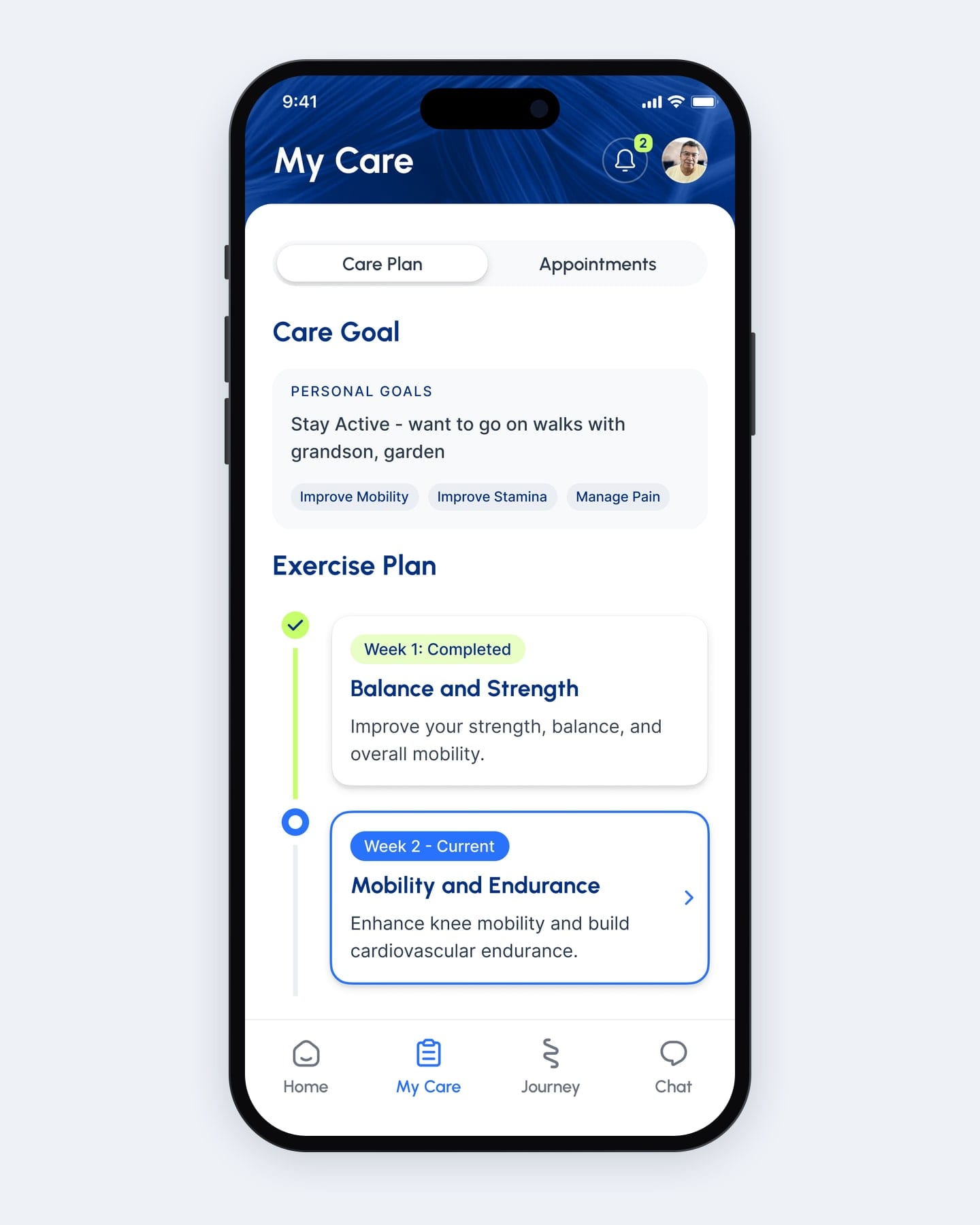
A week-by-week care plan, so patients always know what comes next.
Early versions showed the care plan as a static summary. Now it runs week by week, each week with its own focus and marked as completed, current or locked.
The decision
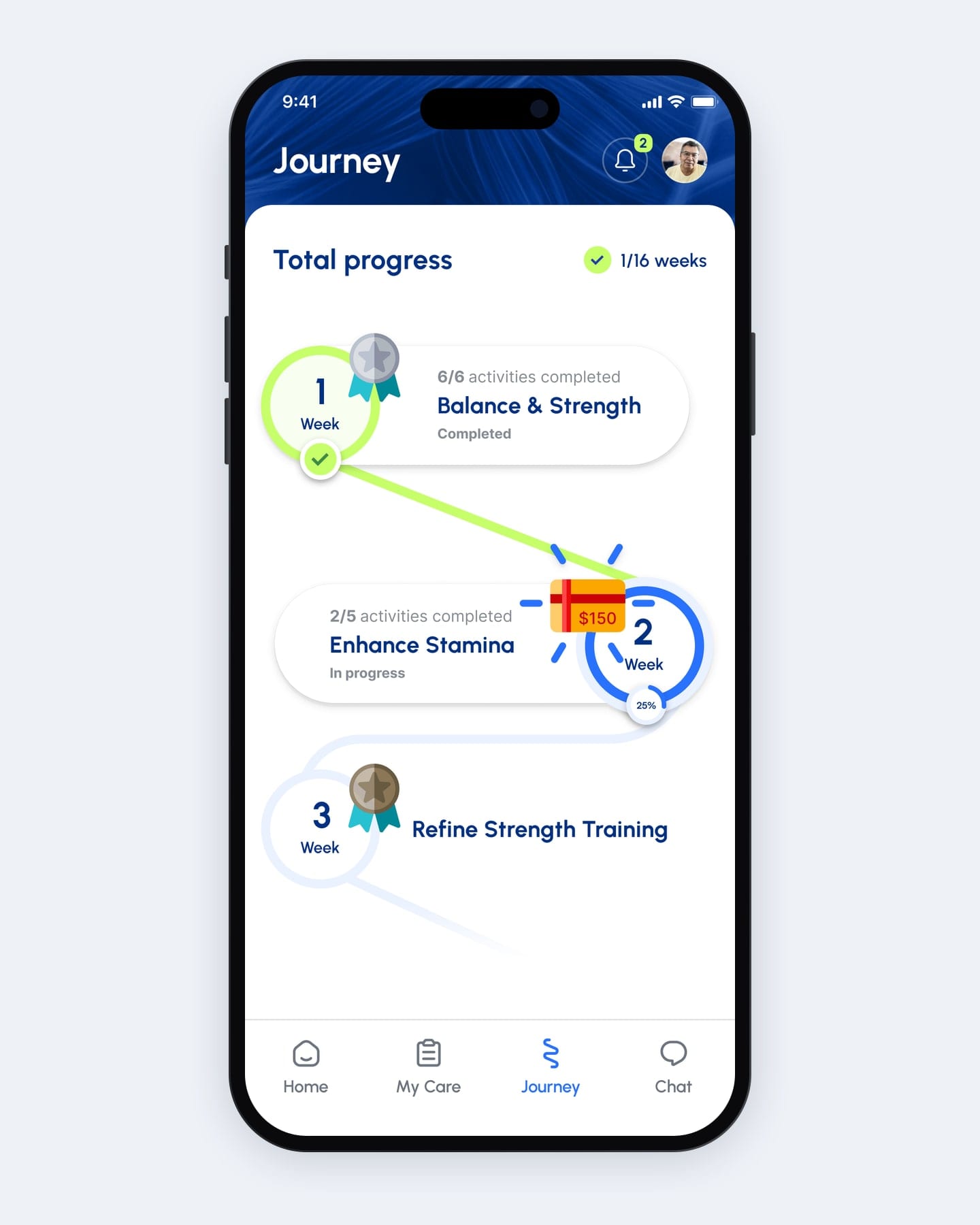
Gamification that rewards recovery: badges for completed weeks, gift cards at milestones.
At first every week on the path carried the same placeholder title. Now each week is named for what it builds, such as Balance & Strength, and earns a badge when it’s done.
Gift-card milestones sit between the weeks, and Home shows the next one beside the activity count, so the reward is always in view.
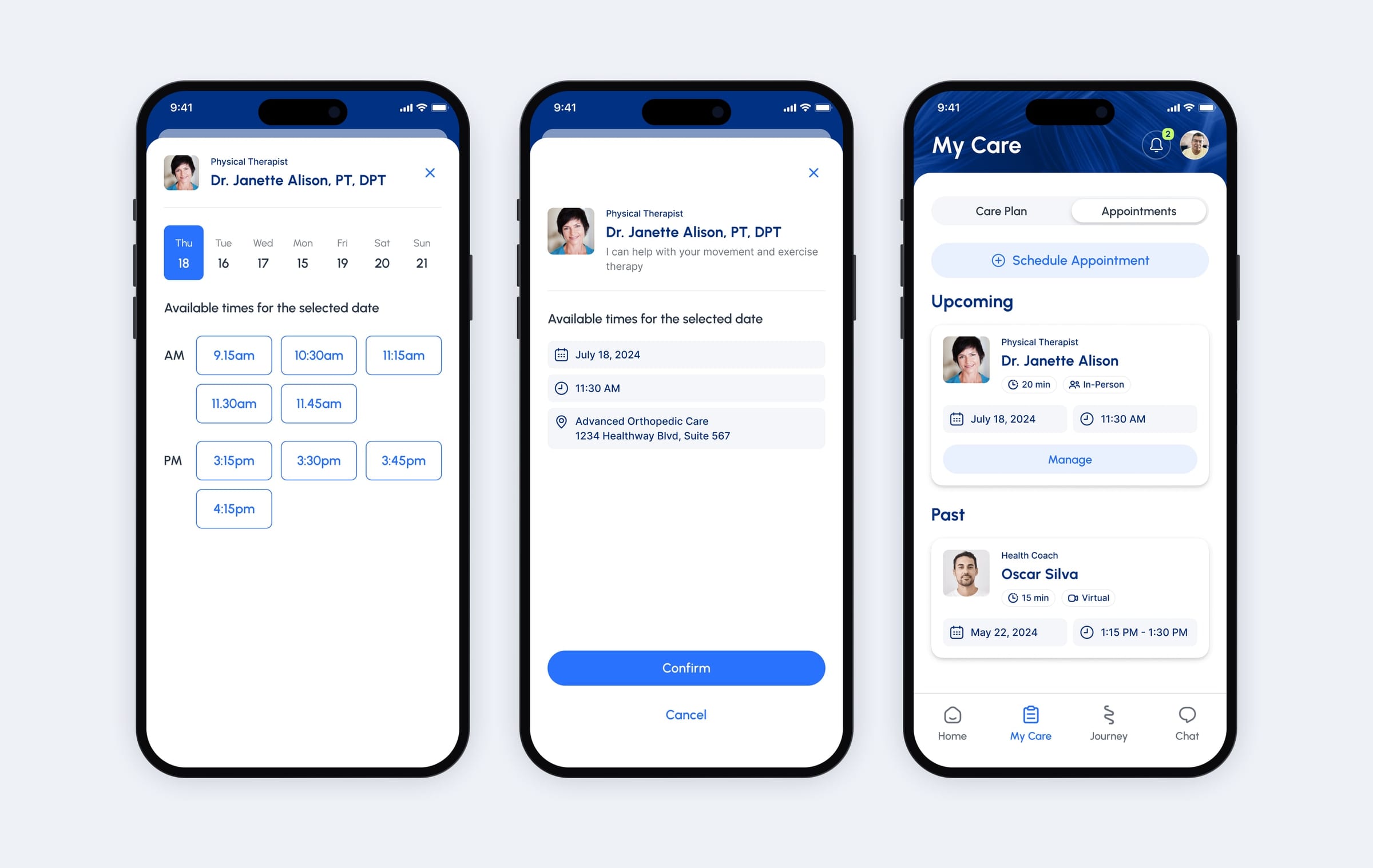
Patients book their next session themselves, in three screens.
Self-service booking came to My Care early on. Now patients pick a therapist and a day, check who, when and where, and the visit appears under Upcoming.
The calls I made
- D01
Postpone with a reason, so a bad day doesn’t break the plan.
- Context
- At first the only action on an exercise was Start.
- Options
- Decision
- Postpone with a reason. Move it by three days and say why: pain, difficulty, equipment, or not understanding the exercise.
- Why
- A swap changes the programme without a clinician. A reason tells the care team what happened, so a missed day becomes information. Trade-off: Patients lose an instant alternative; the plan keeps its integrity.
- D02
One conversation replaces the intake form.
- Context
- Onboarding began as a questionnaire.
- Options
- Decision
- A guided conversation. The assistant screens, checks one movement on camera and books the first session.
- Why
- A conversation asks one thing at a time and can promise a finish line: about three minutes of questions. Trade-off: Harder to review at a glance than a form, so answers have to stay revisitable inside the conversation.
In hindsight
What I would do differently today.
I would test the postpone flow with real patients in pain before settling the list of reasons. It is the moment the product exists for.
I would instrument postpone reasons from day one. They are the most honest feedback a physio programme will ever get.

More work
All projects → AI
AIMotionshift
An AI video tool shaped by what its first users actually needed.
 AI
AIAmass
Life-science data in one place, with every claim cited to its source.
 Automotive
AutoOpat
A simple car search for one of the country’s largest used-car dealers.
 Consumer
LEGO
An event app for LEGO, mapped before anyone drew a screen.
 Sports
FK Jablonec
The apple tree was in the club’s name all along.
 AI
AIINIT
Engineering intelligence for the industries that build the world.