AutoOpatFinding the right car, made simple.
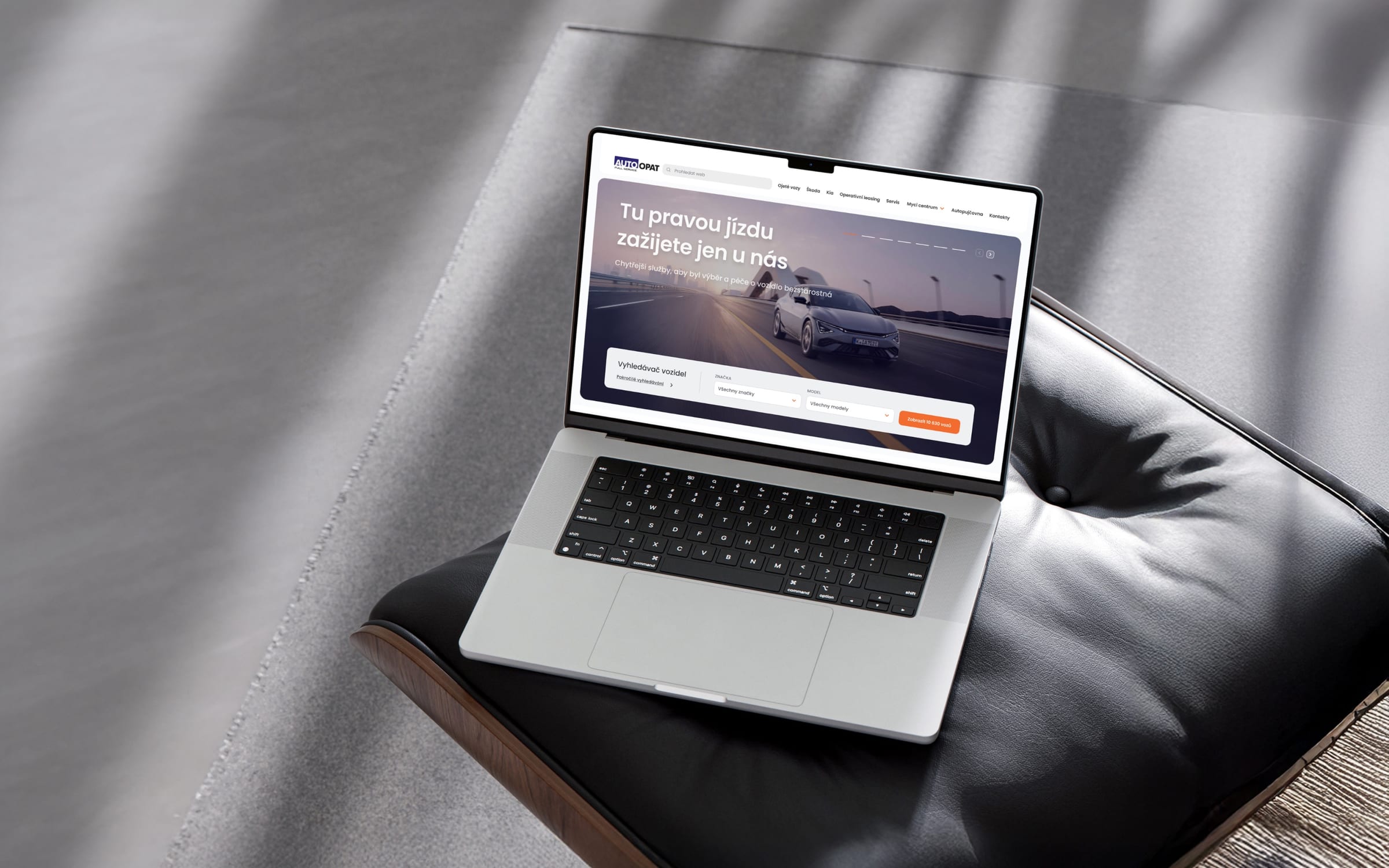
At a glance
- Design thinking
- Ask for the least before showing something useful. Two fields, and the button already says how many cars match.
- Problem
- Auto Opat’s inventory is huge. Search had to stay simple on a phone, and the budget and timeline were tight.
- Approach
- Four search panels were compared on how quickly each puts a matching car on screen, and the compact one won.
- Outcome
- The redesigned site is live, and Auto Opat’s sales director reports a 23% rise in website conversion.
- Role
- Lucie as design and project lead on the website, from the search panel to the project roadmap.
- What we designed
- Roadmapping
- Conversion optimisation
- UX/UI design
- Website design
- Design system
- Platforms
- Website
- Mobile web
- Car search
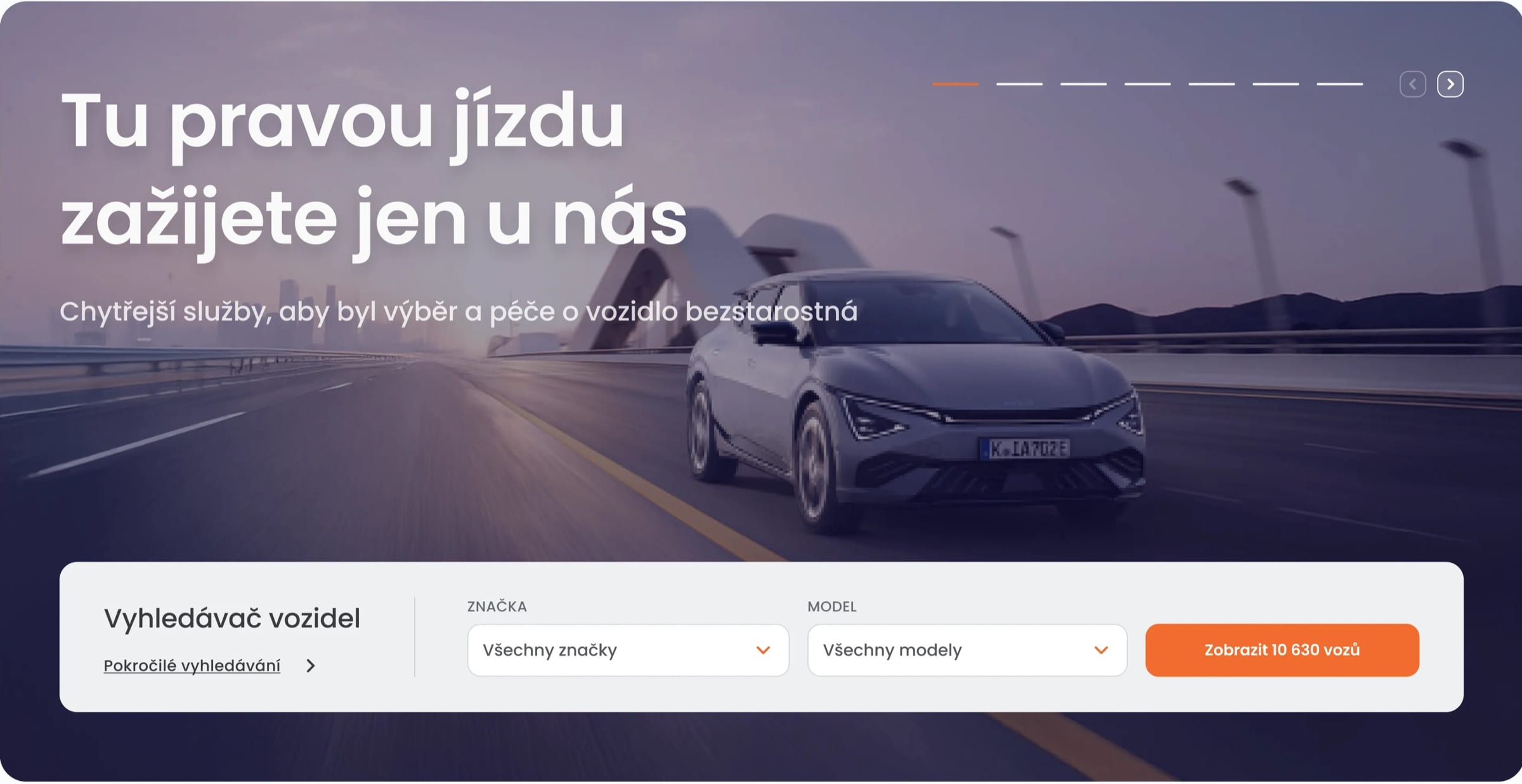
Four search panels, judged on how quickly they find the right car.
The full panels asked for four decisions before showing a single car. The compact ones asked for two and answered with a count of matches, which is already a result.
The decision
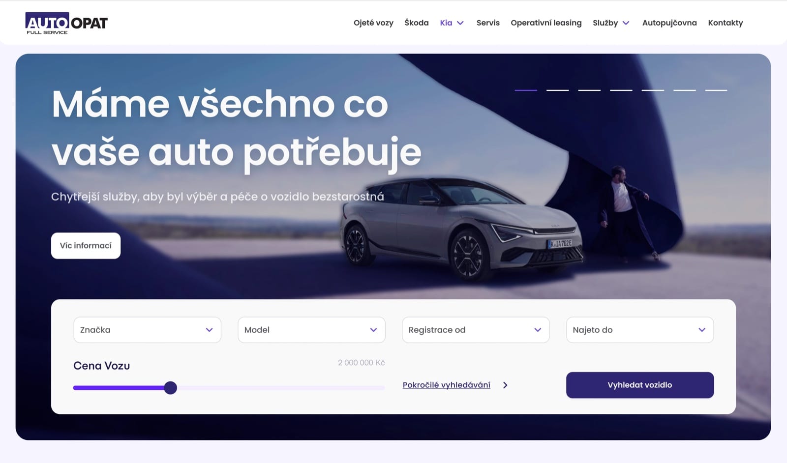
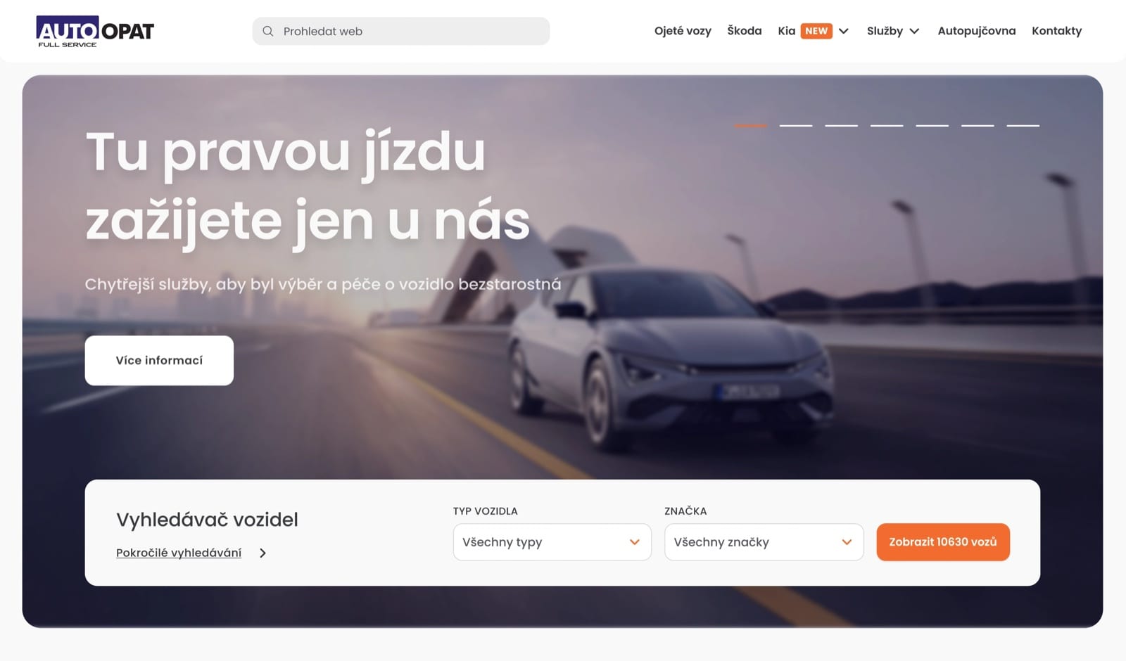
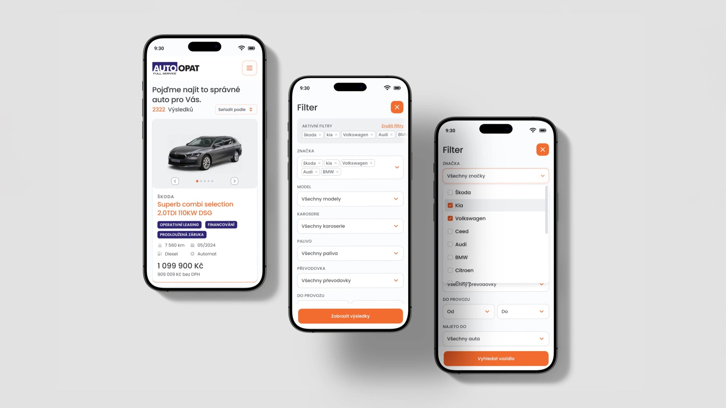
Brand and model are the only questions before the first result.
The compact direction won because it asks the least before showing something useful.
The orange button states how many cars match before the click. Registration, mileage and further filters wait in advanced search, linked directly from the panel.
On a phone, results come first and active filters stay in view.
The match count and sorting sit above the results. Active filters appear as removable tags, so people always see what is narrowing their search.
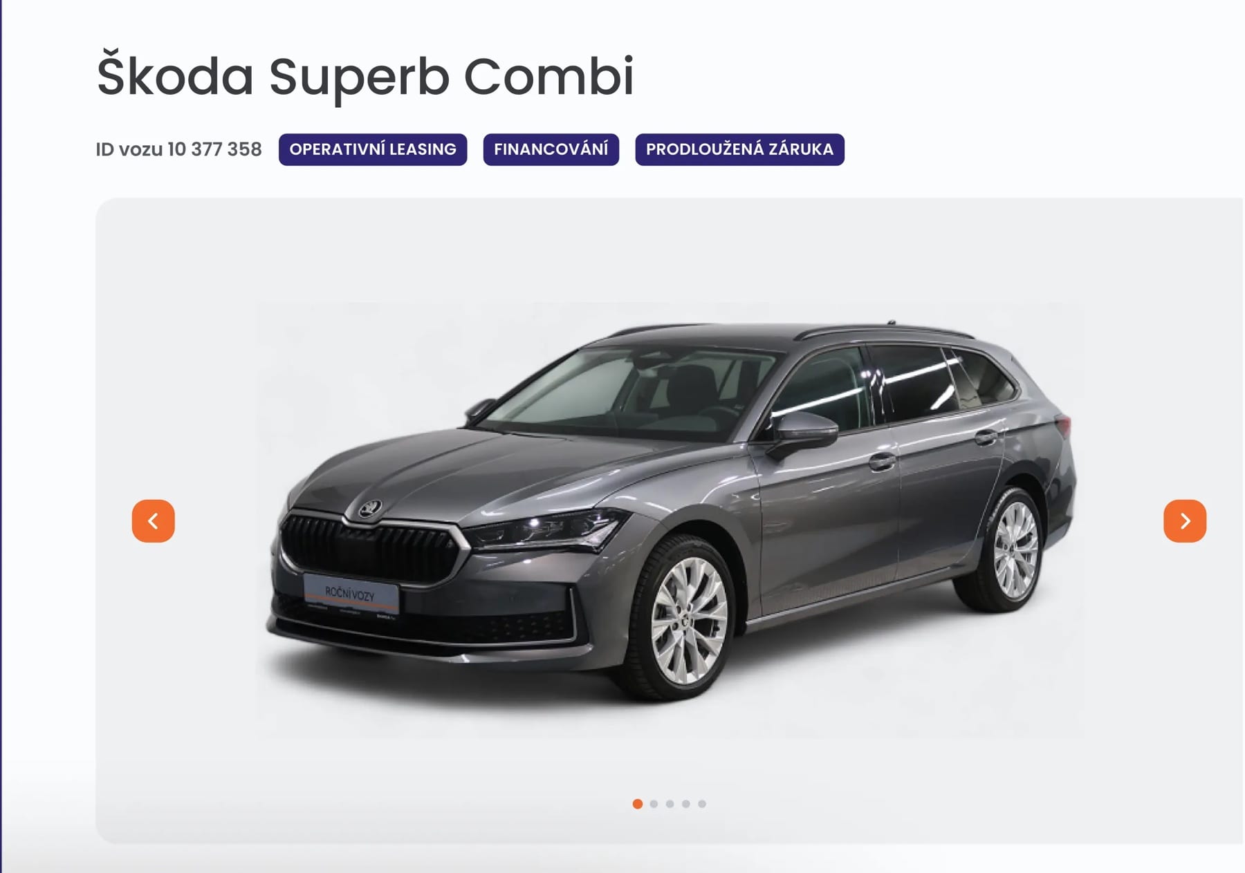
The gallery leads, with the finance options beside it.
Used cars are bought by eye, so the gallery opens the page. Leasing, financing and extended warranty are tagged at the top rather than buried below. Images were adjusted with AI in Photoshop.
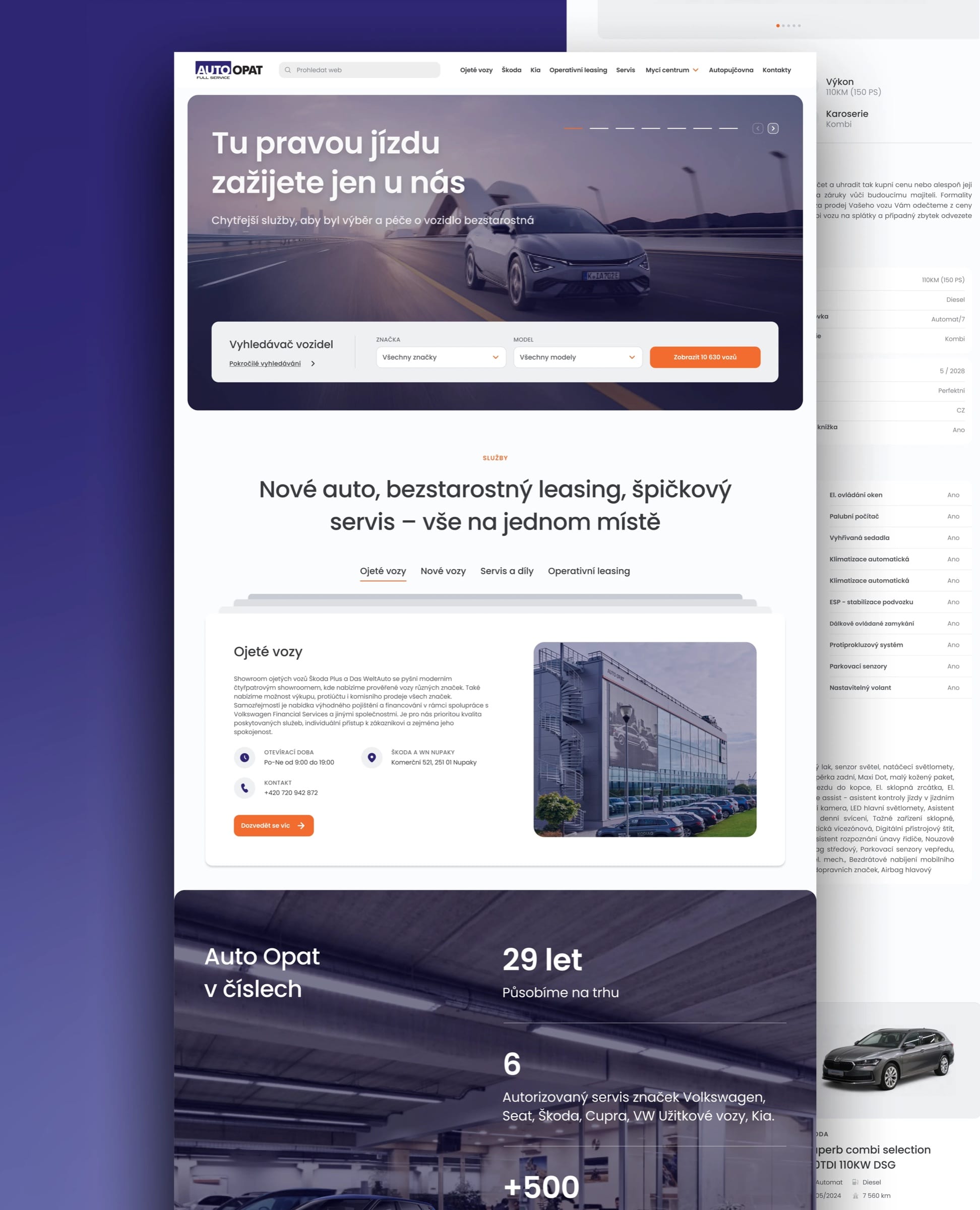
One home for cars, service and leasing.
Auto Opat sells cars, services them and leases them. The homepage puts all three in tabs, so nobody has to guess which part of the business they need.
The calls I made
- D01
Brand and model are the only questions before the first result.
- Context
- Four search panels were designed and compared.
- Options
- Decision
- Compact panel. Vehicle type and brand, and a button that counts the matching cars.
- Why
- It asks the least before showing something useful. Trade-off: Registration and mileage are one tap further away, for the people who need them.
- D02
On a phone, results come first and active filters stay in view.
- Context
- Mobile search had to carry many criteria on a small screen.
- Options
- Decision
- Results first. Count and sorting above the results, filters in a sheet, active ones as removable chips.
- Why
- People should always see what is narrowing their search, and undo it in one tap. Trade-off: The filter sheet is long, so it stays hidden until someone asks for it.
In hindsight
What I would do differently today.
I would agree the definition and baseline of “conversion” with the client before launch, so the +23% could be broken down by search, car detail and enquiry.
I would test the compact panel against the full one in production. The principle was right; the evidence would still have been worth having.
What changed
- +23%
- website conversion rate
- As reported by Auto Opat’s sales director
Thanks to Lucie our website conversion rate has increased by 23%. She completely redesigned our car reseller website, transforming it into a clean, modern, and highly user-friendly platform.
More work
All projects →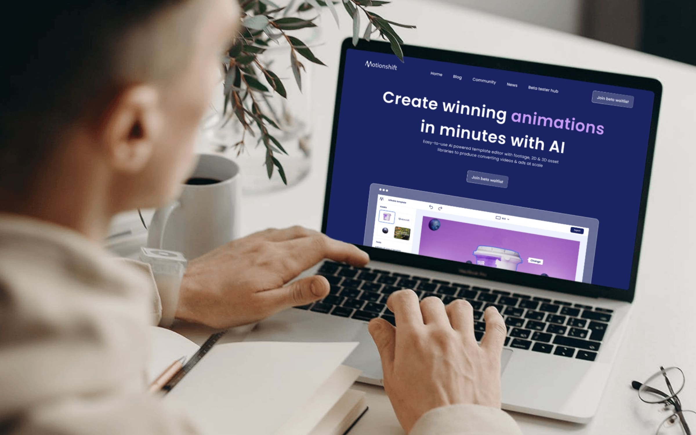 AI
AIMotionshift
An AI video tool shaped by what its first users actually needed.
 AI
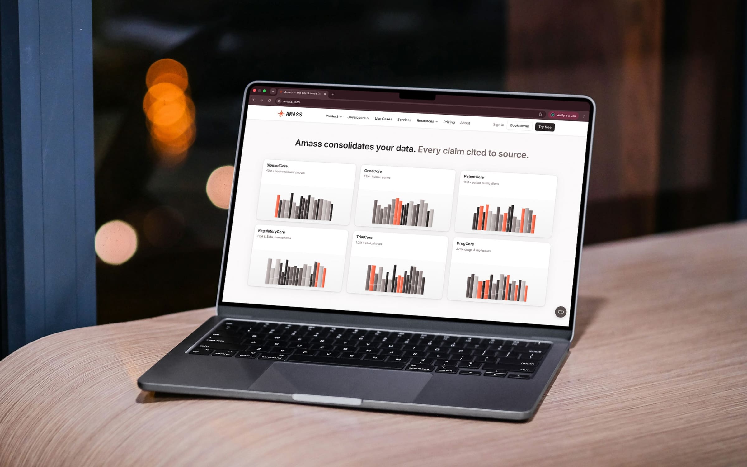
AIAmass
Life-science data in one place, with every claim cited to its source.
 Health
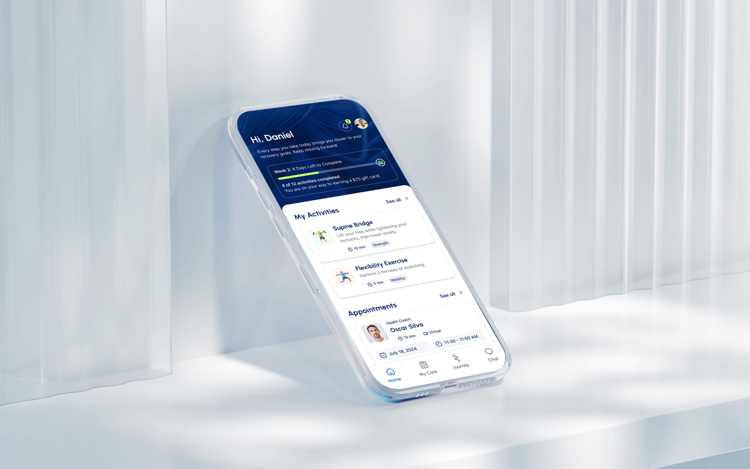
Movido
A recovery app that starts by asking what you want to get back to.
 AI
AITalentiqa
An AI hiring assistant that had a name, and nothing else.
 Sports
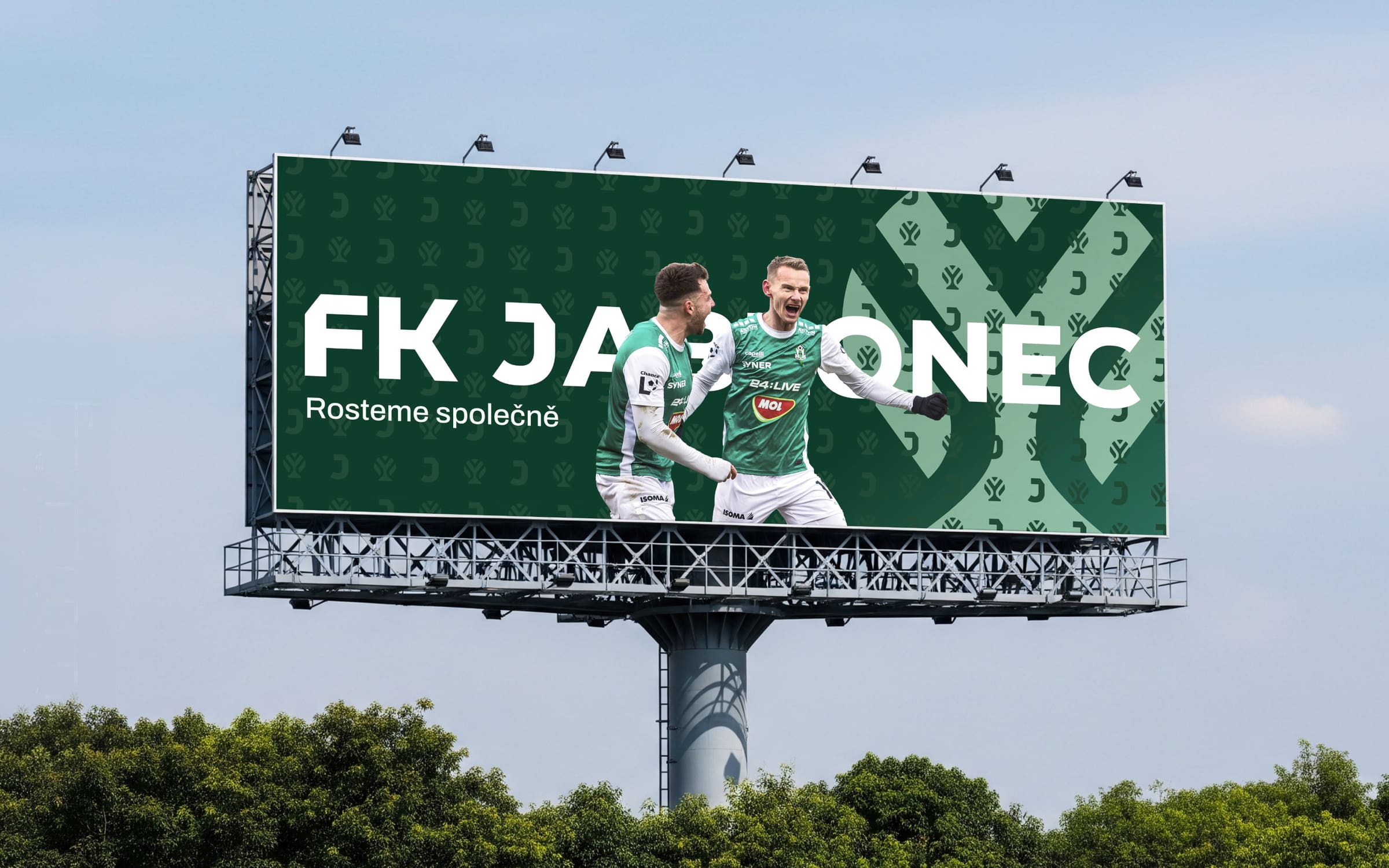
FK Jablonec
The apple tree was in the club’s name all along.
 AI
AIINIT
Engineering intelligence for the industries that build the world.