HeirloomMaking it simple to save a family memory.
At a glance
- Design thinking
- If every format uploads the same way and every state is drawn, errors included, nobody has to guess.
- Problem
- Uploading a keepsake looked and behaved differently for each format, and the dashboard felt outdated.
- Approach
- Components first, one per format on an 8 and 16 pixel grid, designed for phones and then carried to desktop.
- Outcome
- A redesigned upload flow and dashboard, delivered as Figma designs for desktop and mobile.
- Role
- Lucie as design and project lead on the upload flow and the dashboard.
- What we designed
- UX improvements
- UX/UI design
- Design system
- Platforms
- Desktop
- Mobile
Four formats had grown four different upload screens.
Spacing and form fields changed from one format to the next, and again between desktop and mobile. The flow itself was already settled, so our work started at the upload step.
Three rules keep every format’s upload consistent.
- 01One component per formatVideo, audio, text and photo each get an upload box built the same way.
- 02Draw every stateErrors and loading get the same care as the empty box.
- 03Phone first, then desktopSpacing of 8 and 16 pixels carries the layout from one screen size to the other.
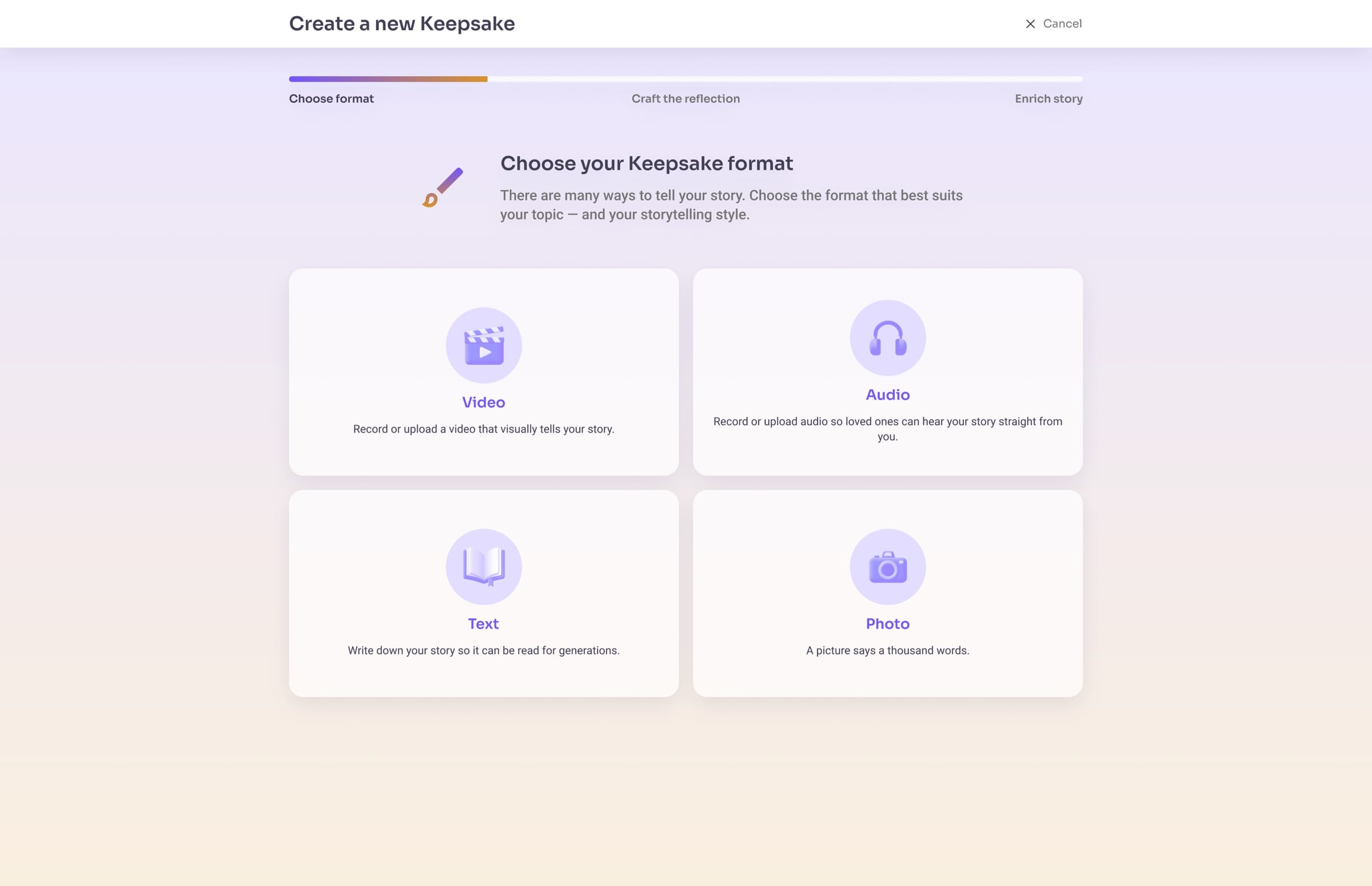
Format comes first, so every upload step can share one structure.
People pick video, audio, text or photo first. Each card leads to an upload step with the same structure, so switching format never means learning a new screen.
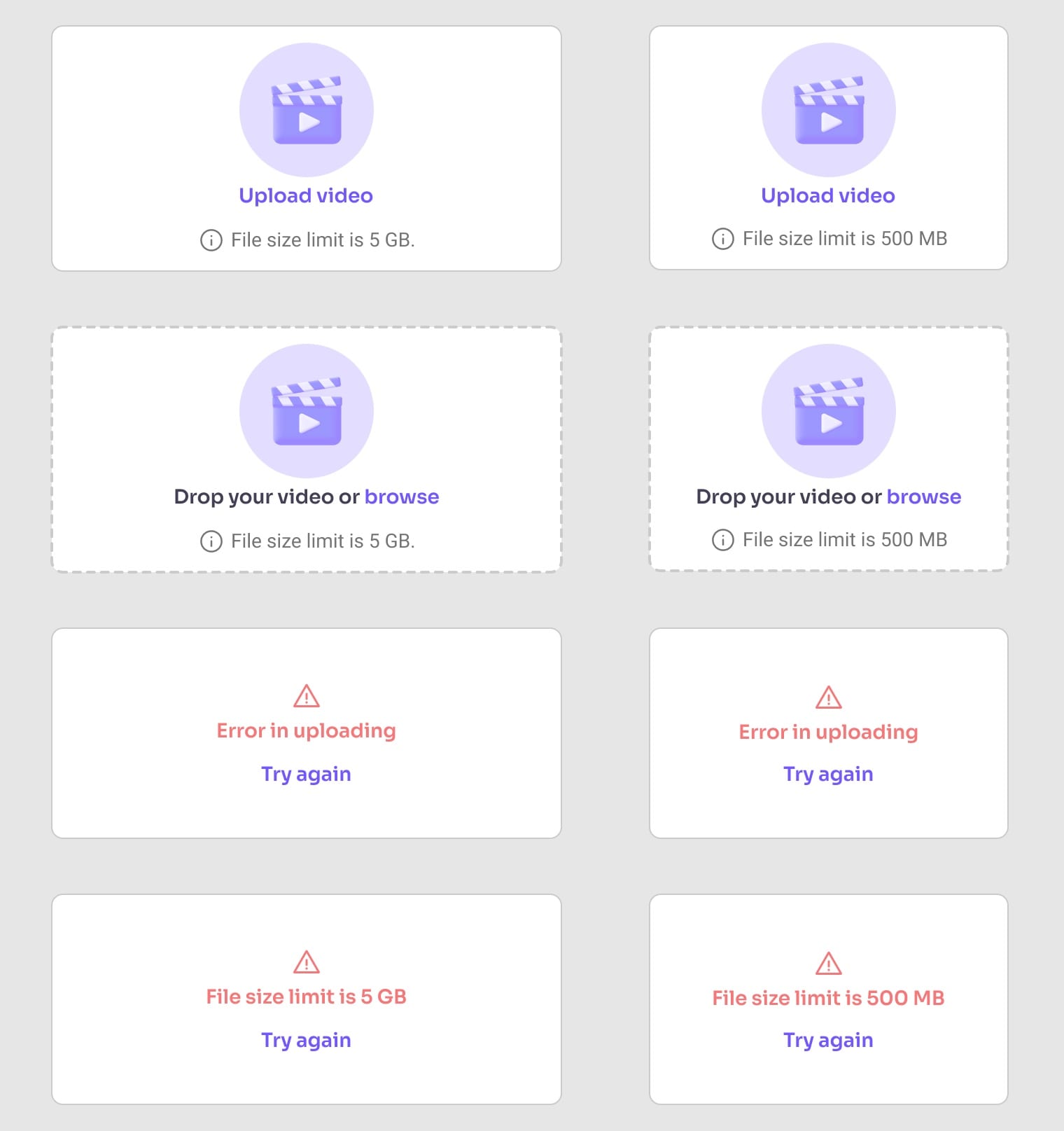
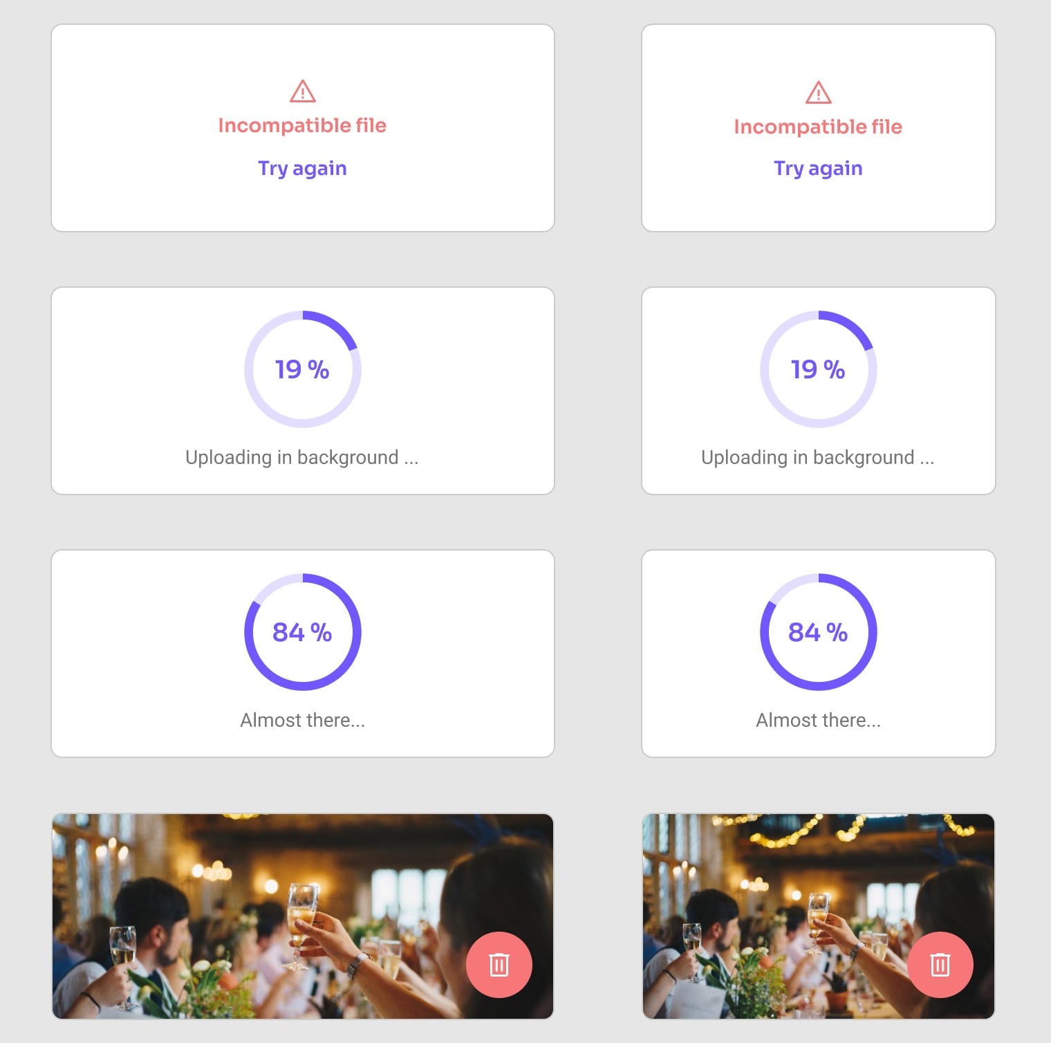
One upload box, with every state drawn.
The same box moves from empty to a dashed outline when a file hovers, then to progress and the finished file. Desktop sits on the left, mobile on the right.
The decision
An error names the problem and offers a way back.
An upload can fail because the connection drops, the file is too large or the format is wrong. Each case gets its own message in plain words and the same Try again link.
An uploaded photo fills the box it was dropped into, with Delete right below it.
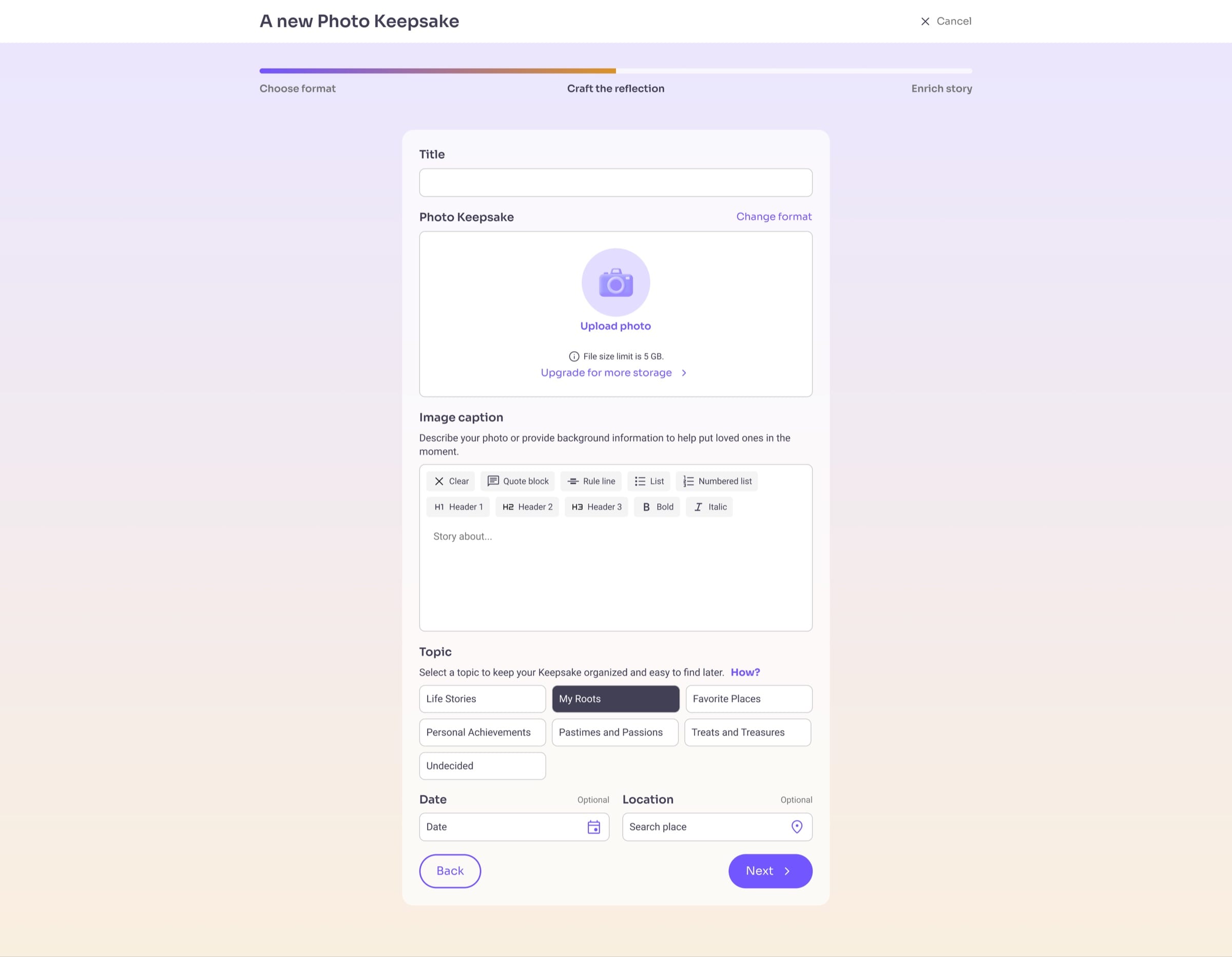
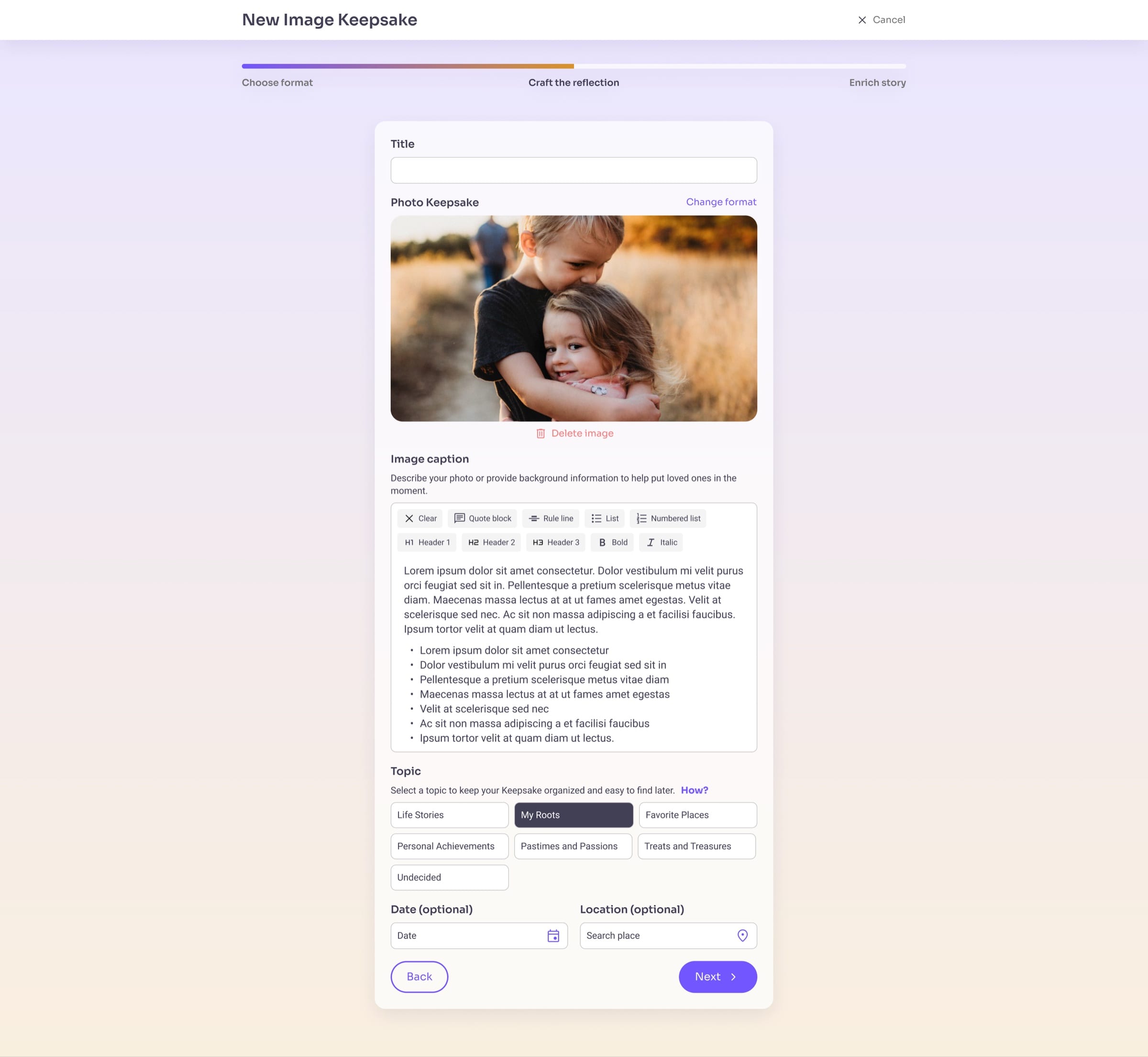
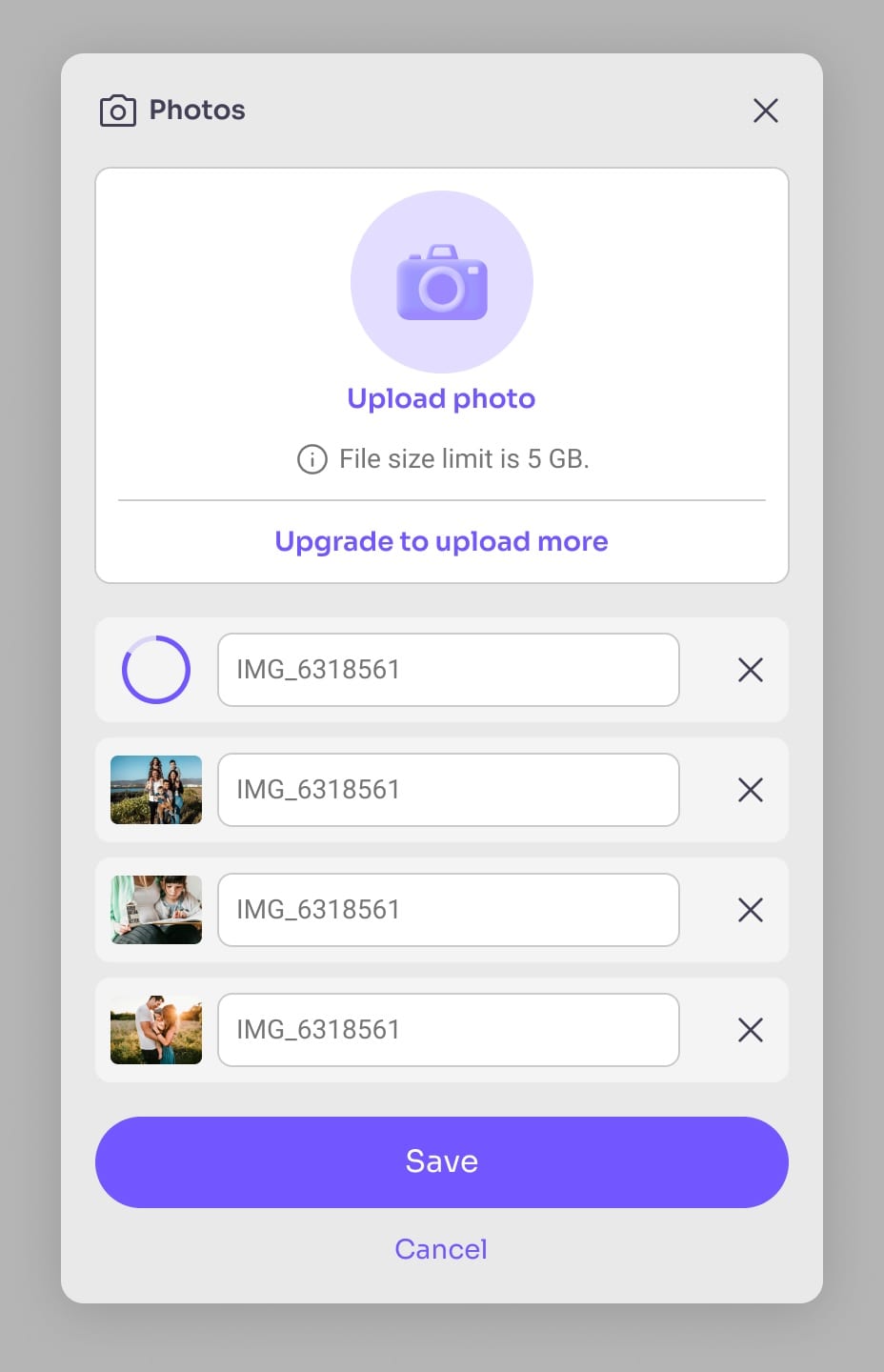
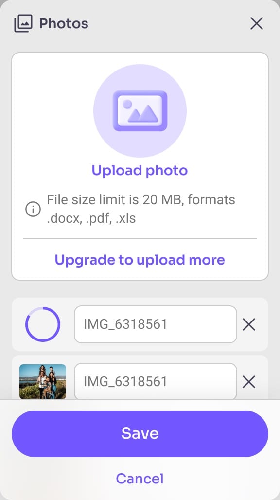
Add more photos, remove any one of them.
Each photo uploads in its own row and can be deleted on its own. On a phone, Save and Cancel stay pinned to the bottom while the list scrolls.
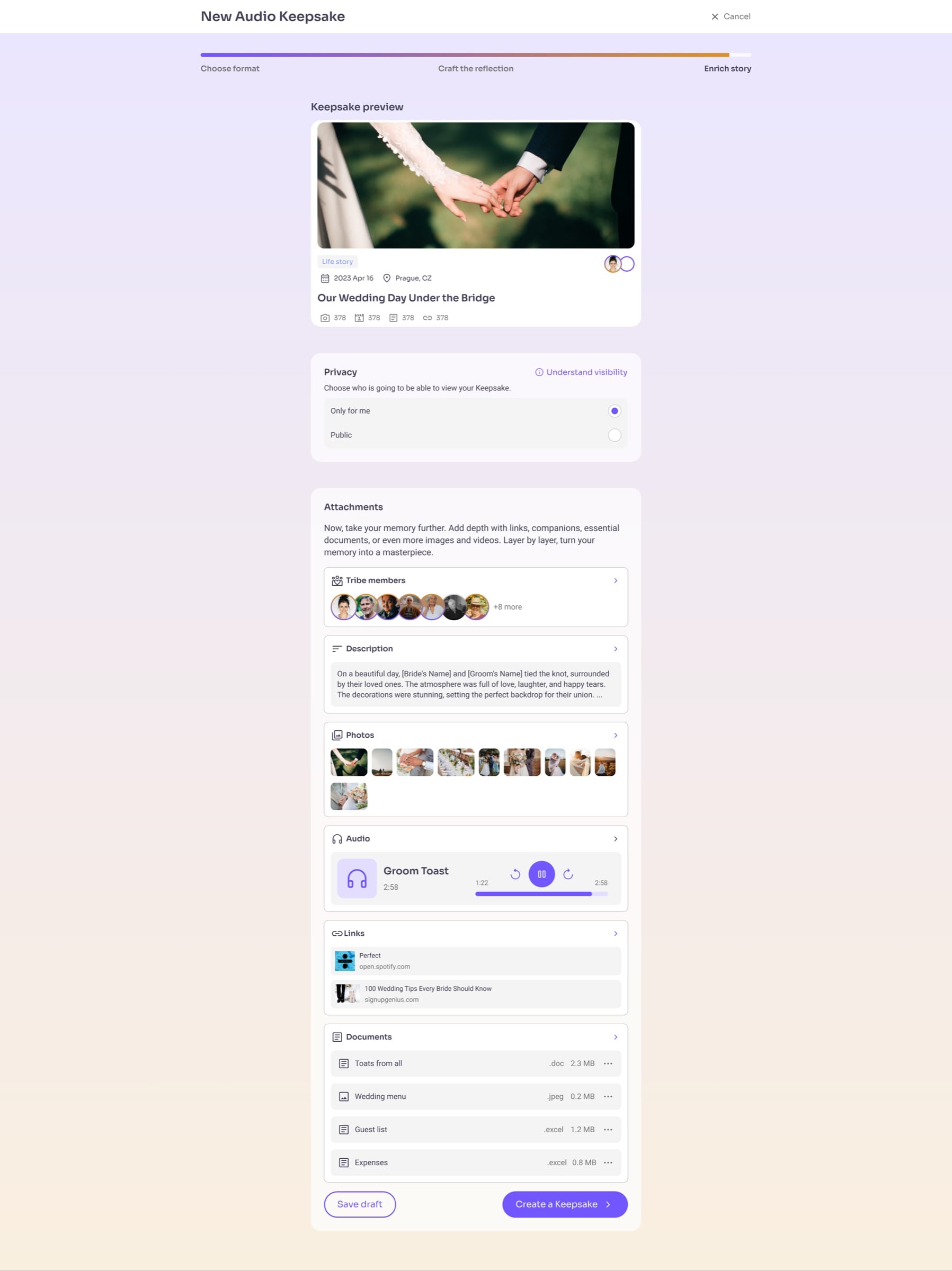
Every attachment uses the same card.
The last step shows the keepsake as family will see it. Everything added below the preview sits in one repeating card, with the same spacing, title and arrow.
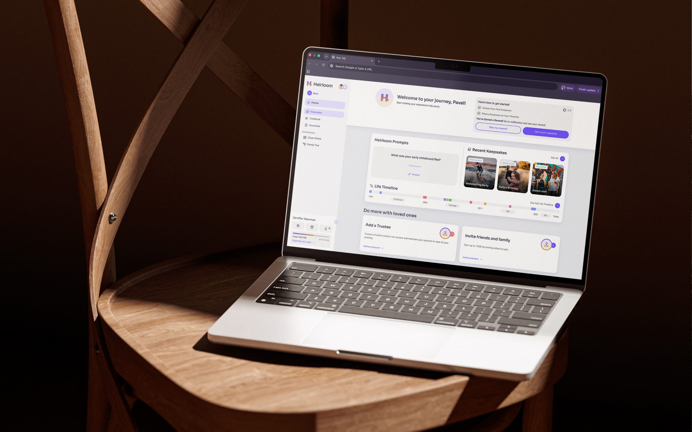
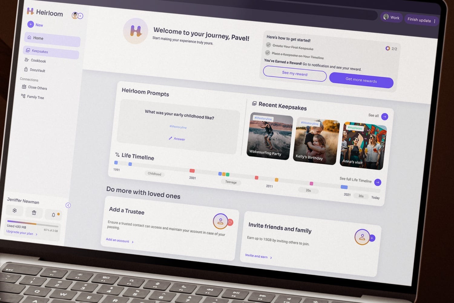
A dashboard that welcomes you and asks you to share.
New members see a short checklist and a reward for finishing it. We put sharing ahead of search for the first phase, because the first goal was getting people to share their profiles.

More work
All projects →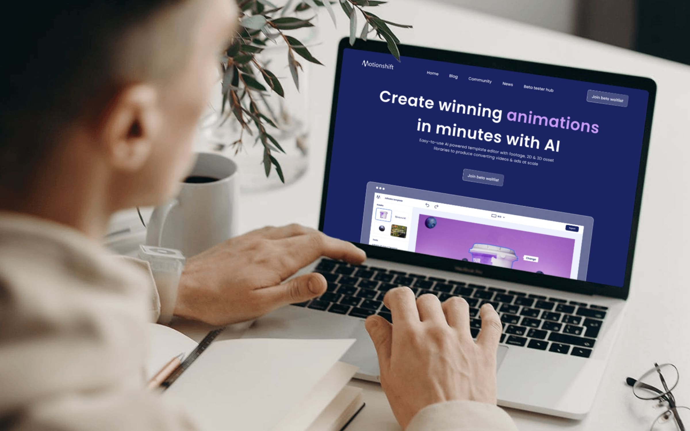 AI
AIMotionshift
An AI video tool shaped by what its first users actually needed.
 AI
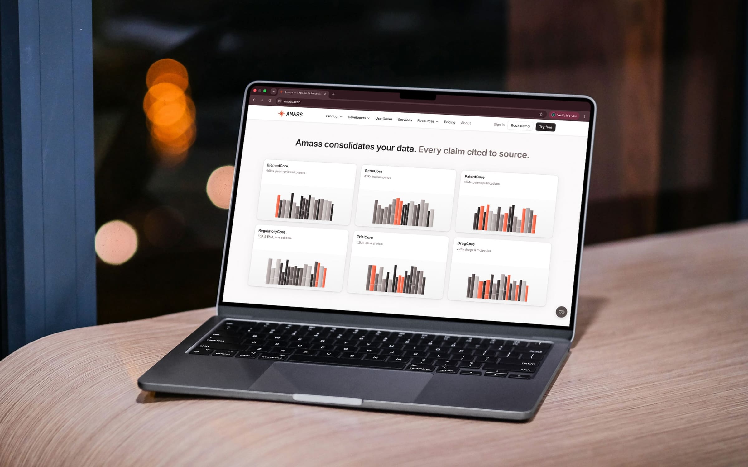
AIAmass
Life-science data in one place, with every claim cited to its source.
 Health
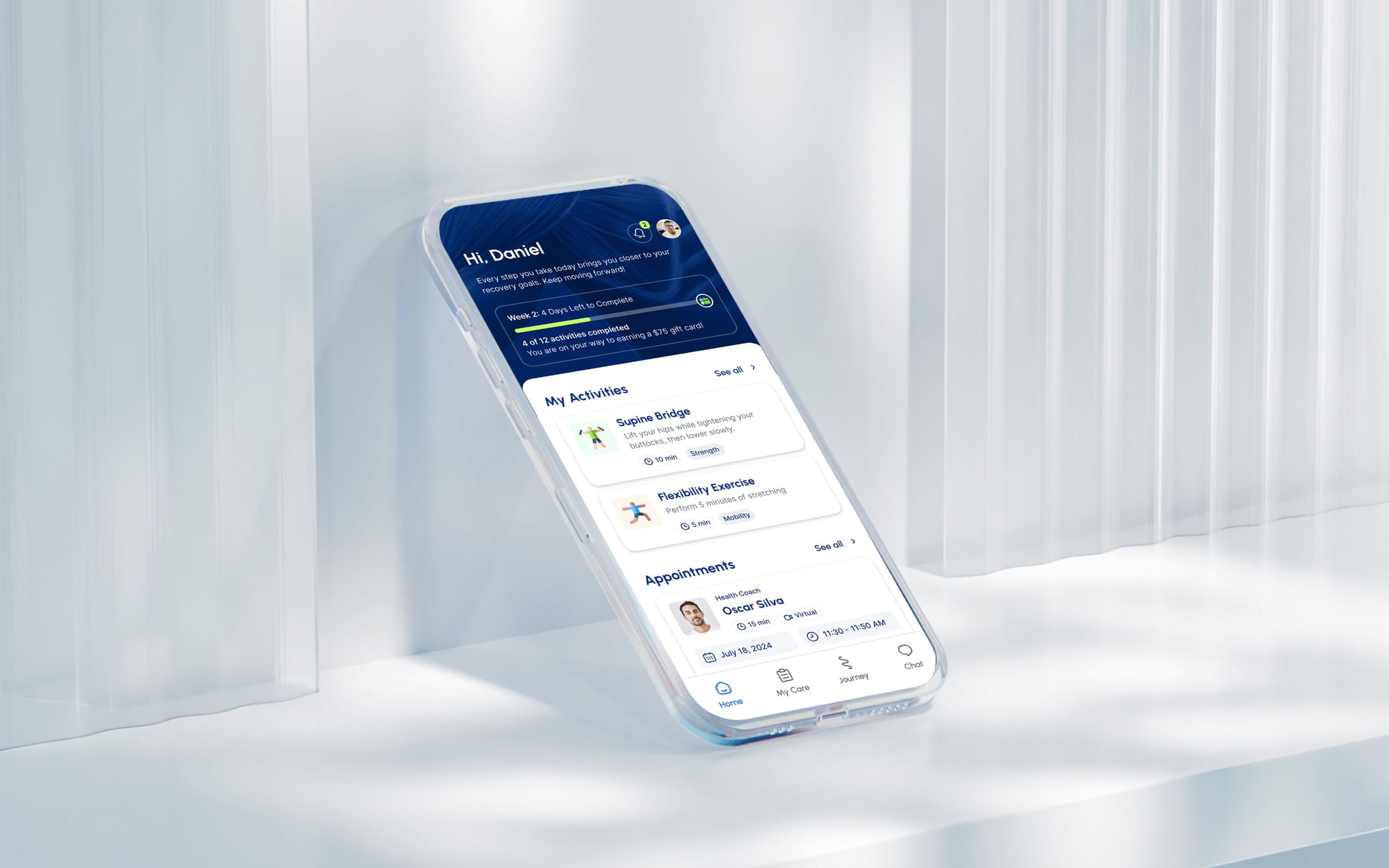
Movido
A recovery app that starts by asking what you want to get back to.
 AI
AITalentiqa
An AI hiring assistant that had a name, and nothing else.
 Automotive
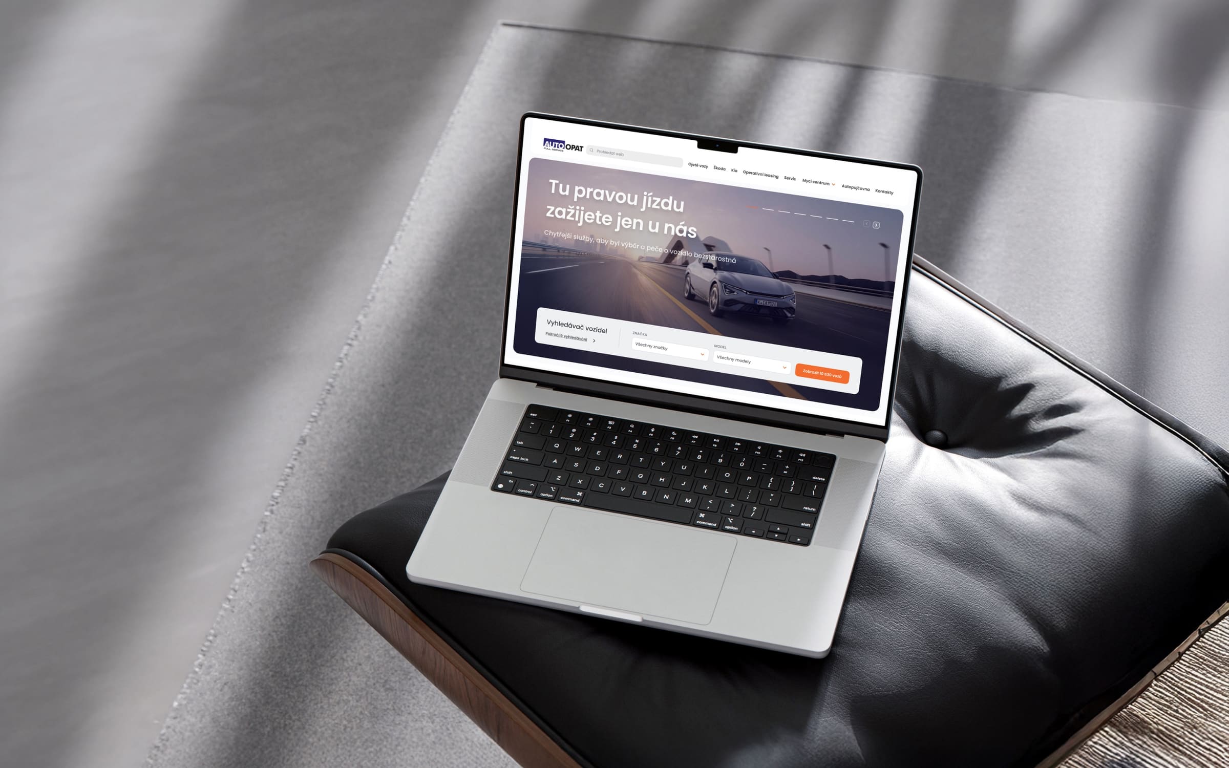
AutoOpat
A simple car search for one of the country’s largest used-car dealers.
 Consumer
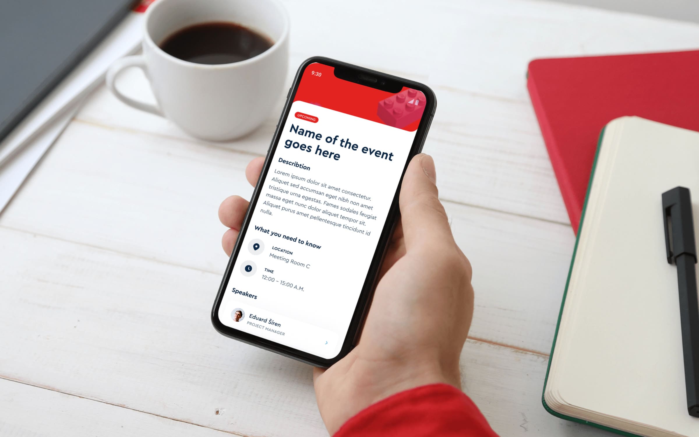
LEGO
An event app for LEGO, mapped before anyone drew a screen.