Equestrian Center ZduchoviceWhere flying on a horse is possible.
At a glance
- Design thinking
- One minimalist horse could stand for sport, breeding and the lodge and still look modern, so the C only suggests its head.
- Problem
- Top-level sport asks for a modern look, the breeding and the lodge for warmth. One identity had to hold all three.
- Approach
- We agreed the brand keywords with the client first, then drew and redrew the monogram by hand.
- Outcome
- One identity runs from the arena gate to the website. Sixteen mark variants cover any new competition series.
- Role
- Lucie as the only design and project lead, working directly with the client.
- What we designed
- Positioning
- Logo design
- Visual identity
- Signage / Environmental
- Merchandise
- Website design
- Platforms
- Arena and gates
- Merchandise
- Social media
- Website
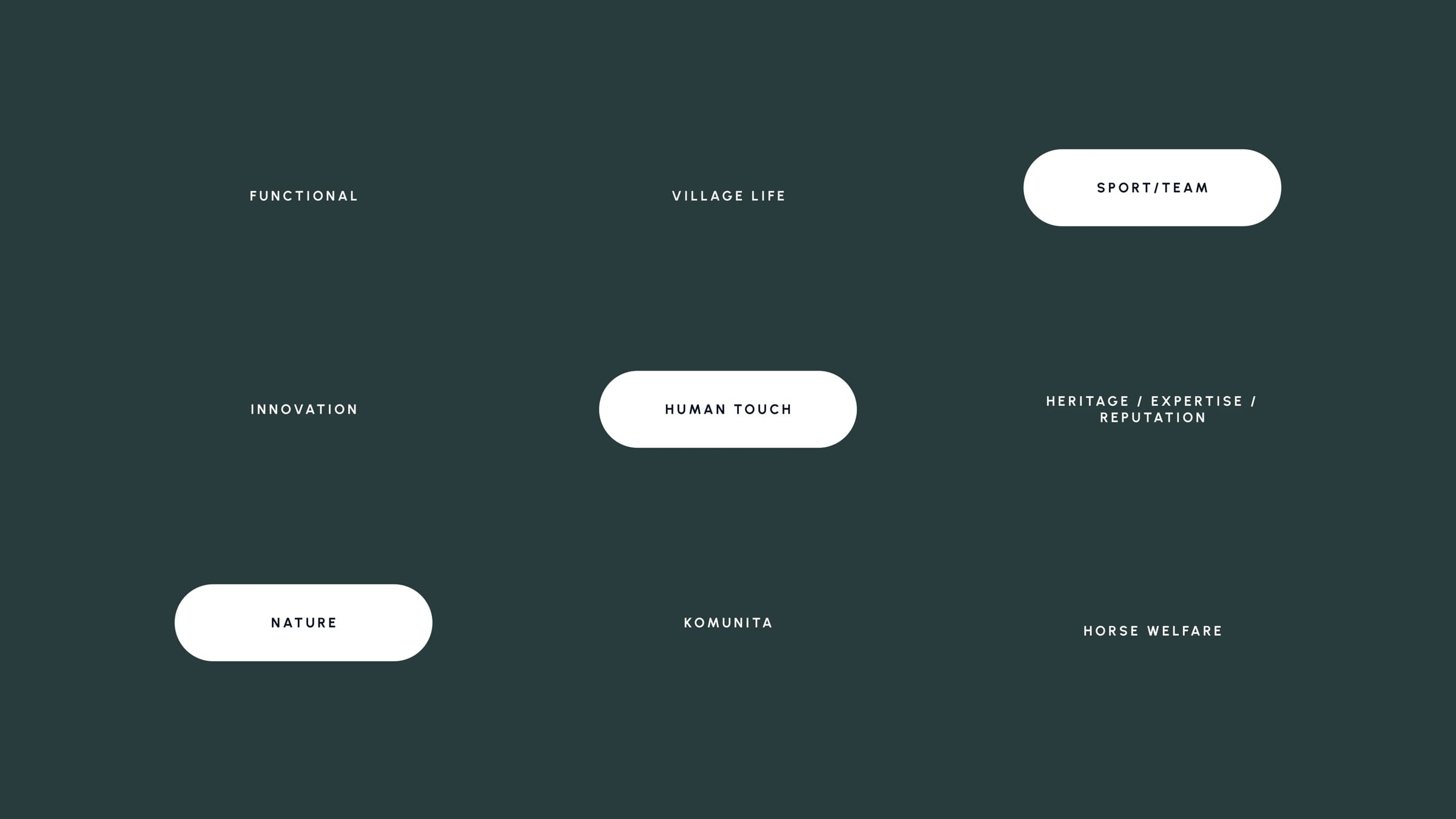
The keywords decided the mark before it was drawn.
Nine words went on the board with the client. Sport and team, human touch and nature were chosen to lead, and heritage and innovation to support. A minimalist horse followed from that order.
The monogram was redrawn by hand until the C suggested a horse and still read as a letter.
Each round tested how far the C could suggest a horse before it stopped reading as a letter, and how the wordmark should sit beside it.
The decision
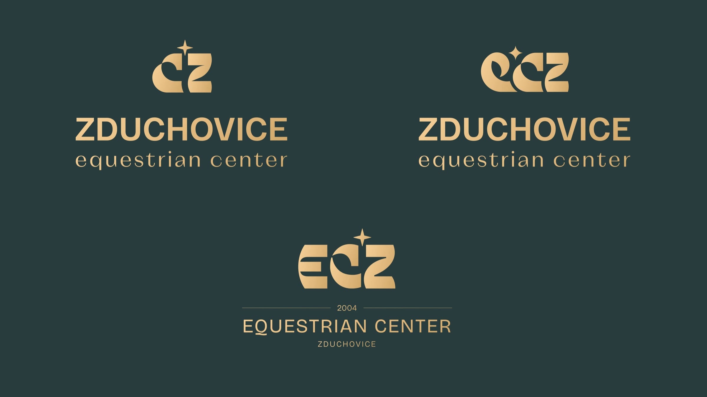
The client chose the hand-drawn mark for the horse’s head in its curve.
The client singled out that head as the part that felt most like the centre. The symbol and the pattern were then built from it.
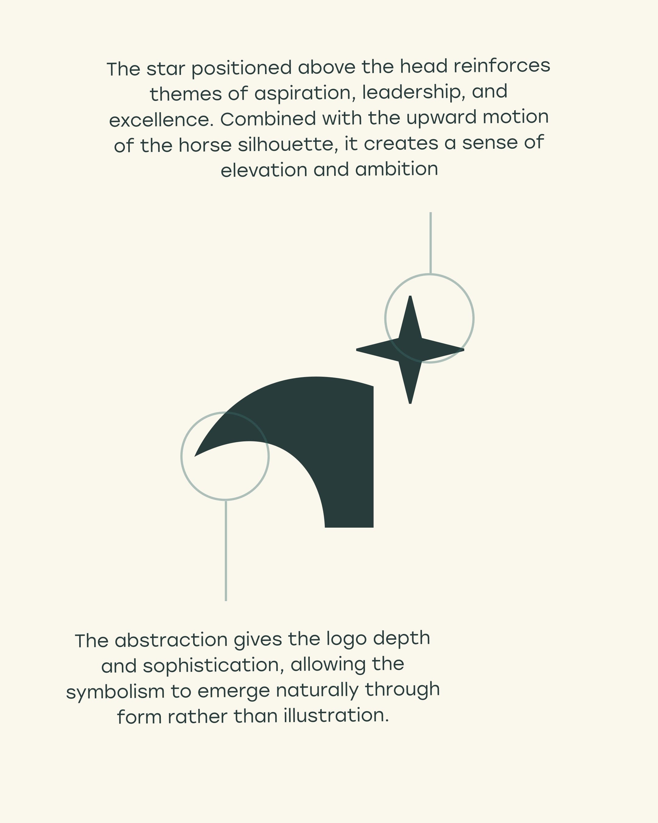
The C suggests a horse’s head without drawing one, so the mark stays minimal.
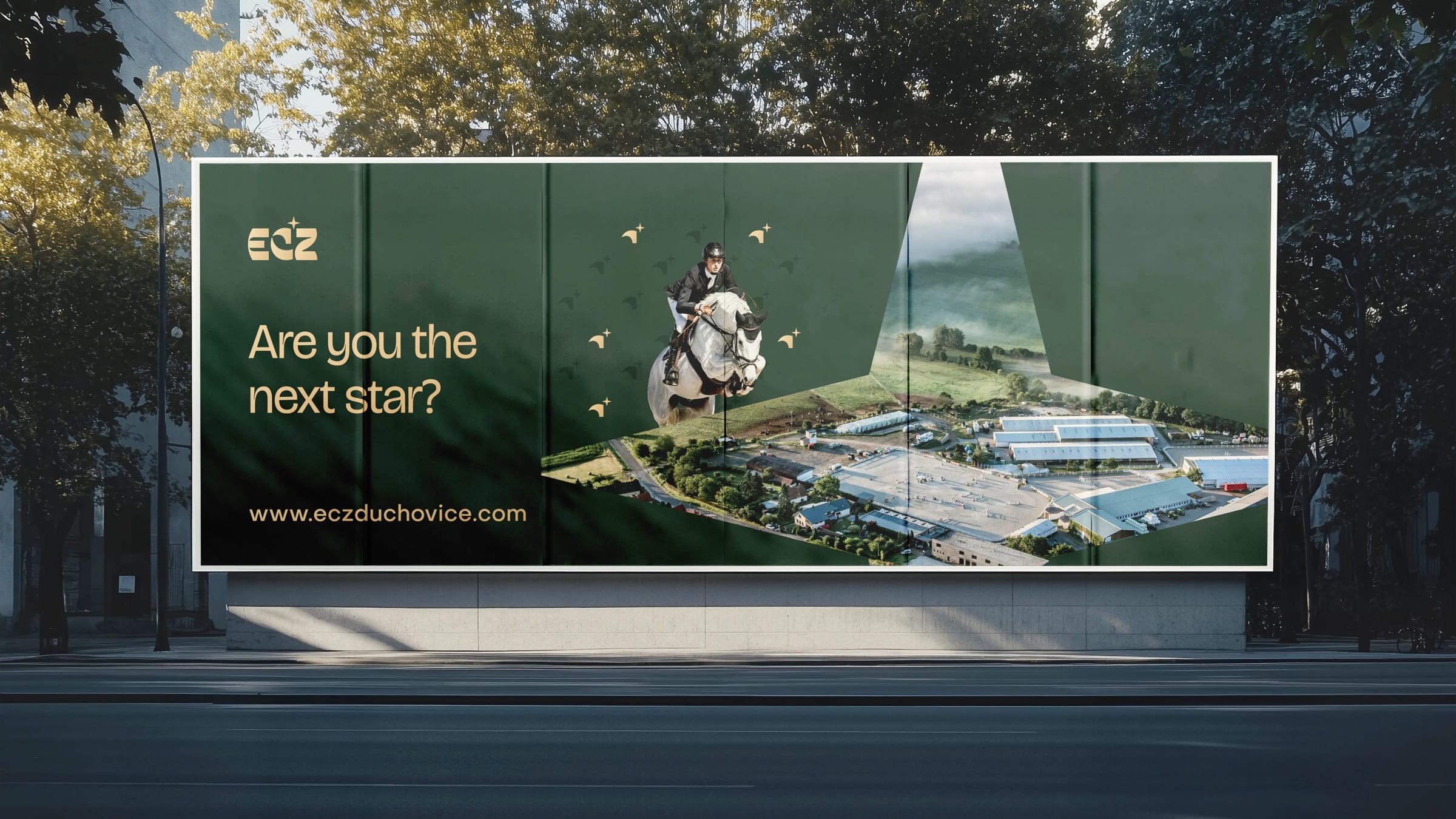
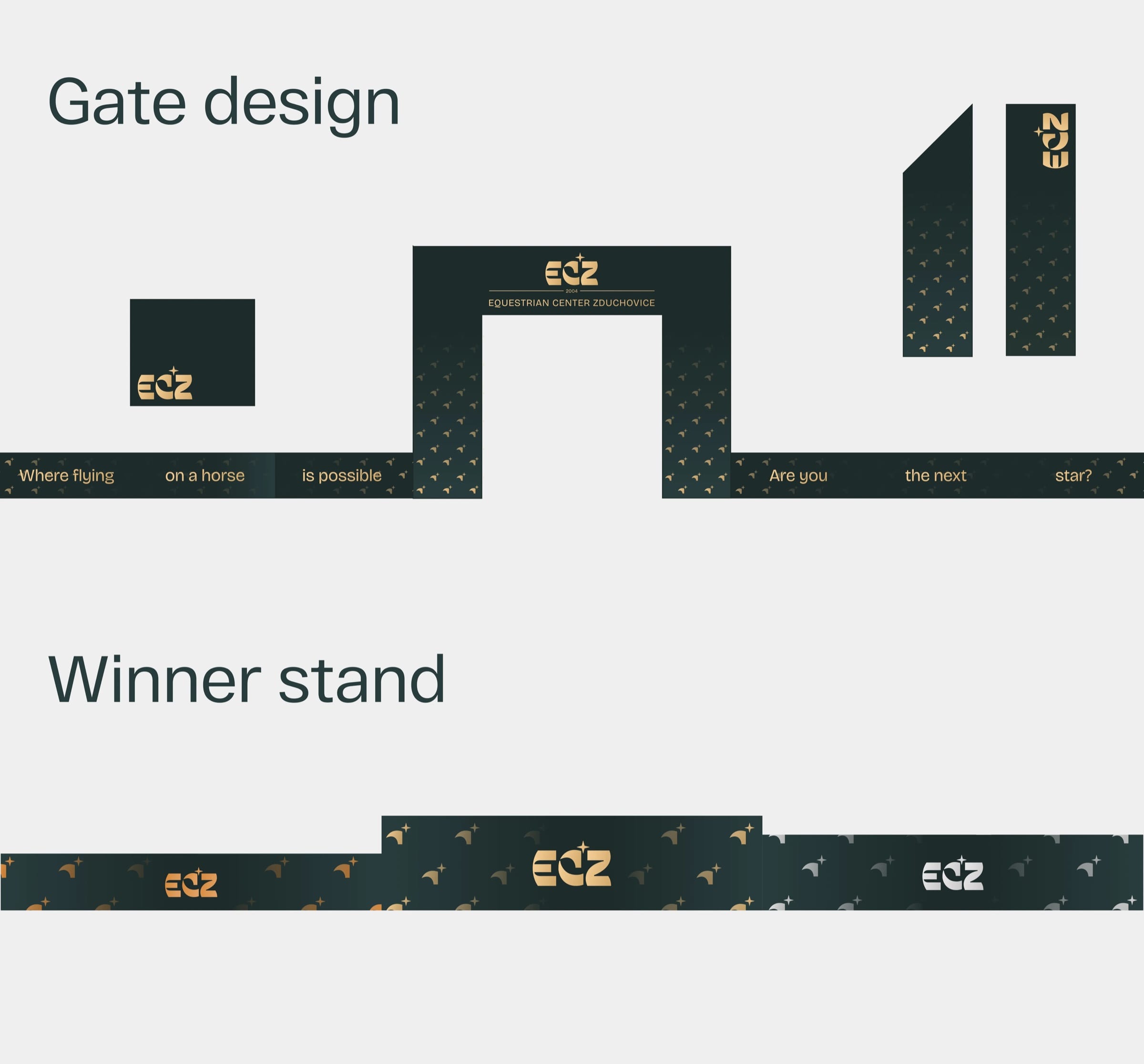
ECZ was chosen for its clarity and sound. The star above the C returns in the claim “Are you the next star?”
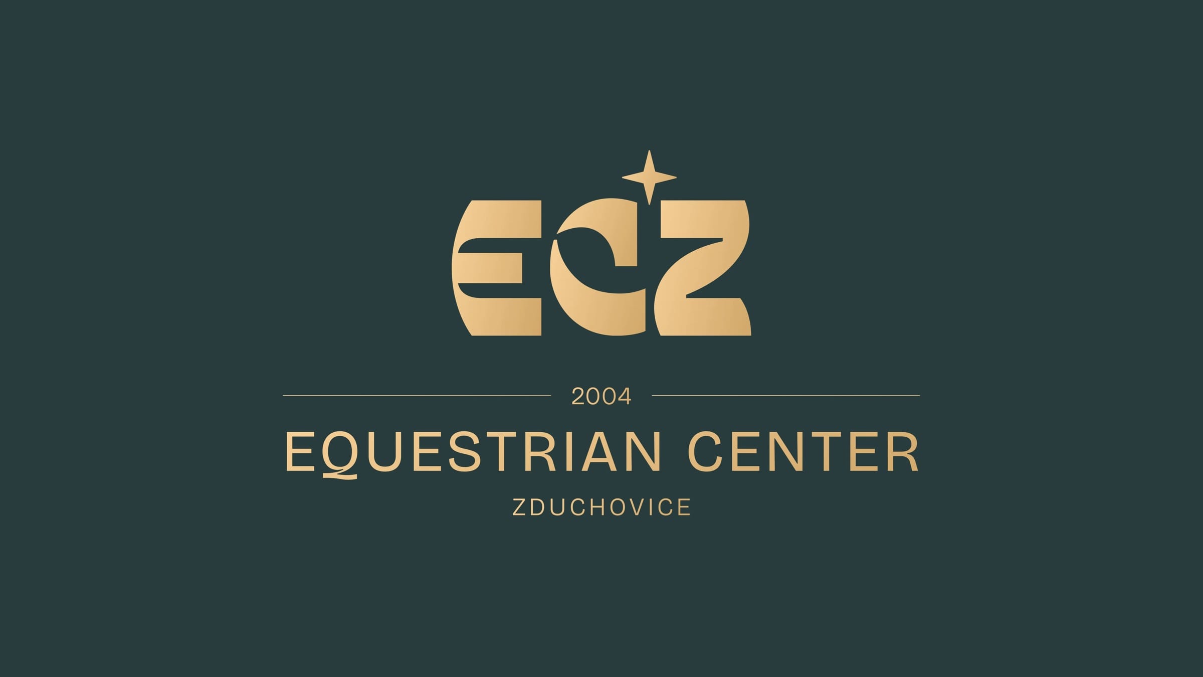
One curve, repeated until it became a pattern.
The symbol takes the horse’s head and star from the C. Repeated, it becomes a pattern in the dark green, sand and mint of the palette.

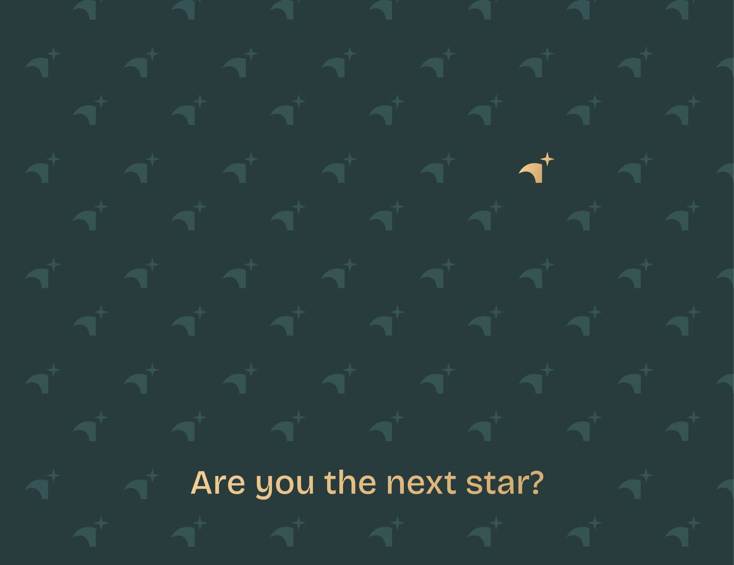
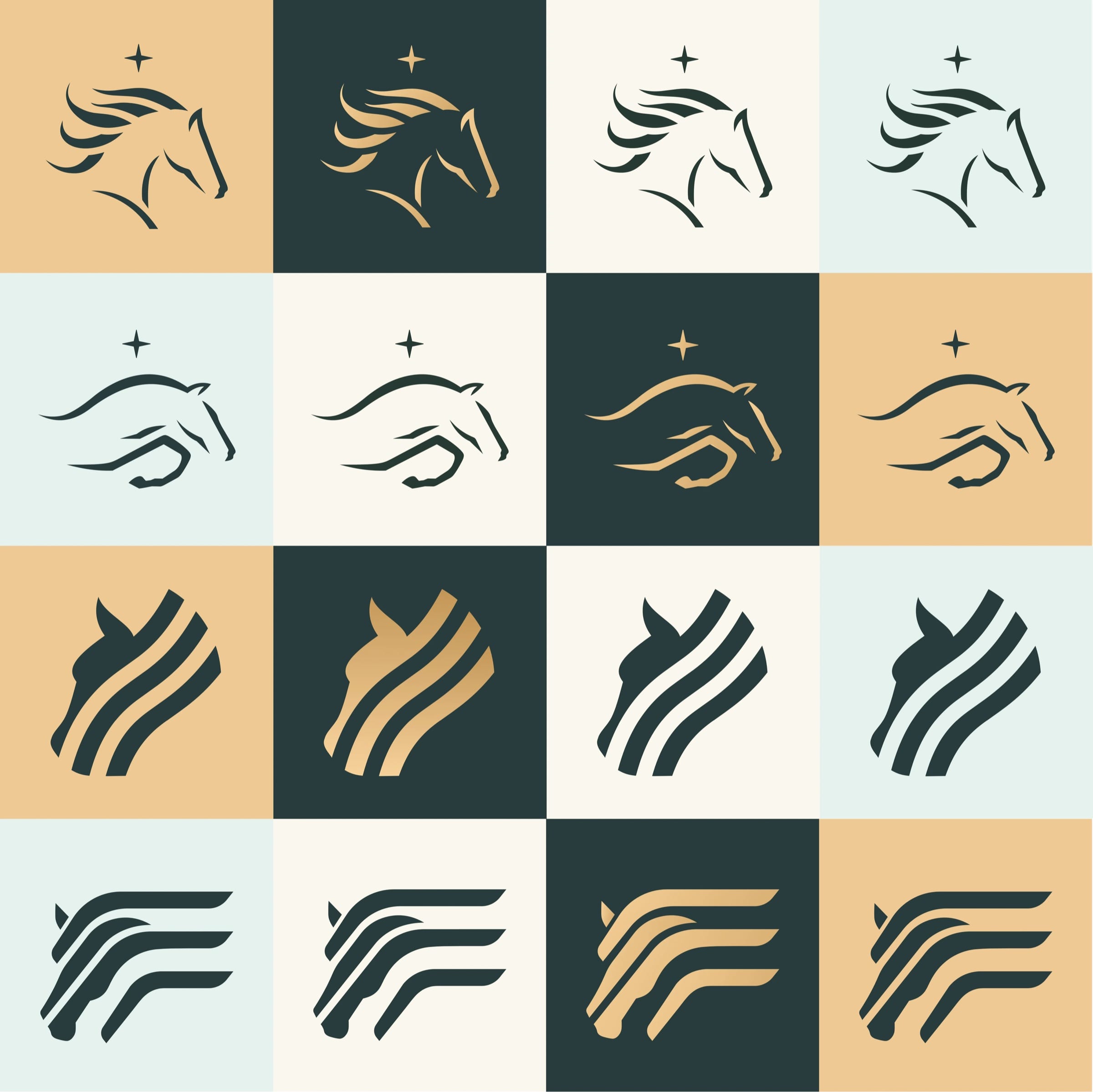
Each horse was drawn in detail, then cut back until the silhouette read at a glance.
Every round removed lines and sharpened the rest. The curves were tuned to feel fast but controlled, and a star above the head links each horse to the logotype.
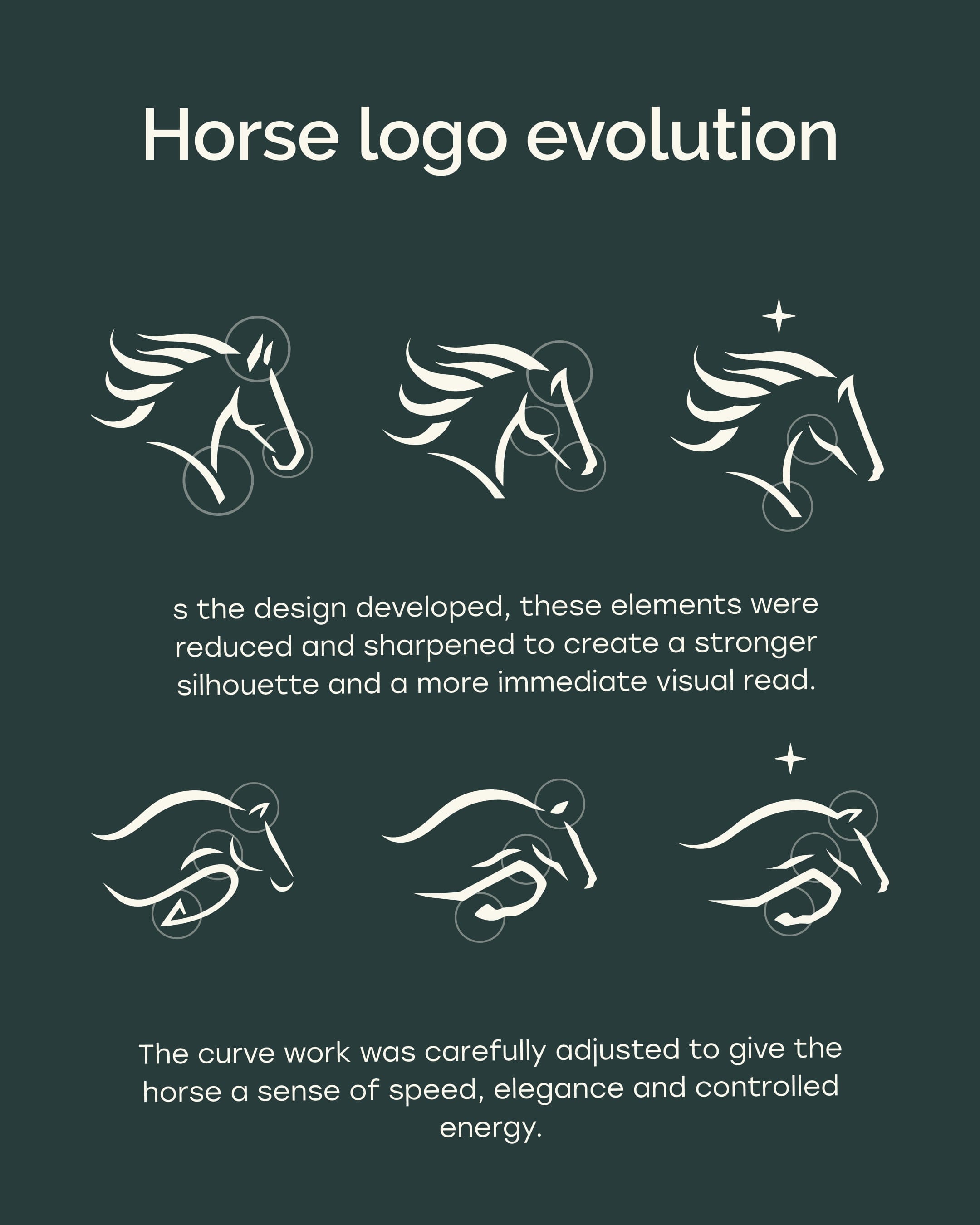
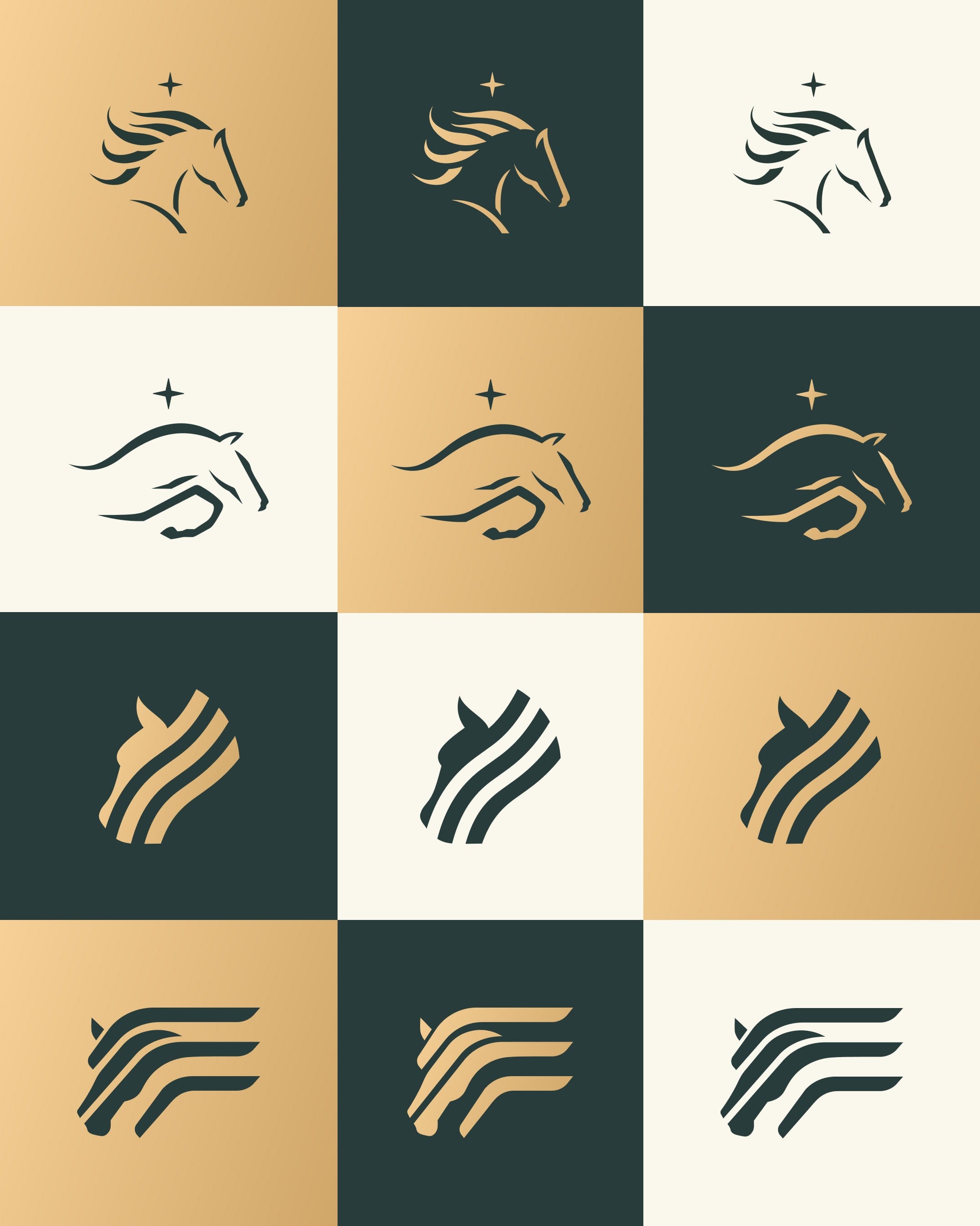
Each competition series gets its own horse mark, so a new series never needs a new logo.
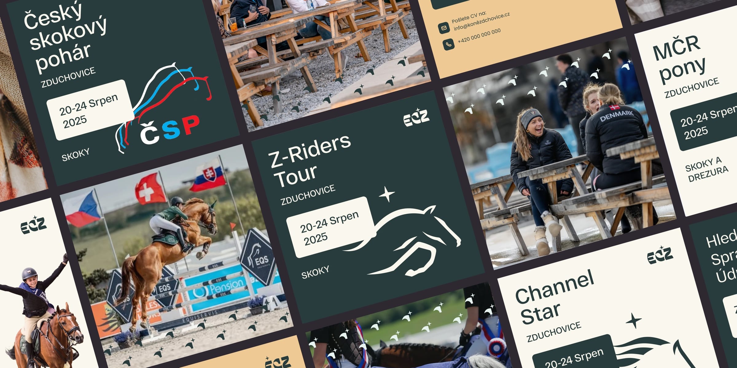
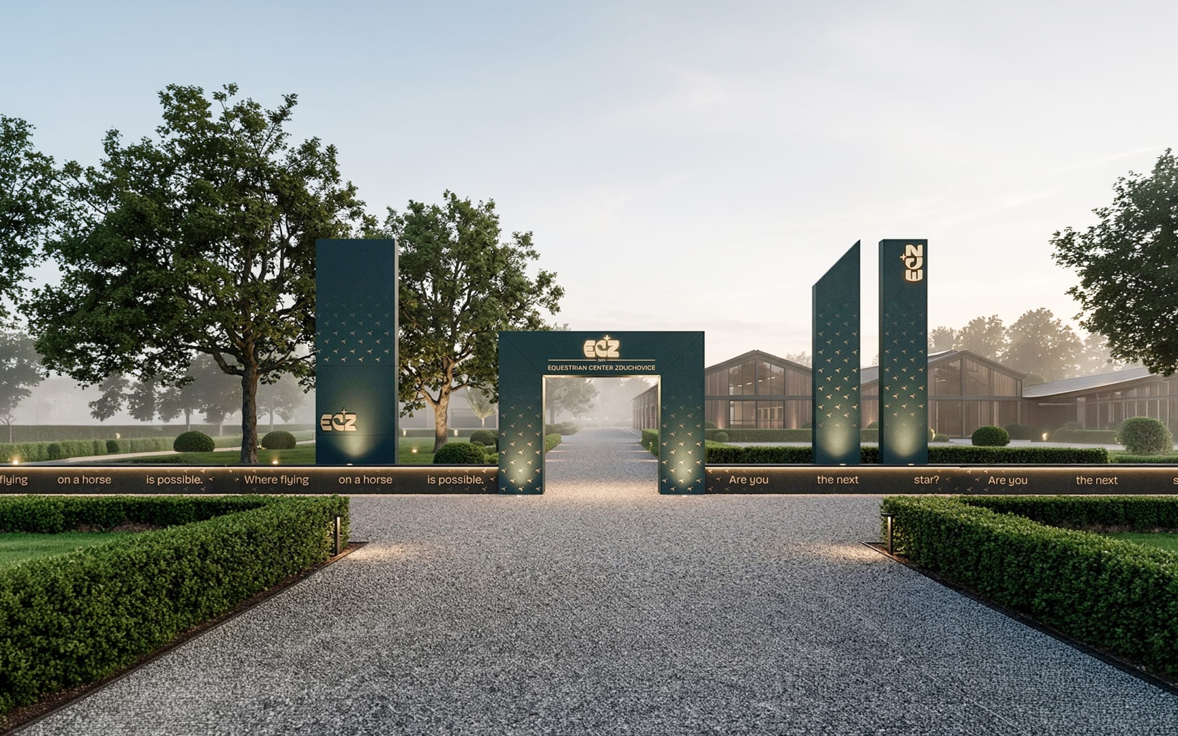
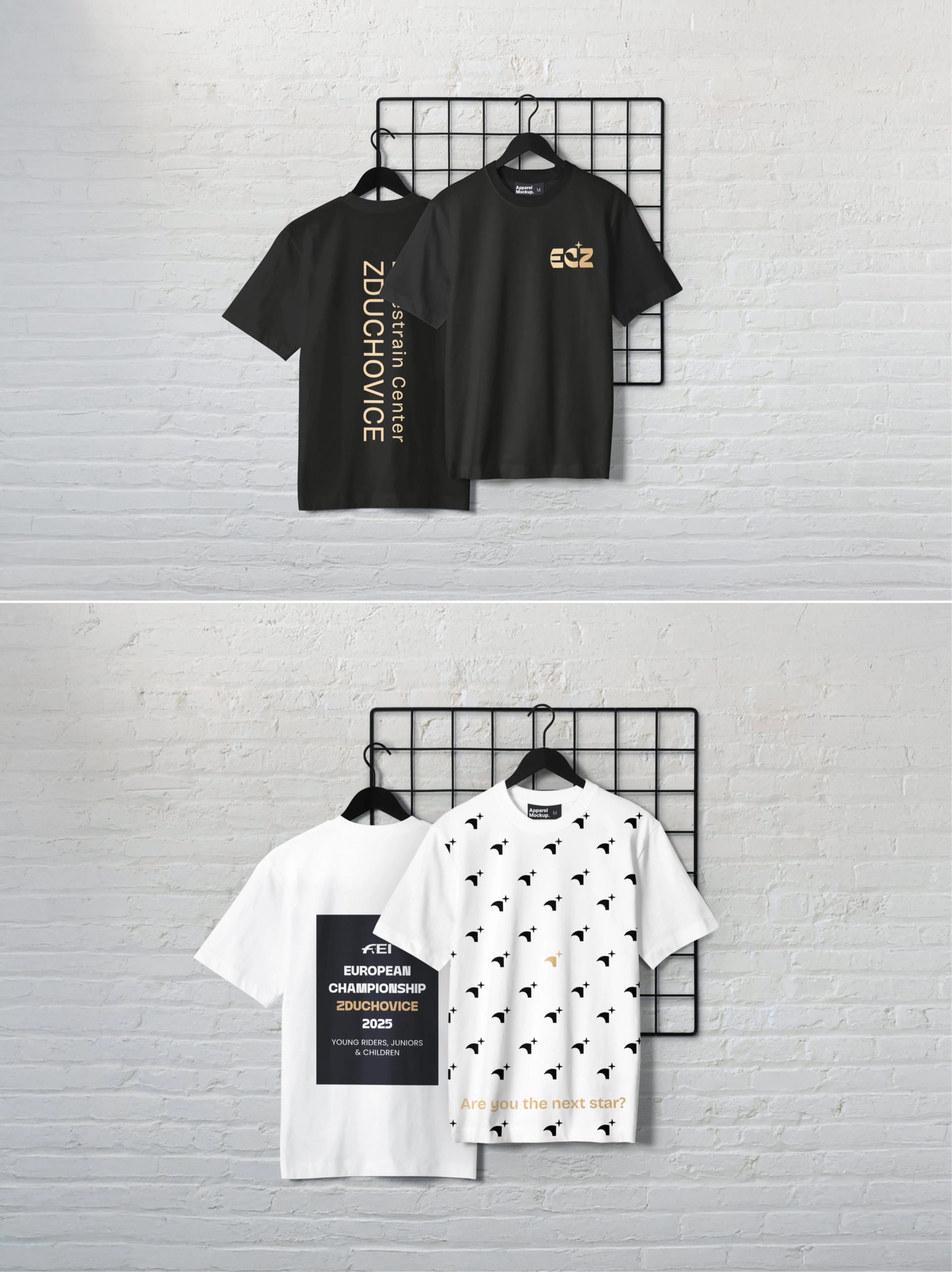
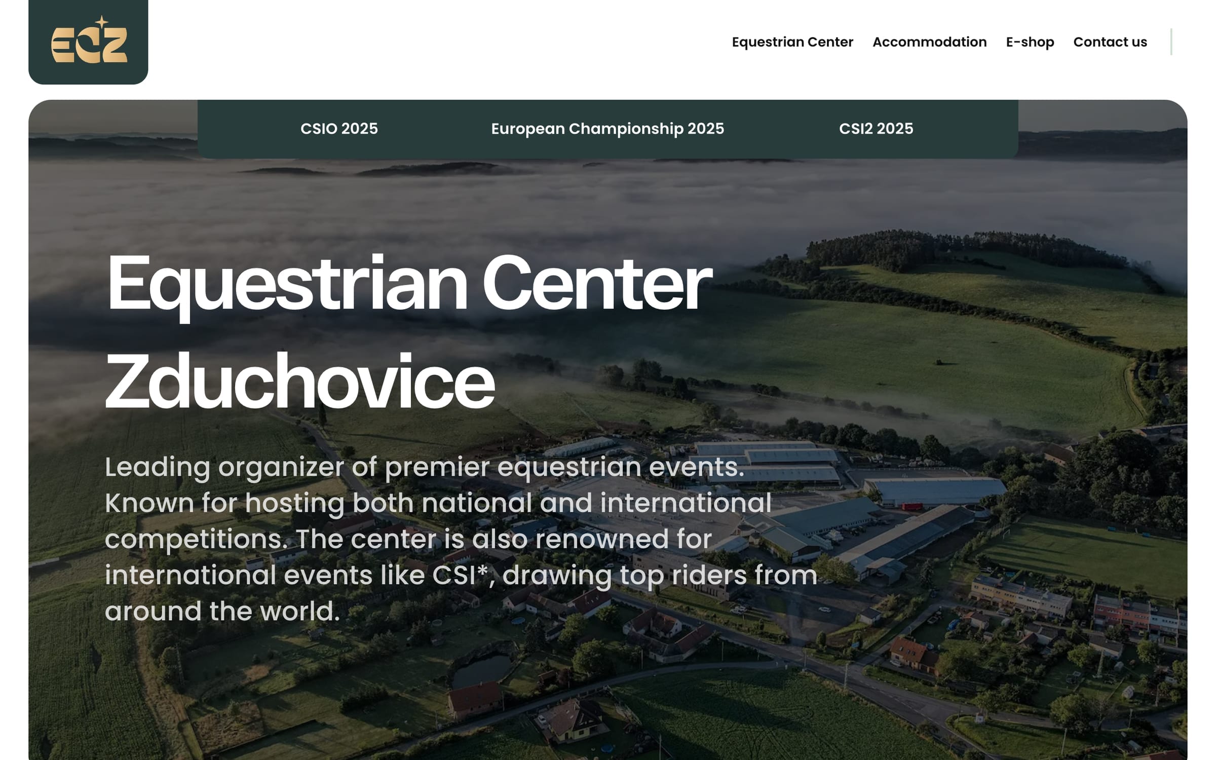
The identity carries from the arena gate to T-shirts.
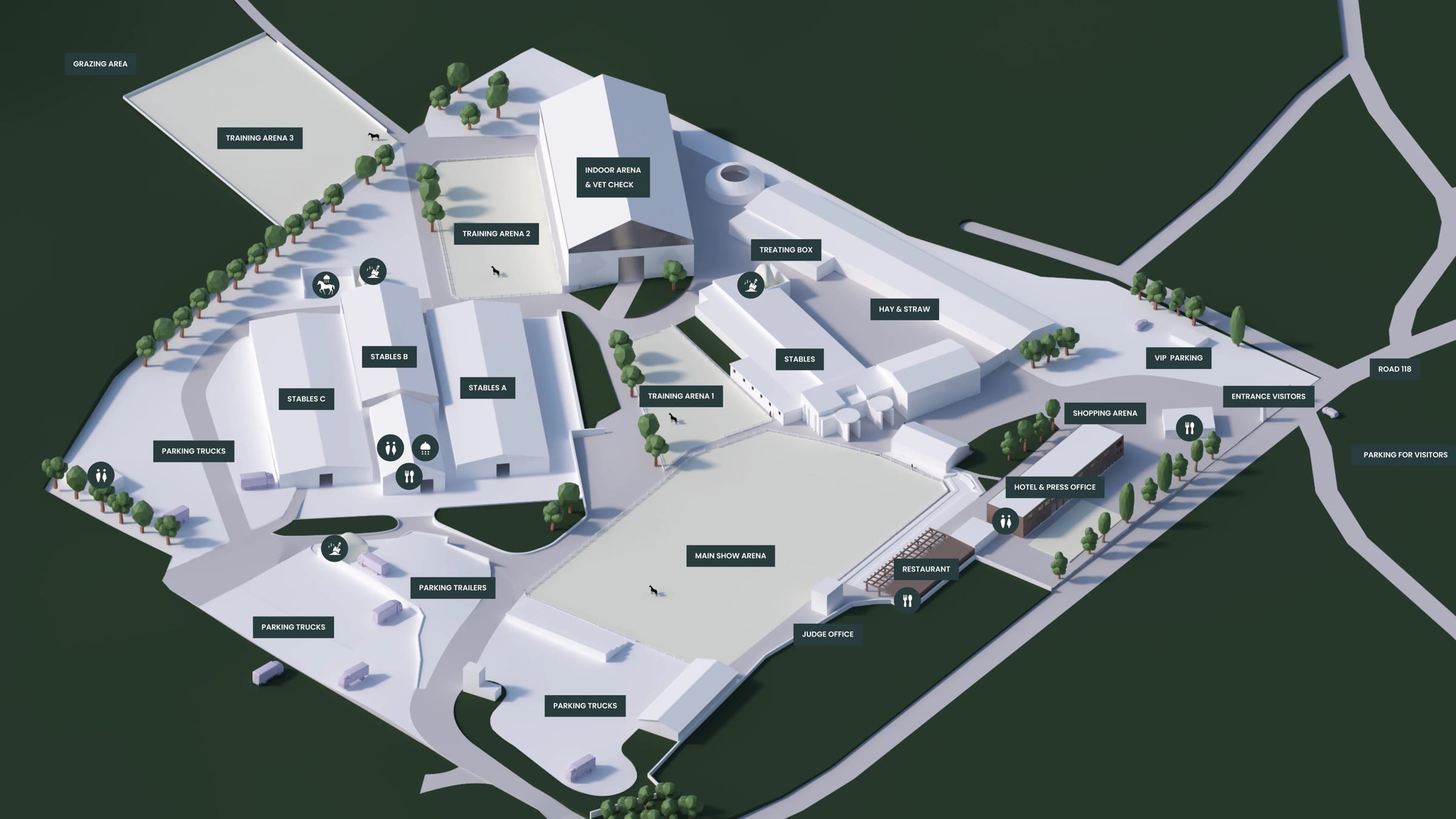
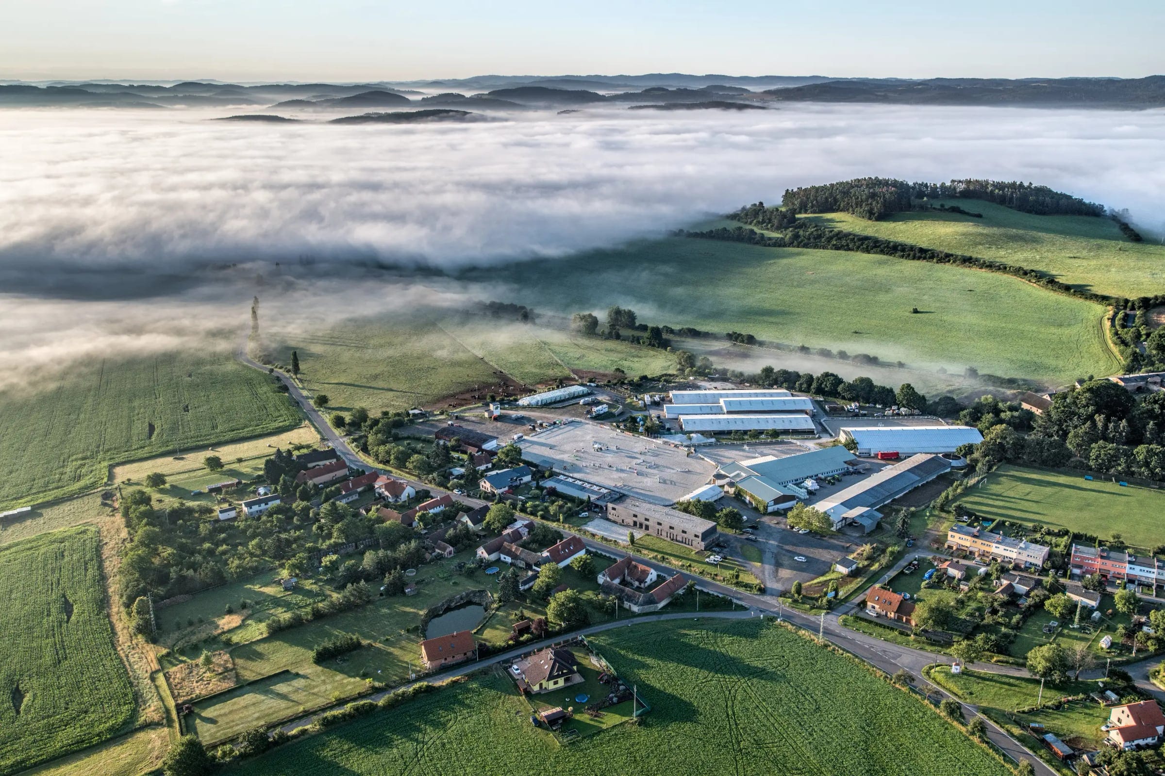
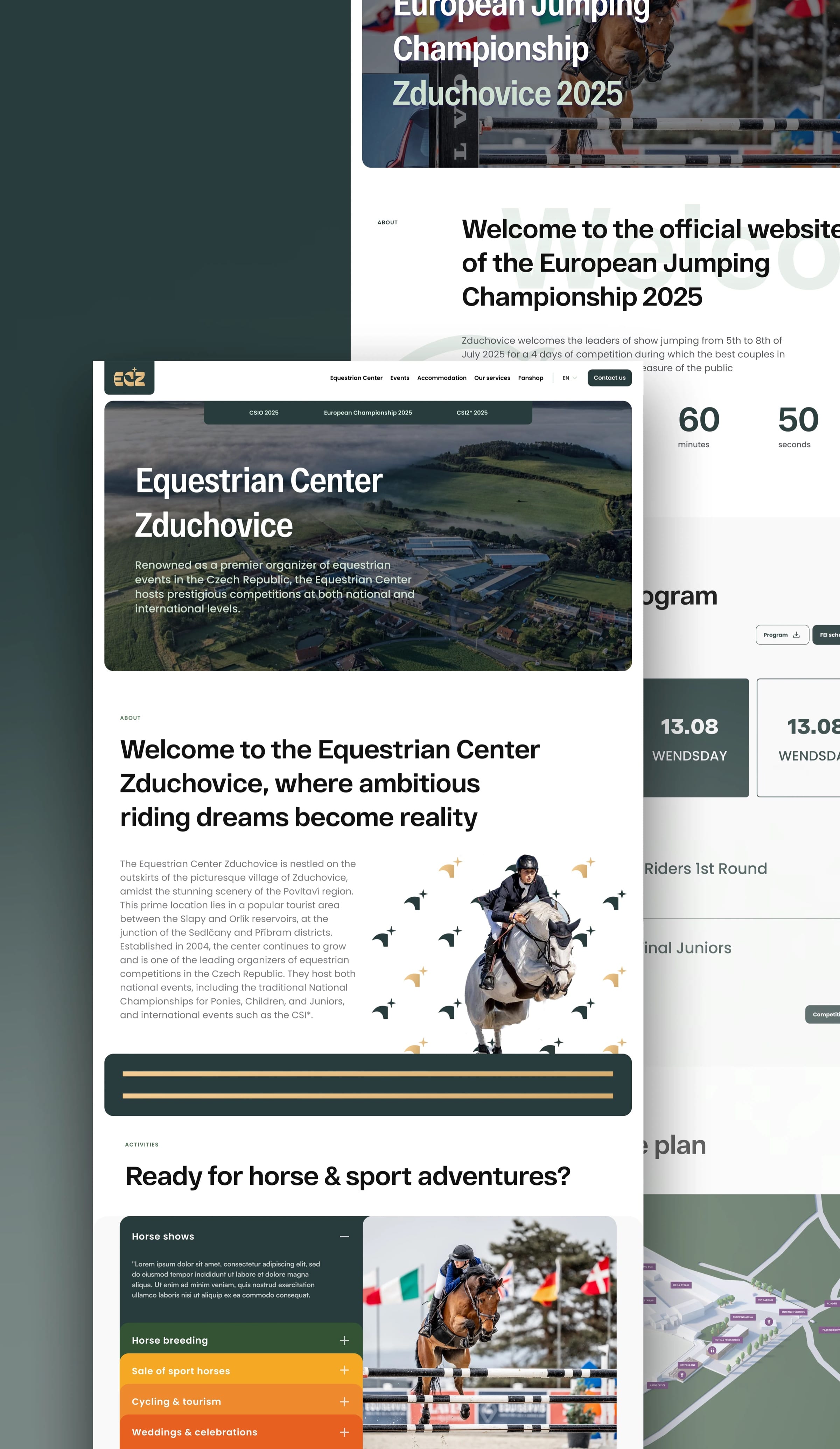
The centre sits in open country, and its main arena is built for international shows.
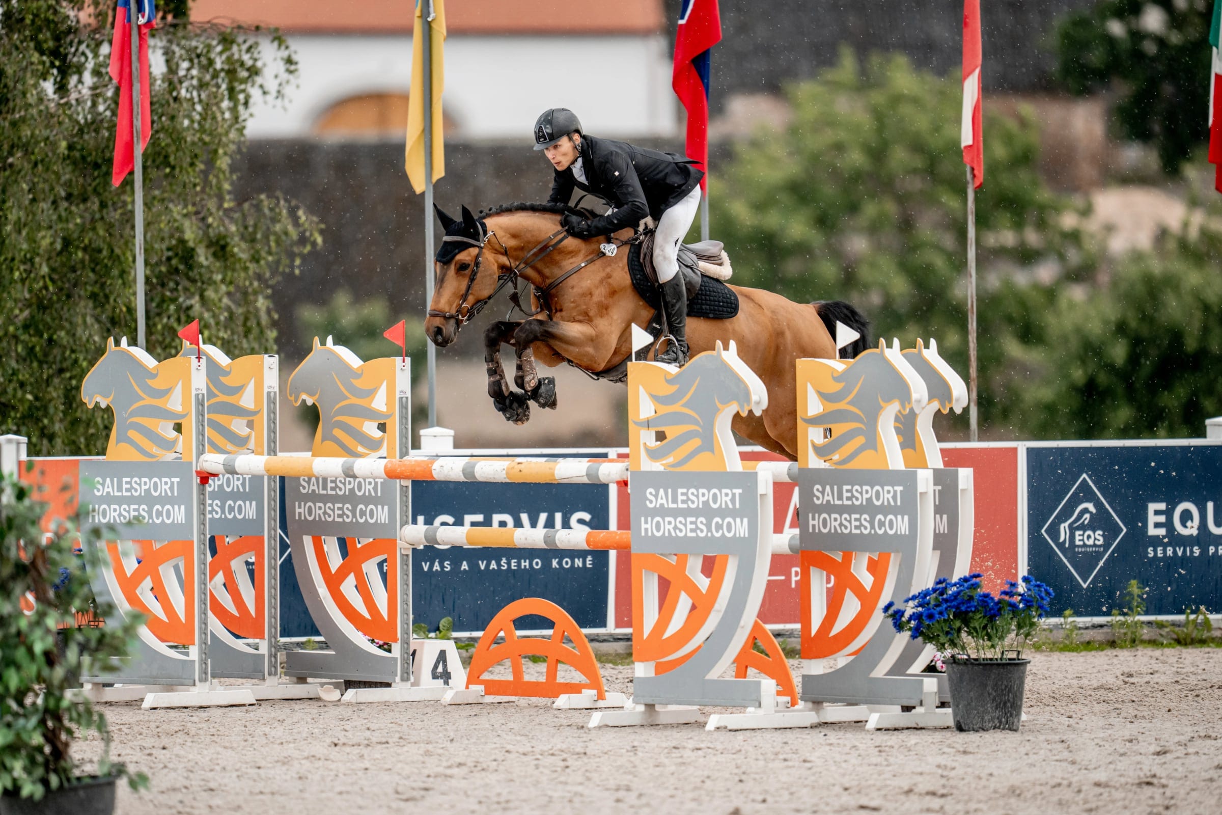
Each activity gets its own section, so nobody reads past the sport to find the lodge.
The European Jumping Championship 2025 gets a page of its own, with a countdown and programme.
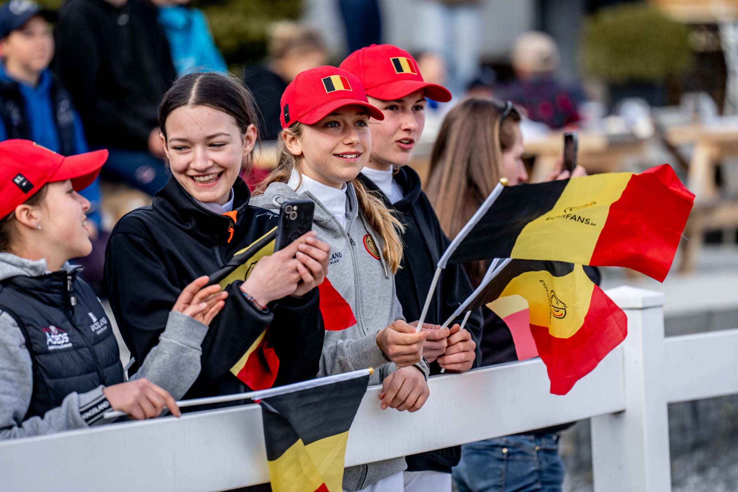
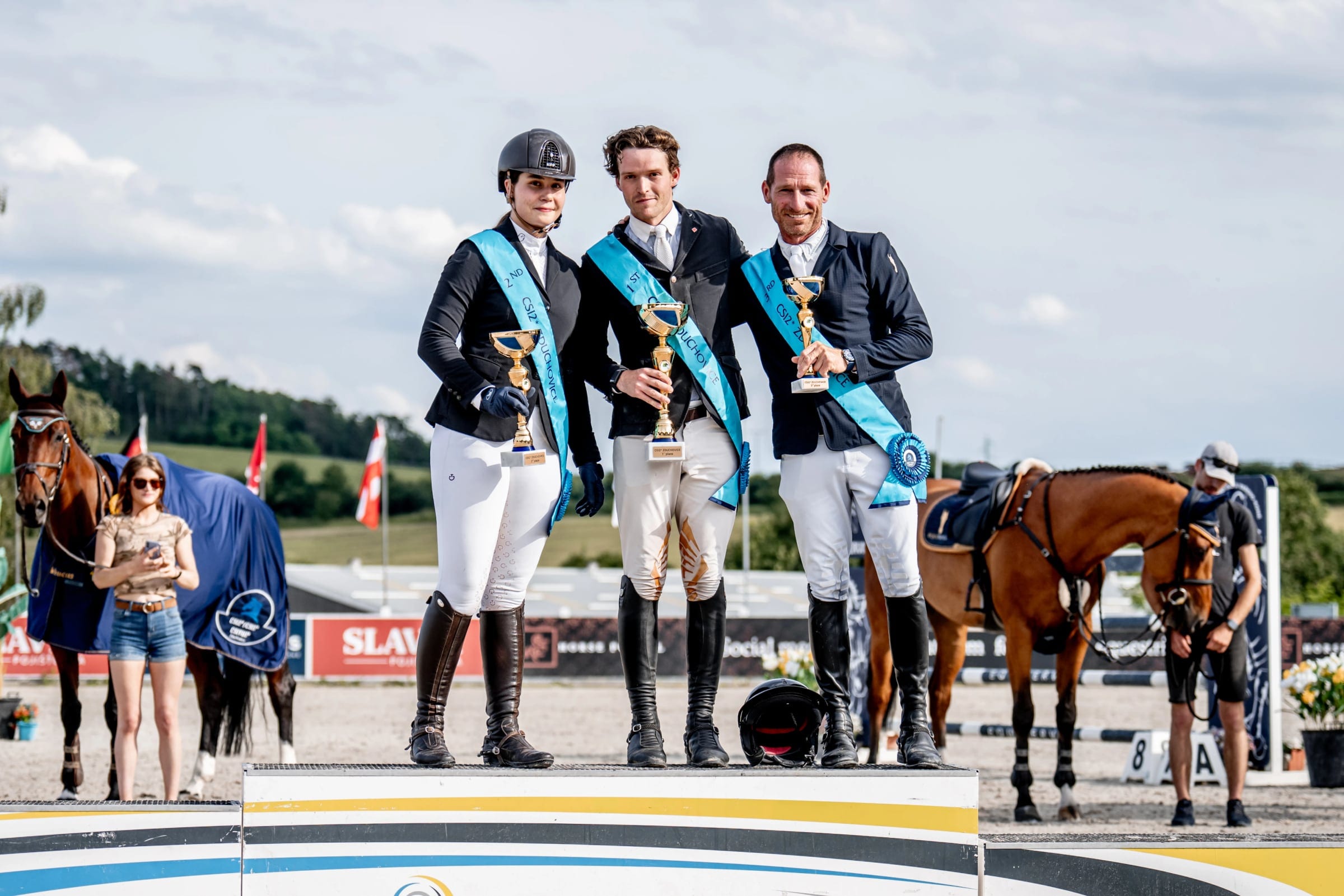
The homepage gives a whole section to the people who come to the shows.
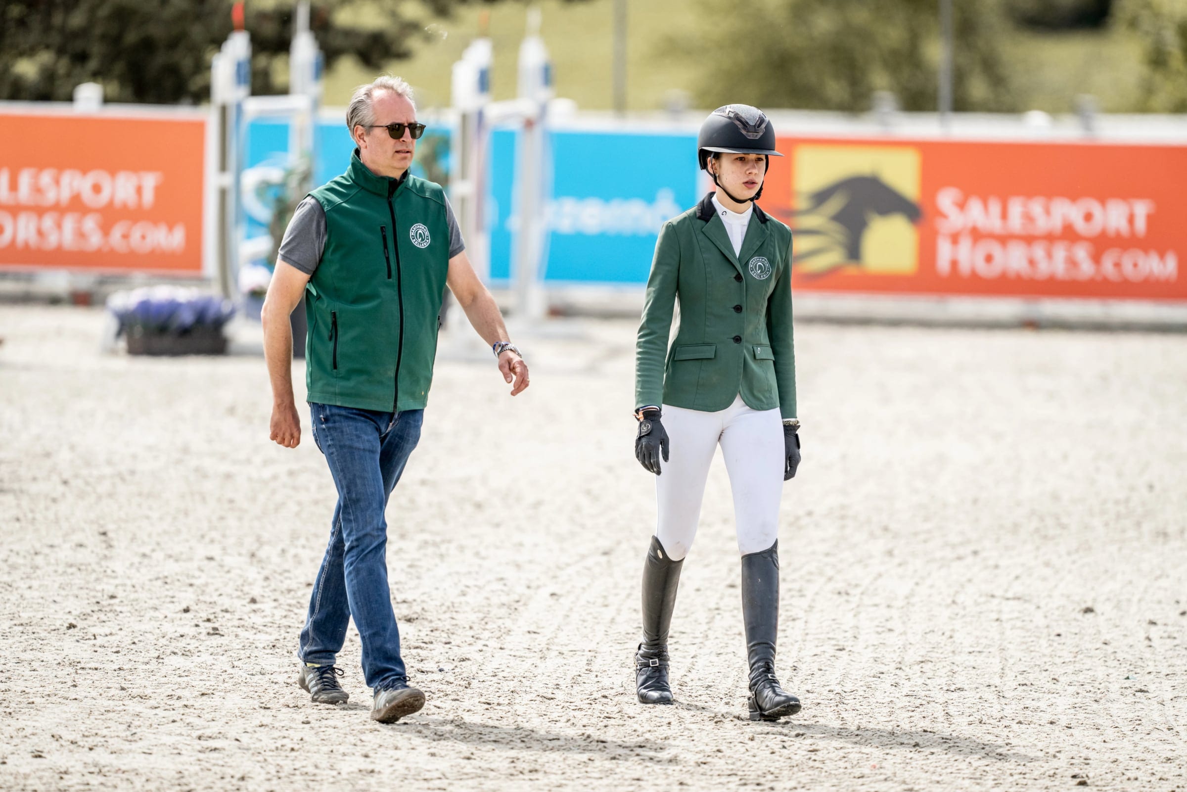
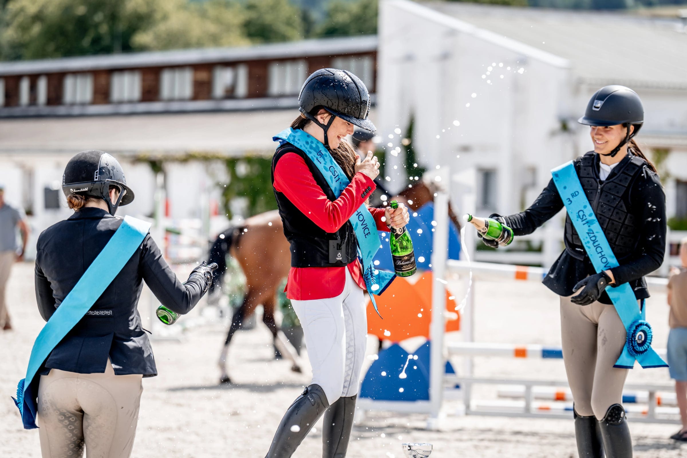
It uses the centre’s own photographs: young fans at the rail, riders on the podium, a course walk and champagne after a class.
More work
All projects → AI
AIMotionshift
An AI video tool shaped by what its first users actually needed.
 AI
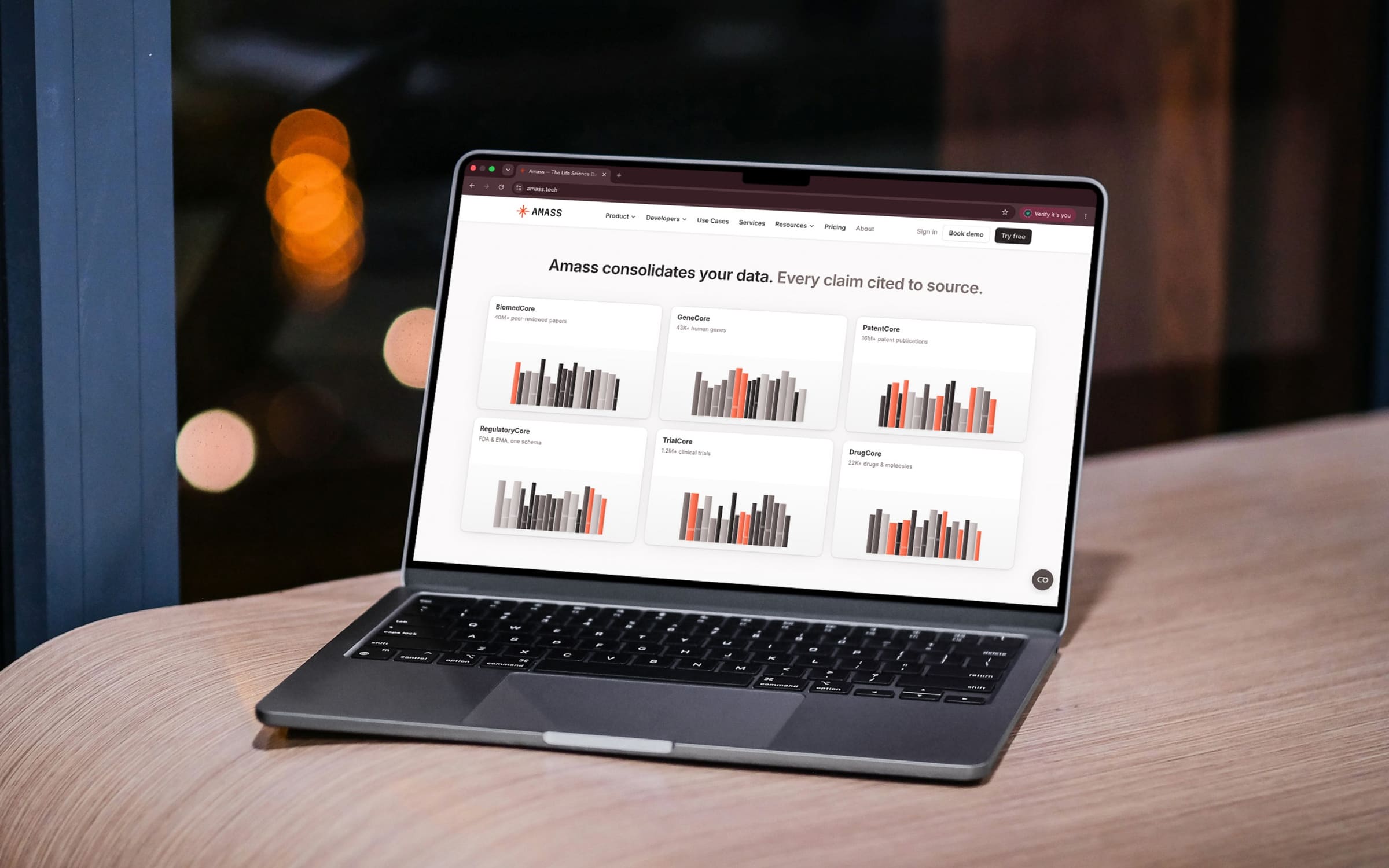
AIAmass
Life-science data in one place, with every claim cited to its source.
 Health
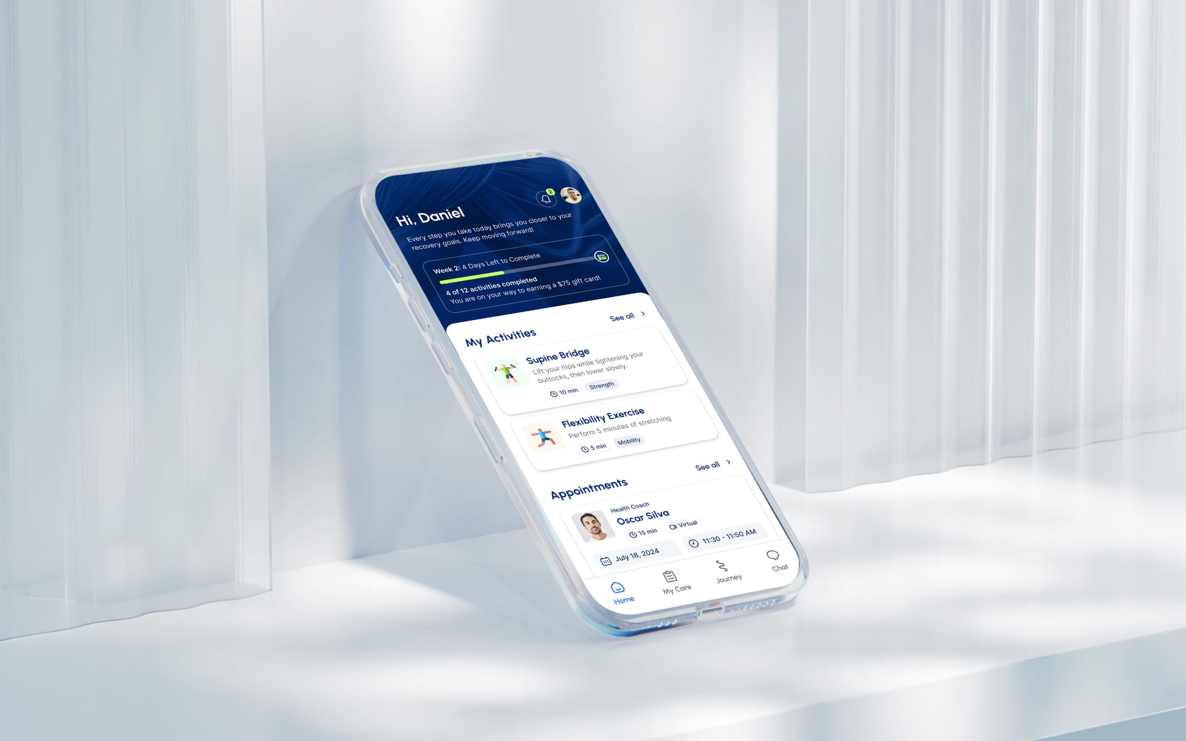
Movido
A recovery app that starts by asking what you want to get back to.
 AI
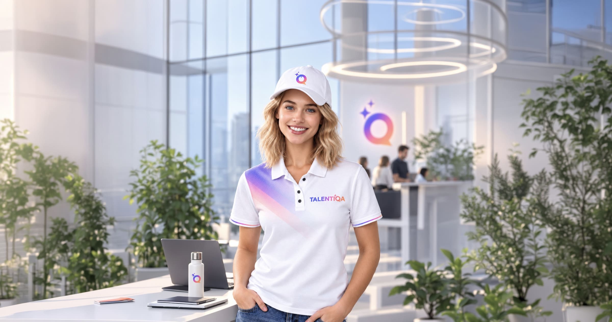
AITalentiqa
An AI hiring assistant that had a name, and nothing else.
 Automotive
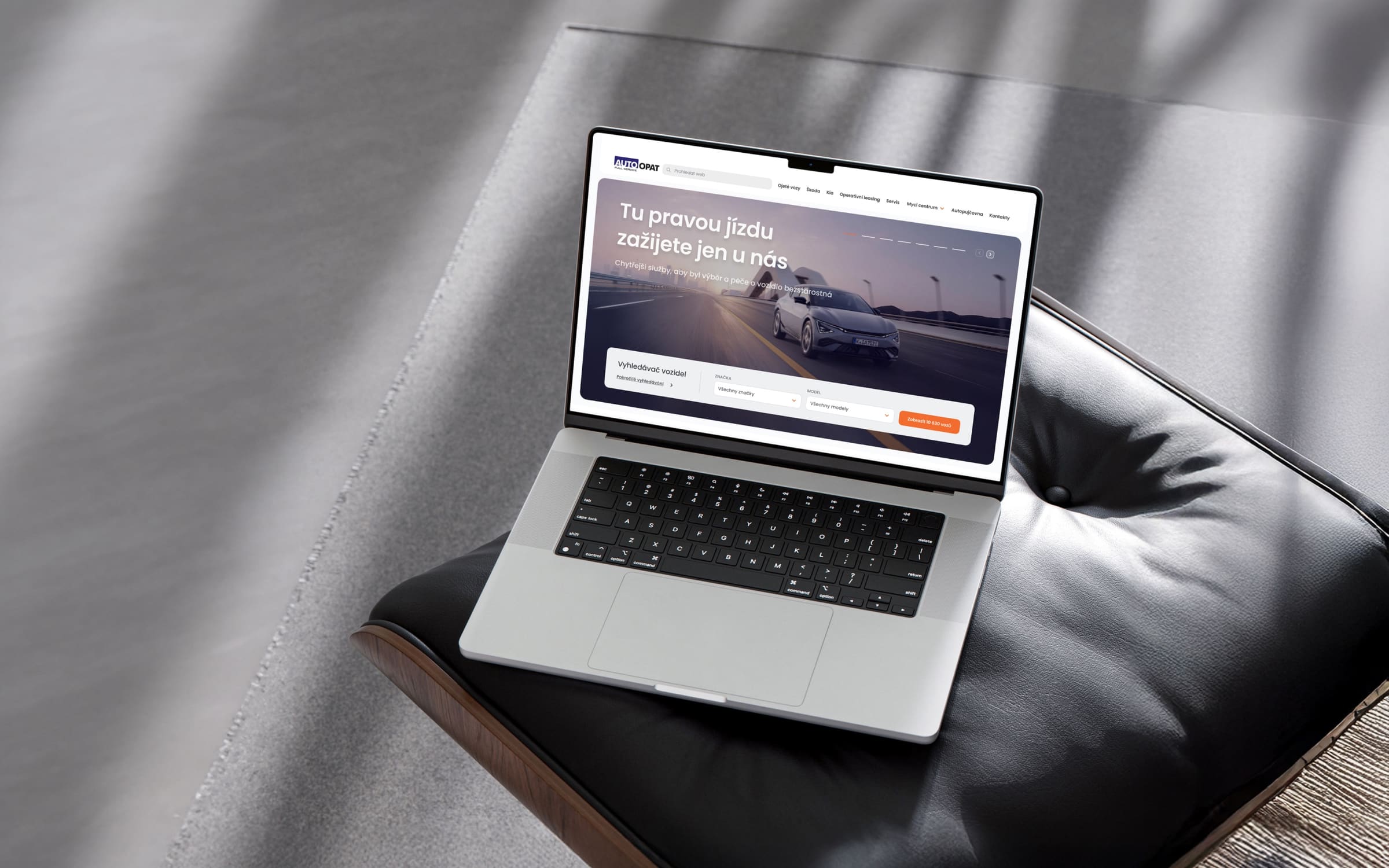
AutoOpat
A simple car search for one of the country’s largest used-car dealers.
 Consumer
LEGO
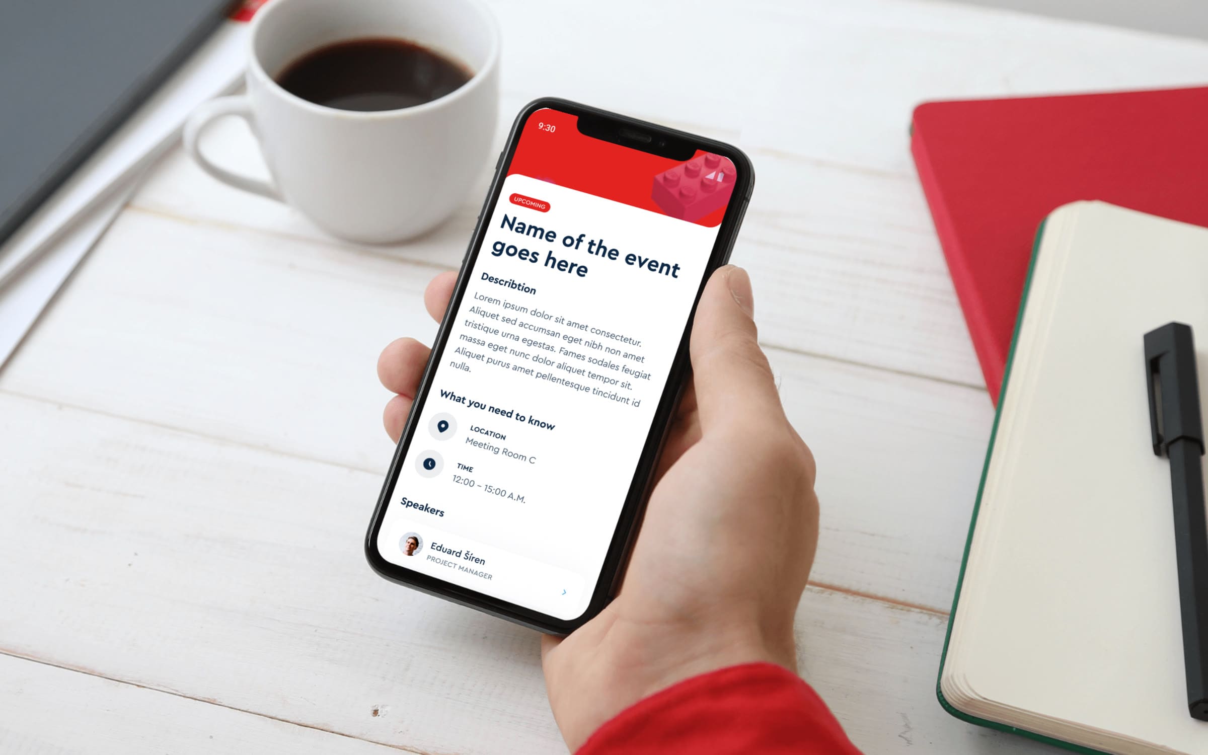
An event app for LEGO, mapped before anyone drew a screen.