AOBPEnabling expertise for a safer future.
At a glance
- Design thinking
- Strength without the need to shout. Restraint is what keeps a defence association credible with ministries and partners.
- Problem
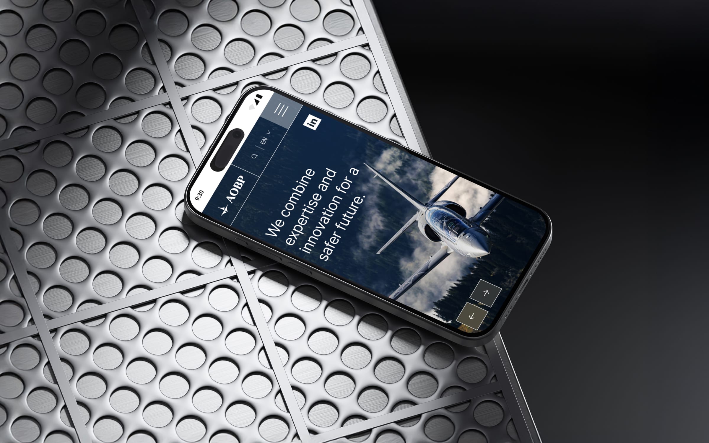
- The website was outdated, and defence imagery easily turns militaristic. AOBP needed to read as a reliable, innovative partner instead.
- Approach
- We started with the structure by renaming the industry categories, then built one module library for the website and the app.
- Outcome
- The redesigned website is live, and the member app follows the same visual language.
- Role
- Lucie as design and project lead, working with Daniel Ždych and the AOBP team.
- What we designed
- Visual identity
- Website design
- Design system
- UX/UI design
- Platforms
- Website
- Member app
- Marketing assets
The structure
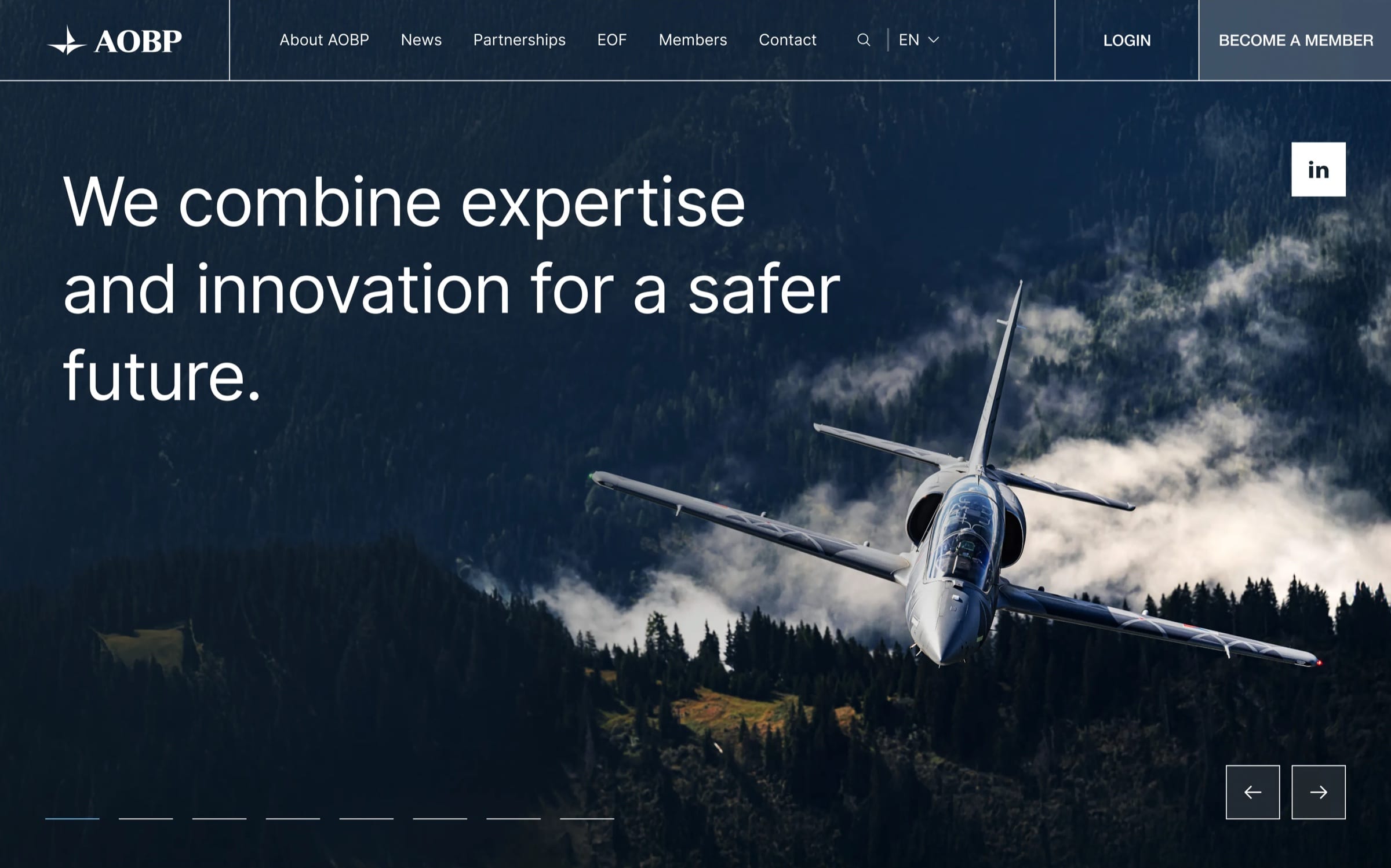
Clear categories, so every member finds its place.
The industry categories are the backbone of the site. Their old names lacked clarity and missed both the range of sectors AOBP represents and its international scope.
We proposed a complete restructuring and renaming, and the new categories fed into AOBP’s SEO and marketing strategy.
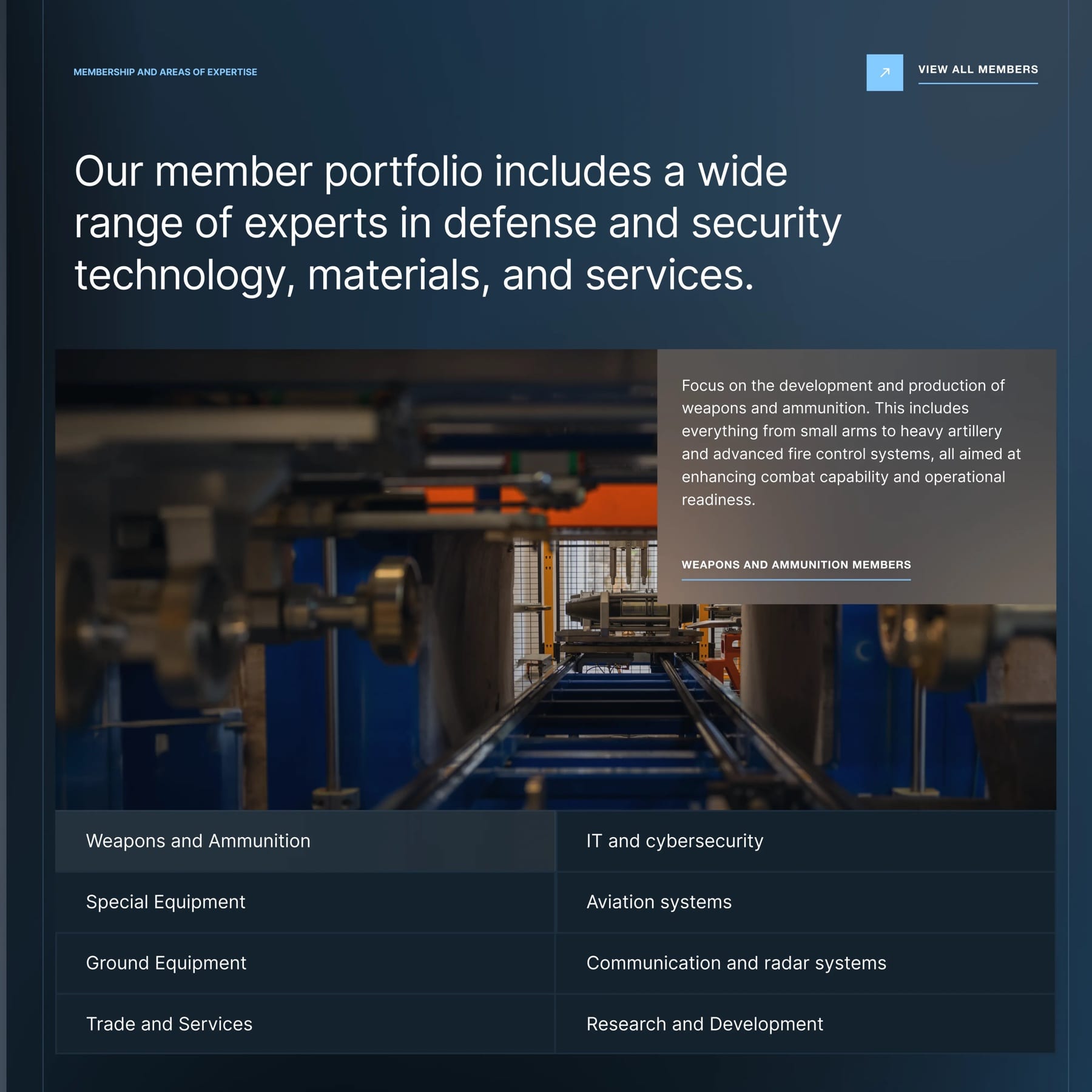
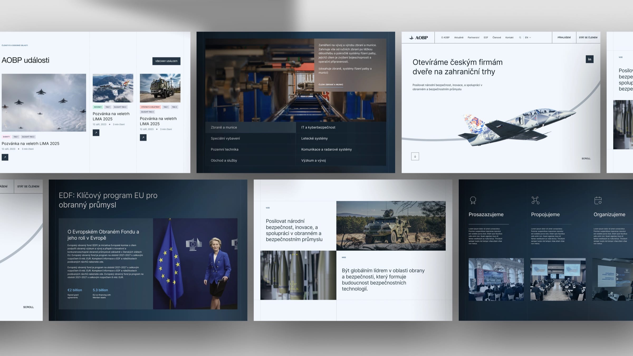
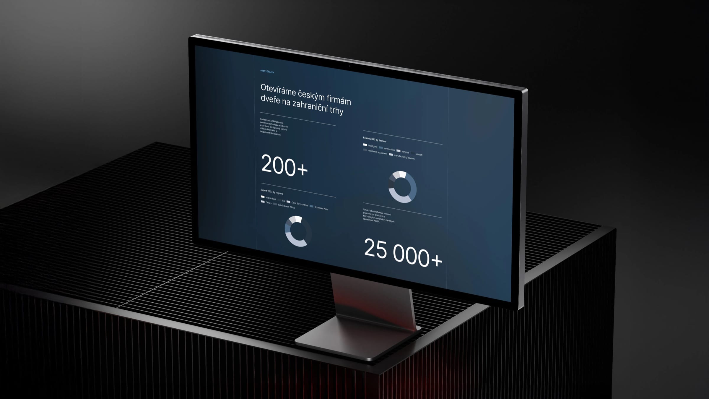
One visual language for the website and the member app.
A shared palette and module library serve both, so every page and screen follows the same rules.
The tone
Strength, without the need to shout.
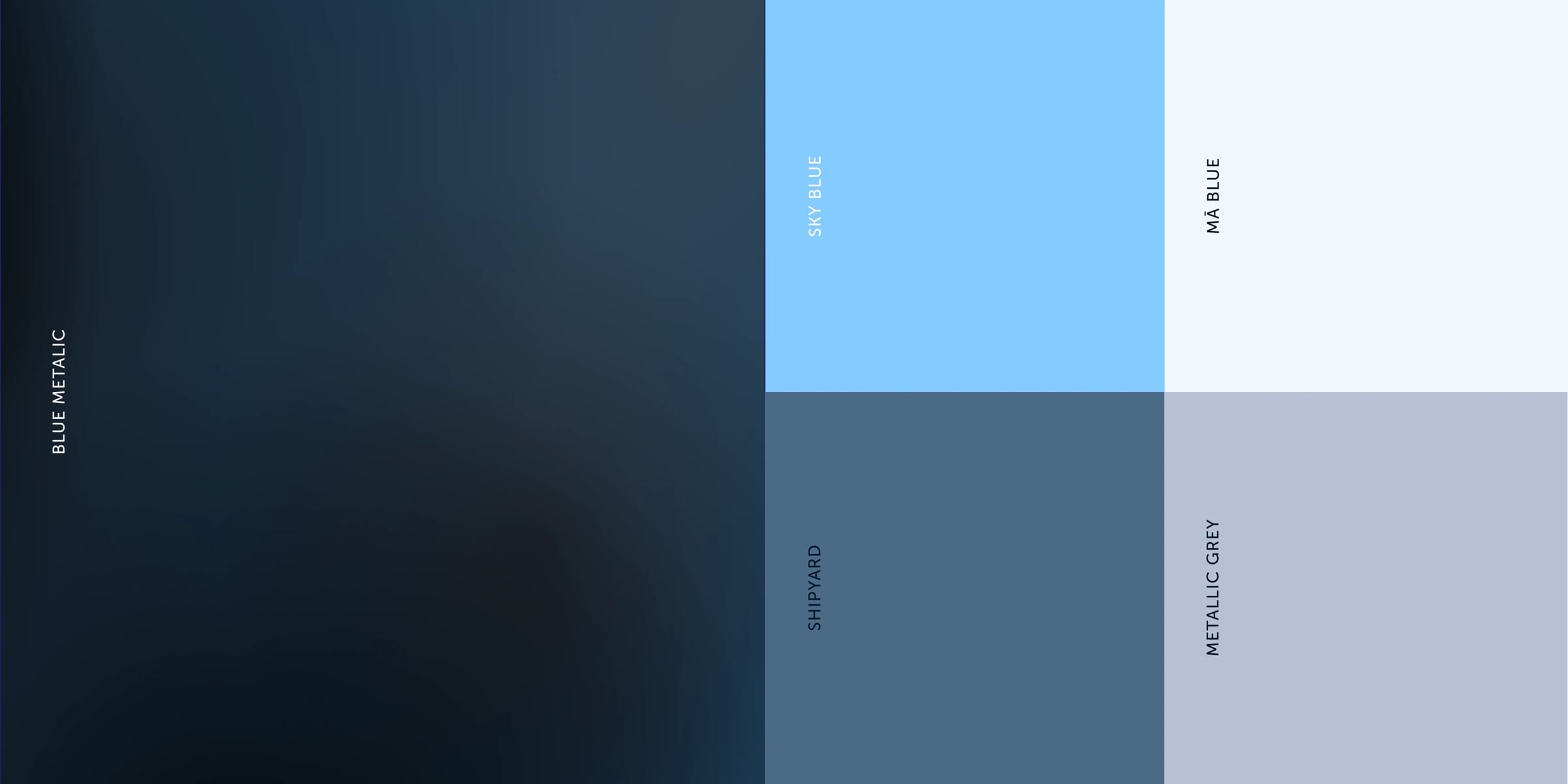
AOBP connects companies in a sensitive sector, and often in sensitive geopolitical moments. Restraint is what keeps it credible with ministries and international partners.
So the brand speaks with authority and unity, and deliberately avoids an aggressive or militaristic tone.
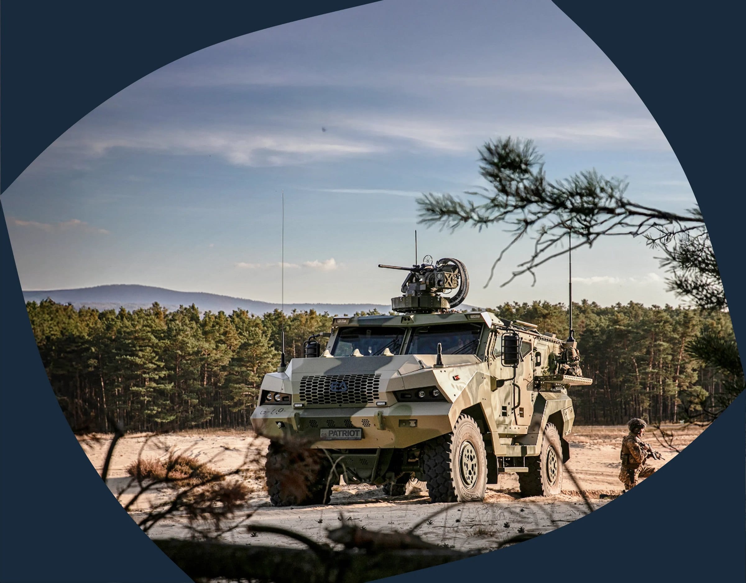
The photography follows the same restraint.
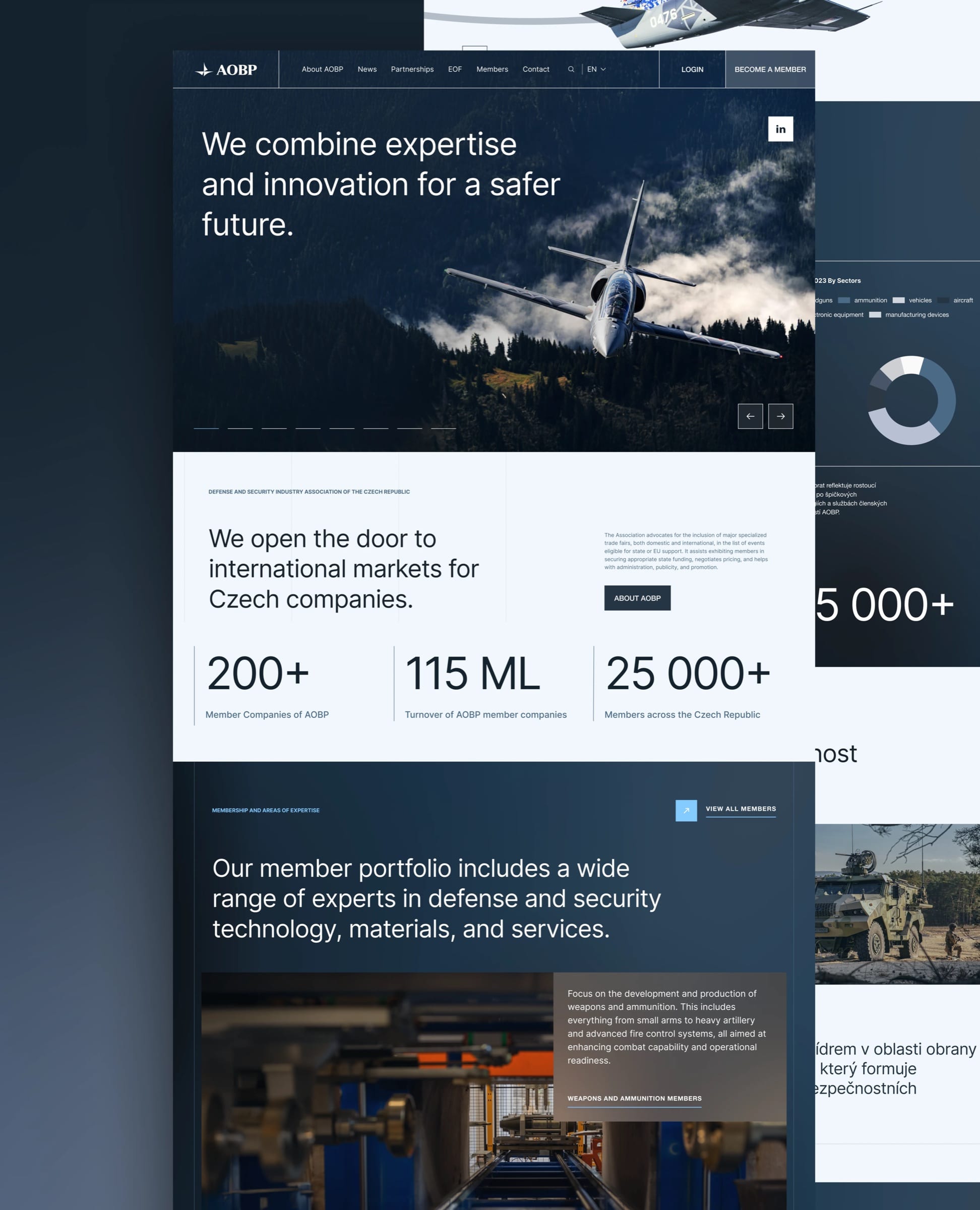
News and member services sit at the top, because that is what people come for.
Everything below is assembled from the module library, so AOBP can add content without a redesign.
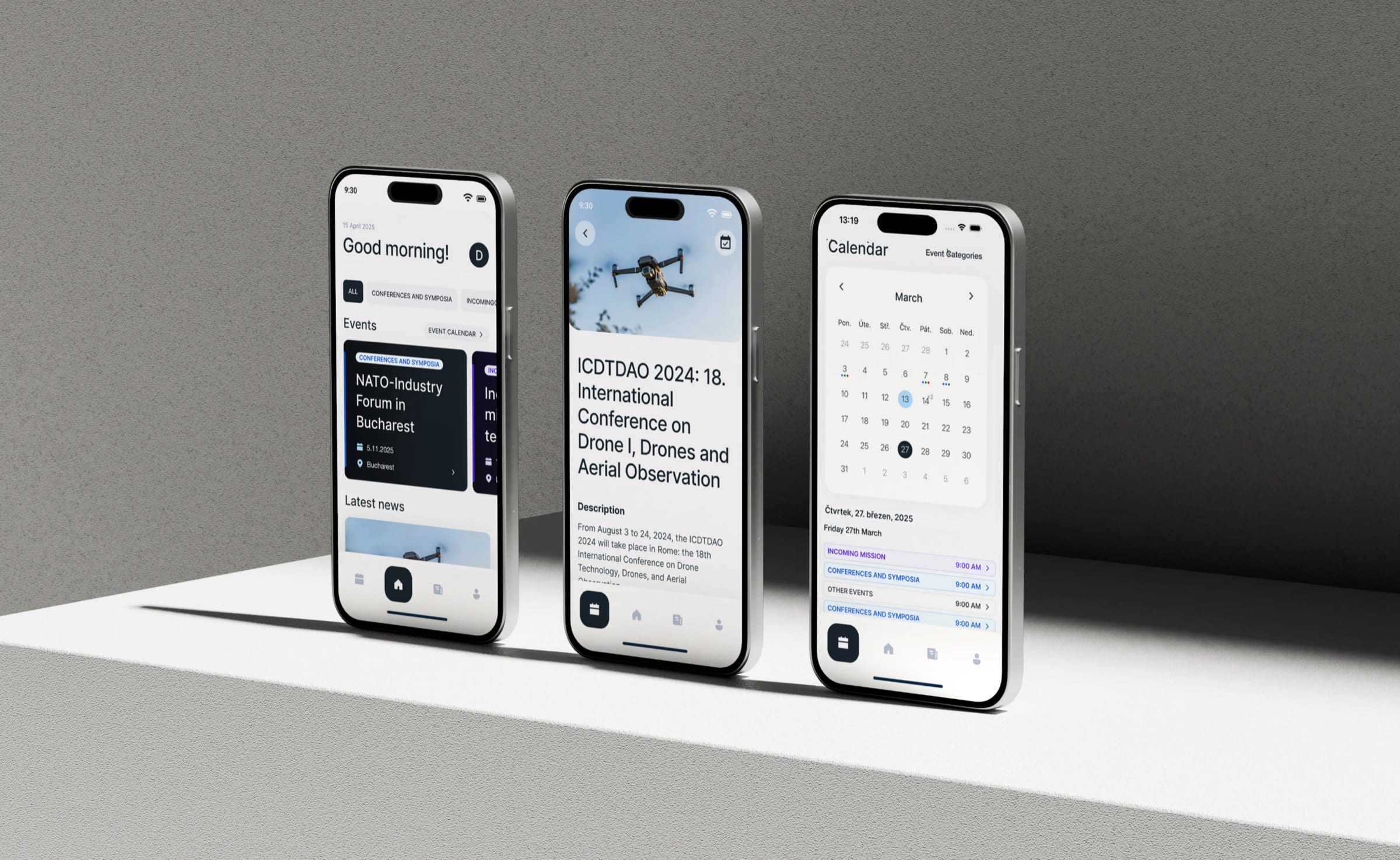
The app members work in now matches the site.
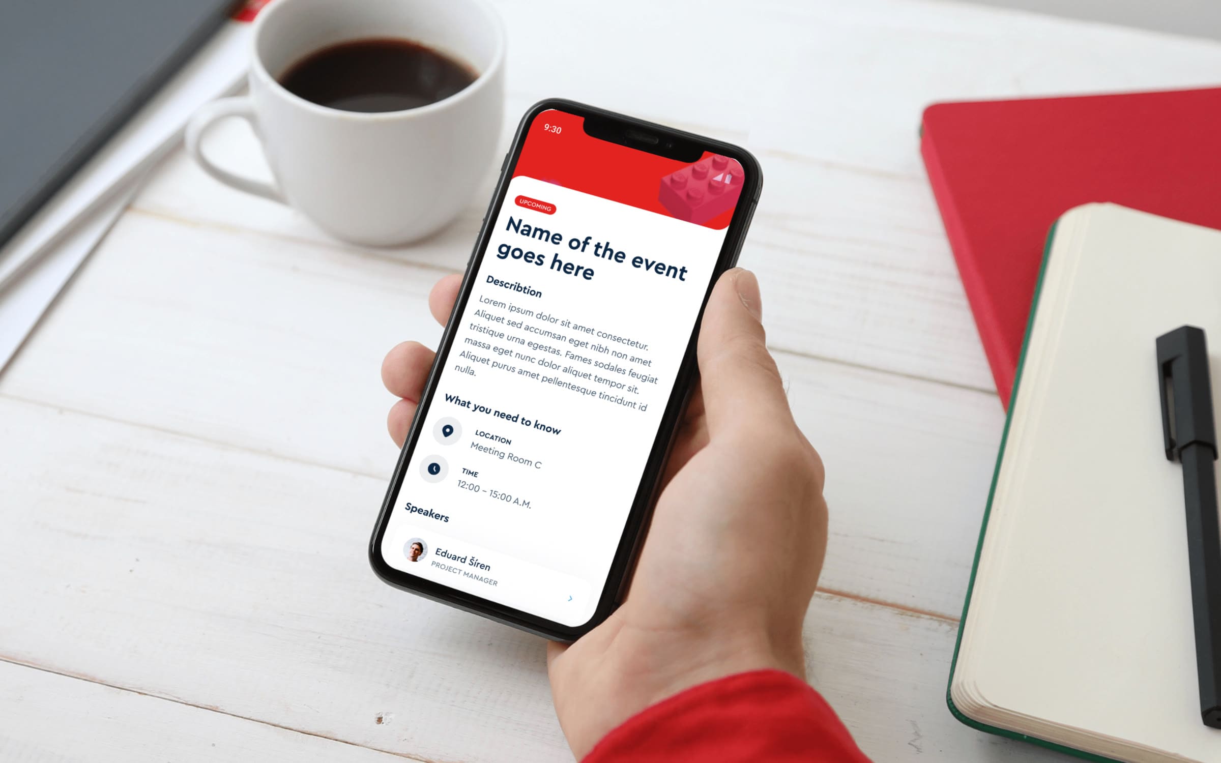
The app is where members actually spend their time, so we redesigned it too. Events, news and the calendar now use the site’s own components, and no longer look like a different organisation.
More work
All projects →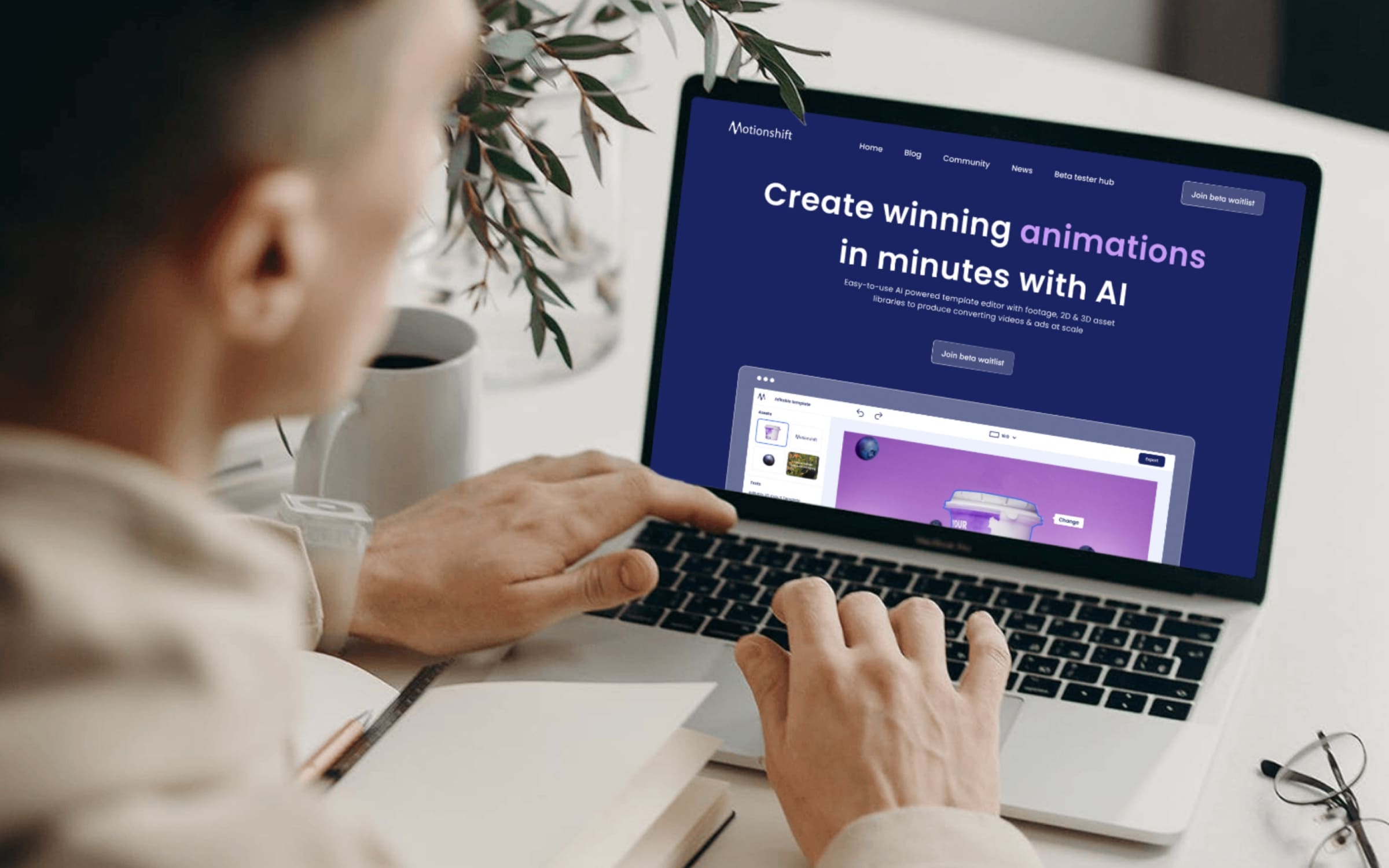 AI
AIMotionshift
An AI video tool shaped by what its first users actually needed.
 AI
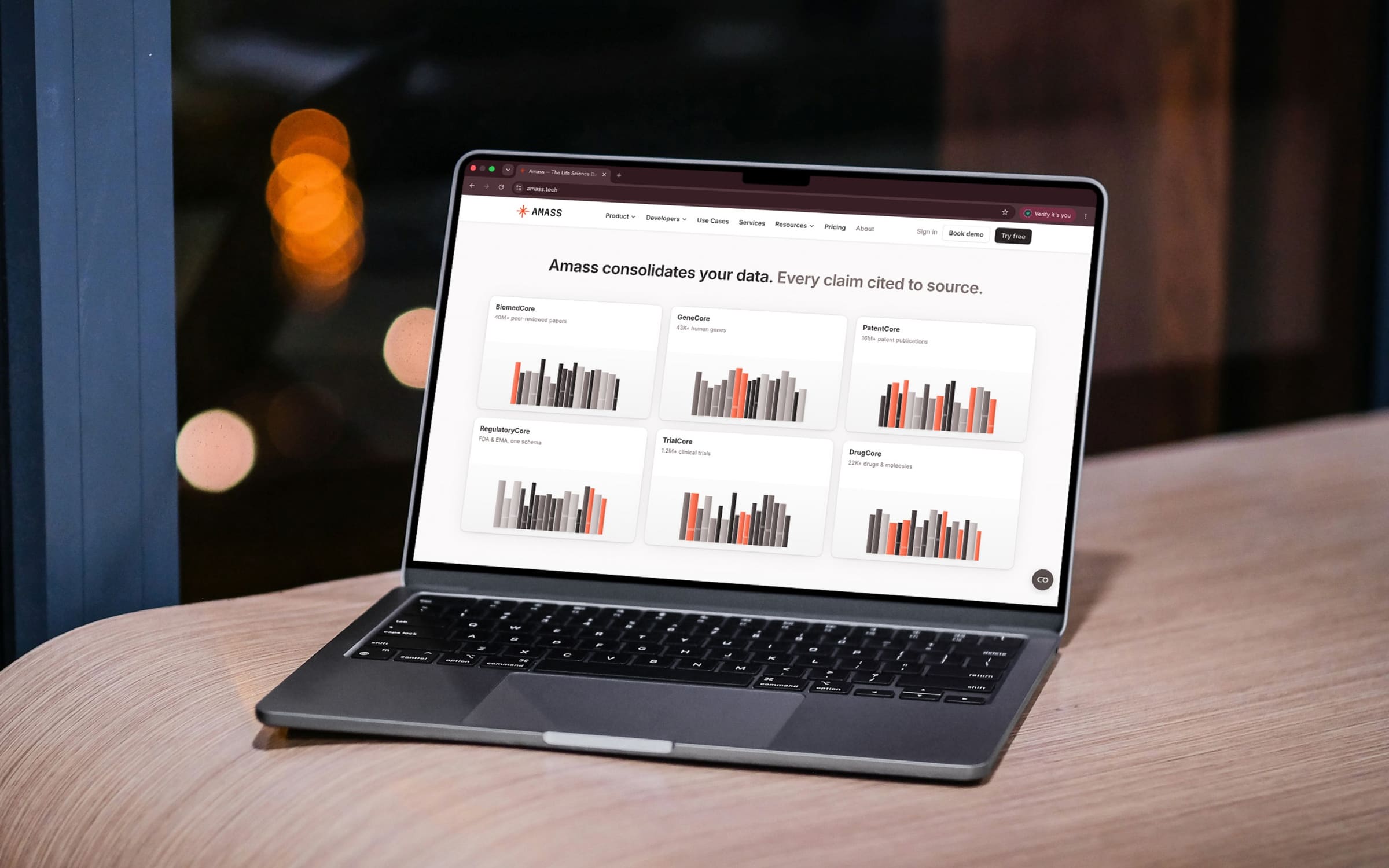
AIAmass
Life-science data in one place, with every claim cited to its source.
 Health
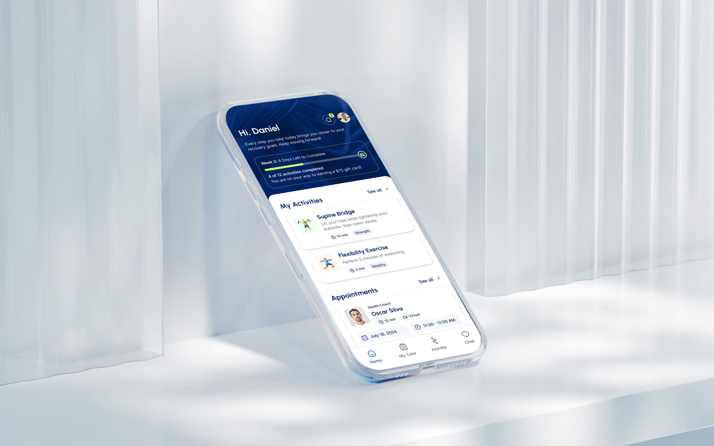
Movido
A recovery app that starts by asking what you want to get back to.
 AI
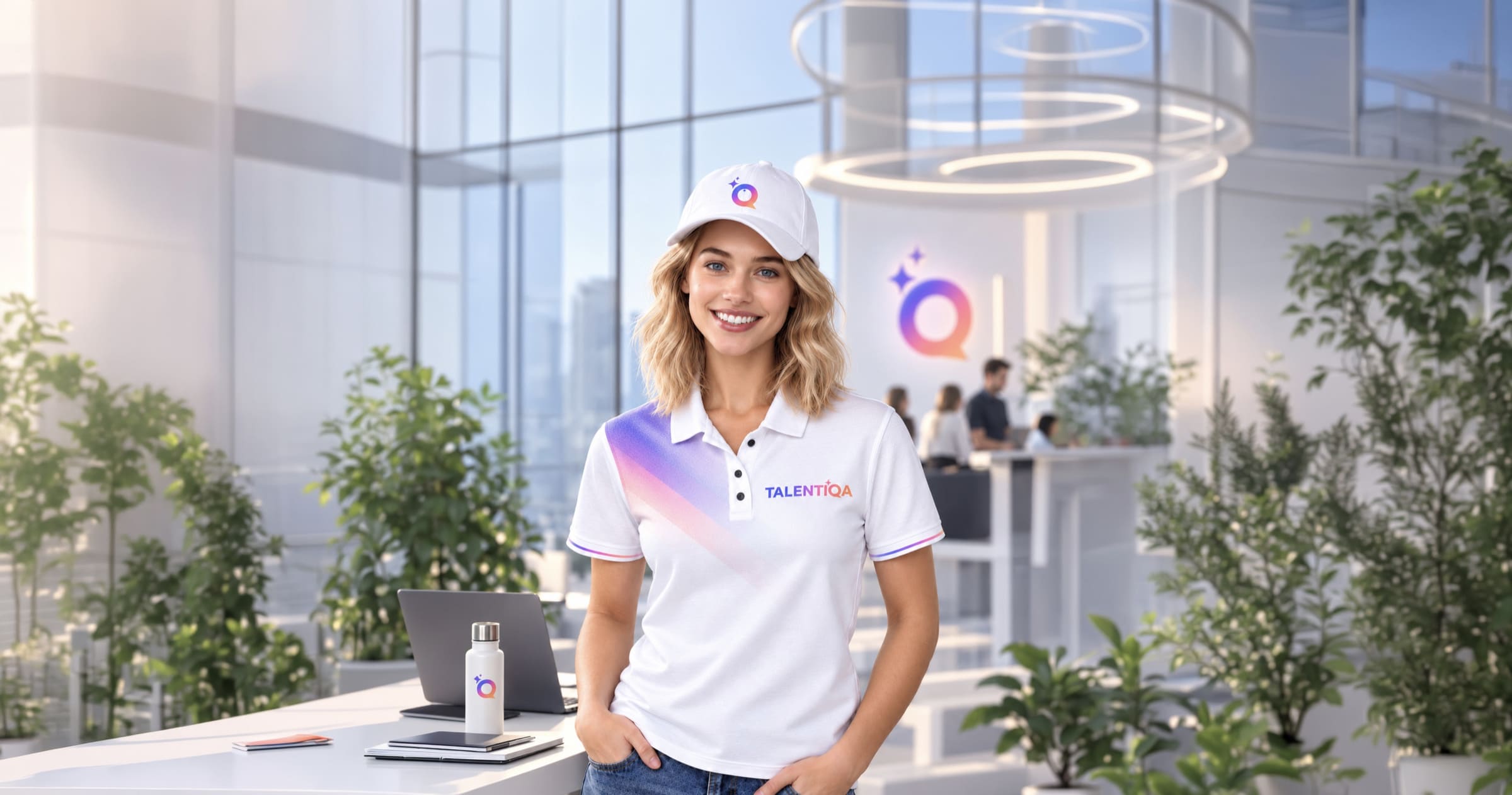
AITalentiqa
An AI hiring assistant that had a name, and nothing else.
 Automotive
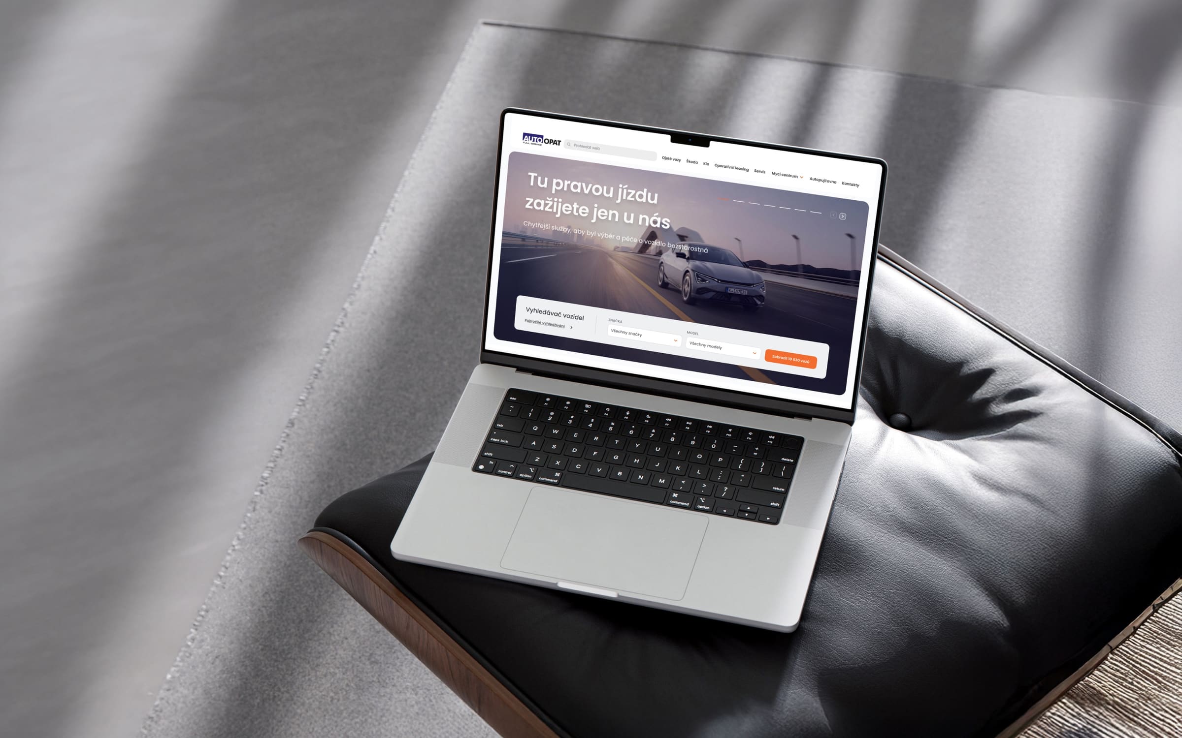
AutoOpat
A simple car search for one of the country’s largest used-car dealers.
 Consumer
LEGO
An event app for LEGO, mapped before anyone drew a screen.